|
|
|
|
|
|
|

Houka Kami Kobushi Deshi-
|
 Posted: Tue Dec 16, 2008 6:07 pm Posted: Tue Dec 16, 2008 6:07 pm
|
|
|
|
|
|
|
|
|
|
Posted: Wed Dec 17, 2008 12:02 pm
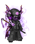
Woah, those are great! I personally like the second and fourth ones.
|
|
|
|
|
|
|
|
|
|
|
|
|
|
|
|
Houka Kami Kobushi Deshi-
|
Posted: Wed Dec 17, 2008 11:18 pm
Self Destructive V2 Woah, those are great! I personally like the second and fourth ones. haha redface redface thanks, I have to agree with you, the second one I liked, I just wanna see if I can make the boxes more or less invisible so it doesn't mess with the image 'to' much, because it's the boxes that bother me. Oh well. I agree with you. Also the second one was the first signature like that I made, compared to the other three.
|
|
|
|
|
|
|
|
|
|
|
|
|
|
|
Posted: Fri Dec 19, 2008 11:46 am
I like the first one more for the fact it's less blinding to my eyes (I have a calibrated screen so it looks really bright to me). The second one has a great focal point, so you may wanna try something combining the two.
The third one, you may want to try to offset all that red with another color. A green or even a yellow here and there would actually liven it up. It's just that the red overpowers the other colors in the picture. And the last one, looks great, but I'd make the name stick out a little more, I find it really hard to read.
Great job though, they look really awesome.
|
|
|
|
|
|
|
|
|
|
|
|
|
|
|
|
|
|
Posted: Sun Dec 21, 2008 11:39 pm
Houka Kami Kobushi Deshi- Self Destructive V2 Woah, those are great! I personally like the second and fourth ones. haha redface redface thanks, I have to agree with you, the second one I liked, I just wanna see if I can make the boxes more or less invisible so it doesn't mess with the image 'to' much, because it's the boxes that bother me. Oh well. I agree with you. Also the second one was the first signature like that I made, compared to the other three. I'm not seeing these boxes you're referring to. o.O
|
|
|
|
|
|
|
|
|
|
|
|
|
|
|
|
|
|