|
|
|
|
|
|
|
|
|
 Posted: Wed Jul 02, 2008 9:29 pm Posted: Wed Jul 02, 2008 9:29 pm


anyone got any opinions? i need to inprove my art, but i don't know what to do.
|
 |
|
|
|
|
|
|
|
|
|
|
|
|
|
Posted: Sat Jul 26, 2008 4:32 pm
heyo, ready for some honest crit?
let's get started.
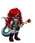
the first one: very cool, I love the face! the blending of just a FEW colors on the face makes it stand out. but you should only use two or three DIFFERENT colors for the rest of the body. too many bold colors clash and make it hard to focus on just one main part of a characters body.
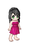
second pic:
cool clothes and necklace/choker, but the face and hair are too angular to make it look realistic enough.
because you start to draw with a computer program, sketch out what you want, it'll make your lines softer and more gentle looking. you definitely want to choose the freestyle lines when you're drawing with a computer program, instead of choosing the LENGTH of the lines that you make. Draw your own, they'll look less angular. also, I'd choose a different color for the eyes, usually a color that matches the character's clothing, it makes it easier on the eyes. the blood should be flowing out of her mouth, not forming at the bottom of her chin. Instead of the blood just coming to a stopping point at the chin, make it flow downward (consider GRAVITY in all your art pieces) and your art will look better.
the blood should also be darker colored, using lighter colors for blood doesn't look realistic.
the clavicle at the base of her neck should flow more freely towards the sides, instead of being drawn with two lines at the sides a few inches away. does that make sense?
the neck shouldn't be so long, try to shorten the length between her head and her shoulders. the shine in her hair should be broken up, instead of jutting out and being so angular...you should also try to draw little strands of hair instead of just filling it in with brown, it doesn't look very good that way.
her nose should be a little larger and her fang should be more to the right.
otherwise, you did a GREAT job!
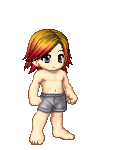
third pic:
the arms are too small, and so is the torso. same for the clavicle (see pic 2)
I love the cape, and the scarf, they look great, so I'm not going to crit. them. is there a chance that you can color the skin so that it stands out from the whiteness of the glowing? Because right now it's not showing that it's a lighter color than her skin and her pants other than the bottom of the pants are colored. I'd advise making all your body parts below the head way bigger so that it's proportionate according to the head.
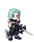
fourth picture:
this is really cool, I like the costume!
try practicing drawing hands, and also, I would make her legs a little further apart so that she seems more steady. I would make the mouth and the nose a little bigger, and outline her kneecaps more. otherwise, GREAT JOB!
Your art is really awesome, just work on the things I've mentioned above.
I'd love to see more of your art!
|
|
|
|
|
|
petitefromage Vice Captain
|
|
|
|
|
|
|
|
|
|
|
|
Posted: Sat Sep 27, 2008 10:57 am
ok well pencil crayon looks ugly unles very thick makes ur pics look grainulated and in bad quality also try to practise your shading thats very important u have no shading generally and if you do its very small amounts you barly notice ohhh and when ahading remember the shadow lightens up as i gets to light its not light clothing to super dark do transition
|
|
|
|
|
|
|
|
|
|
|
|
|
|
|
Posted: Wed Oct 01, 2008 8:36 am
Use reference, when you want to create something feel free to research pics and use reference.
|
|
|
|
|
|
|
|
|
|
|
|
|
|
|
|
|
|
Posted: Thu Jan 08, 2009 8:16 pm
learn and use crosshatching.
learn about light and shading.
use both to give texture to the clothes
and lose the flatness of your coloring
you can use the crosshatching to better mix the colors
|
|
|
|
|
|
|
|
|
|
|
|
|
|
|
Posted: Mon Feb 02, 2009 12:48 pm
You have to study and draw things that you see, don't try to draw things from your head or create. Drawing is like any artform, first you need to take things in. You need to take things in visually, the same as in music you need to take sounds in, and imitate songs you hear to learn how to listen to notes and how they are put together. In art you need to take as much information in as you can. Concentrate on drawing everything you see, thats what will teach you how to draw. Then you can learn tecniques that help you take in certain information, and than draw it. But first start drawing people
|
|
|
|
|
|
|
|
|
|
|
|
|
|
|
|
|
|
|