|
|
|
|
|
|
|
|
|
 Posted: Sat Jun 14, 2008 9:32 pm Posted: Sat Jun 14, 2008 9:32 pm
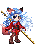
Here is a pic of Hoshi...its not that great- sweatdrop I don't happen to have a program on my computer where i can make the pic look better... though the texture on the wings was on purpose...
|
 |
|
|
|
|
|
|
|
|
|
|
|
|
|
Posted: Wed Jun 18, 2008 4:56 pm
Thanks to Ohri for finding this!!!
This pretty much what I had in mind for Hoshi. Sweet and delicate looking, but ready to kick some serious A**.
http://img.digik.net/Anime & Game/Idolmaster/[Digik] IM_1617.jpg
|
|
|
|
|
|
|
|
|
|
|
|
|
|
|
|
|
|
Posted: Wed Jun 18, 2008 7:20 pm
You may want to check the link there. And the pic looks fin. Keep it up mrgreen
|
|
|
|
|
|
|
|
|
|
|
|
|
|
|
Posted: Sat Jun 21, 2008 7:31 pm
GAH!!! It was working the other day. stare it works in the PM that Ohri sent me... anyhoo.... New picture.... complete free style, no example pic.. Not great.... few mistakes when I inked it... no color cause i dont have a good coloring program 
|
|
|
|
|
|
|
|
|
|
|
|
|
|
|
|
|
|
Posted: Sat Jun 21, 2008 9:02 pm
I can still the overall picture. I like it. It's actually a great one.
Creative Critsism:
Is the hair supposed to be that poofy? You should really try to roll it of the scalp, something that took me some time to figure out. Long hair doesn't bunch up on the head unless nappy, hence why long hair usually roles off the neck. I would have rather seen it not inked, because the few mistakes I see are easily fix able. Try rounding the tip of the nose more, Change nothing else. The eyes near perfect, maybe a smidge to big, but excellent none the less. Just the same, the eyebrows are to long They should start and end around the same place as the eyes and be slightly hire than where the nose arch begins.
The only other overly exaggerated things I see, are the jaw, which should have started coming up around where the long strand of hair is, and the breast, which in itself is something that must be learned. The latter of the two is the least noticeable to me.
And don't worry about free style, I may look at a picture for the figures general look, but everything I do is free hand work.
Again, over all, I love the pic. Can't wait to see more.
By the way, this is what I see when I click the link:

|
|
|
|
|
|
|
|
|
|
|
|
|
|
|
Posted: Sat Jun 21, 2008 11:59 pm
>Revan- thanks for the tips... I have always had a hard time with the chin thing... and when I draw a straight on shot of the face... well one eye is always a bit higher and bigger then the other one... they usually look something like this in size.. O. o its... annoying. so i cheat and trace the eyes out of a manga book... and sometimes that doesn't even work... stressed .
the hair thing... I was trying to prevent the head from looking too small..... can see thats not working so well... sweatdrop
the breast issue.. it looked fine before I drew her hair down, but she looked freaking anorexic with her back showing... I have the original skech.... I may try to improve it...
|
|
|
|
|
|
|
|
|
|
|
|
|
|
|
|
|
|
Posted: Sun Jun 22, 2008 5:46 pm
I have that problem with eyes too, Nimriel. A lot of the time I have to adjust the placement of the eyes and eyebrows when I go to ink. I also find that drawing the 3/4 view of the face helps with that problem too, so it's my favorite way to draw the face, because the eyes are supposed to be bigger the closer they are to the viewer, and curved as they follow the curve of the face. That way you don't have to fiddle so much if the size is slightly off. Here is a great video tutorial of the 3/4 view.
|
|
|
|
|
|
|
|
|
|
|
|
|
|
|
Posted: Tue Jun 24, 2008 11:24 pm
another pic of Hoshi....  I was going to post a pencil skech, but I couldn't get it to show up right... so yeah...
|
|
|
|
|
|
|
|
|
|
|
|
|
|
|
|
|
|
|