|
|
|
|
|
|
|
|
|
 Posted: Tue Apr 22, 2008 3:16 pm Posted: Tue Apr 22, 2008 3:16 pm
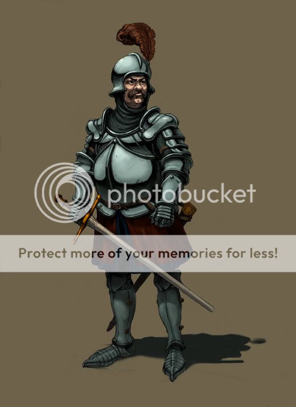
I know how non-member posts go over so well here, but I'm short on sleep, ergo, judgement. Y'know how if you spend too long on a piece without takin a break, you start to lose the ability to actually see what it is you're painting? I hit that point three hours ago. http://i7.photobucket.com/albums/y263/mistersmite/more random stuff/blurgblrgblgglrb.jpgI still have some tweaks to do, work on the plumage, see if I can get some warmer highlights on there, need to map out the ground shadow more correctly (it won't be completely accurate, just better), a few other things I can't think of at the moment. It's almost 80 to 90% done. I was hoping to get some troubleshooting on the reflectivity of the armor, and a general opinion on whether it's too shiny. I also would like some input on whether I should move the scabbard, cause right now it's forming and 'X' with the sword and seems to draw the eyes to that lower third of the piece. It wouldn't take much to tweak the scabbard so it's more verticle, and behind the left leg. I'd still have small complex shapes with high-contrast values there, but it would reduce that issue somewhat. Also, I'm still having a little trouble with the face. In particular, if I stay true to my lighting, I lose a lot of the definition on the dude's nose, which is important, cause he should have a big nose. ...problems. neutral *EDIT* Update 1:
*EDIT* Update 2:
*EDIT* Update 3:  commentary below
|
 |
 |
|
|
|
|
|
|
|
|
|
|
|
|
 Posted: Thu Apr 24, 2008 11:02 am Posted: Thu Apr 24, 2008 11:02 am
His arms look like they are different lengths and his right arm is bending weird, or it's not and the armor is designed weird and isn't moving properly
Also the tunic skirt whatever thing looks unfinished in relation to the rest of the piece
|
 |
 |
|
|
|
|
|
|
|
|
|
|
|
|
|
|
|
 Posted: Fri Apr 25, 2008 9:53 am Posted: Fri Apr 25, 2008 9:53 am
Thanks for the comments, they helped.
Actually, the right arm was kinda whacked. I tried fixing it, gave up, you mentioned it, OCD set in, and I (mostly) solved the problem by fixing both arms. Much more consistent now. The right arm still has a really stiff pose, but I'm gonna hafta concede and move on at this point, since it would take not just reworked the hand, but also re-drawing most of the sword. You win some, you lose some. Blech.
The tunic, I'm not 100% on. I don't want to play it up too much, since I'm setting up the focus more on the upper body, and I really don't want to drag the viewer across the image by imposing information overload. The blue edging was going to have a gold thread leaf design on it, which looked really cool down to 50% size, but turned into squiggly crap when reduced further, so I nixed it. But it would be bitchin if I ever did a high-rez model of 'im. Yet I am Z-Brush impaired >.>;;;;
I still don't like how the shadow is sitting, so I might just do a hack job on that and call it a day. And that reflection on the left greave is starting to bother me...
But I'd love to hear more suggestions if you got 'em.
|
 |
 |
|
|
|
|
|
|
|
|
|
|
|
|
 Posted: Sat Apr 26, 2008 9:48 am Posted: Sat Apr 26, 2008 9:48 am
I'm still really bothered by the red part of the tunic, it's wrinkling weird and I think the blue edge looks good but the red part just has an air of being unfinished, I think if you add more detail to it it would probably benefit you since its simplicity next to the armor and such actually makes it a bit of a distraction
you could also consider shortening it
|
 |
 |
|
|
|
|
|
|
|
|
|
|
|
|
|
|
|
 Posted: Sat Apr 26, 2008 10:27 am Posted: Sat Apr 26, 2008 10:27 am
It's also really really dark, and too much information gets lost. Like the red doesn't really have any highlights compared to the armor, which obviously has lots of light cast on it.
|
 |
 |
|
|
|
|
|
|
|
|
|
|
|
|
 Posted: Sun Apr 27, 2008 11:55 am Posted: Sun Apr 27, 2008 11:55 am
Professor_Markus It's also really really dark, and too much information gets lost. Like the red doesn't really have any highlights compared to the armor, which obviously has lots of light cast on it. i thought the same thing, but wasn't sure if it was just my monitor. mad
|
 |
 |
|
|
|
|
|
|
|
|
|
|
|
|
|
|
|
 Posted: Sun Apr 27, 2008 12:04 pm Posted: Sun Apr 27, 2008 12:04 pm
Updated image in the first post Overall this panting reeks of the half-finished drawing that lies as its framework. rolleyes I'm going to be much more discerning when digging out old drawings to paint from now on. I'm on the verge of calling it quits and moving on, so this one doesn't obstruct other projects any longer. I still need to mess with that shadow, though... I flooded the front of the tunic with more light, as suggested (and thank you), but I didn't really put in any time actually fixing the problems with the folds of the fabric. In lightening it, I also deemed it necessary to add saturation to the plume, to keep the richness in the upper portion of the figure, and to balance out the now lighter reds, that shouldn't be drawing much attention (which was why I was so hesitant to brighten them). And I felt that shortening the tunic would have taken away from the design, though I could bring it up to mid-thigh and still keep it with period fashion. Someone suggested a wider blade, so he's gone from carrying a 15th C. German sword to something akin to a 14th C. English one. But the adjustment suits his personality and his bearing more. Page Boy i thought the same thing, but wasn't sure if it was just my monitor. mad Between working on an LCD monitor and my habit of dark color selection, I bet it's partly your viewing apparatus and partly mine. >.>
|
 |
 |
|
|
|
|
|
|
|
|
|
|
|
|
 Posted: Thu May 01, 2008 1:37 pm Posted: Thu May 01, 2008 1:37 pm
I have the same problem with dark colors. Things don't look nearly as bright to me as they do to other people on other computers, which has left me having to recolor something I'm working on right now because it looks ******** crazy on every single other monitor I've seen it on.
That said, I do think the armor is a little too shiny. It needs more grit. Even a texture might do it, sparingly applied.
|
 |
 |
|
|
|
|
|
|
|
|
|
|
|
|
|
|
|
 Posted: Thu May 01, 2008 11:08 pm Posted: Thu May 01, 2008 11:08 pm
First off, you have no clue how much I've had to resist the urge to cover the dude in dirt, dust and gore. xd
Early on I decided that it would be a set-piece, portrait shot. I really didn't want to dump the time into painting a horse carcass behind him and such. I did make certain to leave some imperfections in the breastplate, but even then I didn't spend much time emphasizing them.
Typically, when I'm sending something to print, I have to brighten it, and sometimes add saturation, often blue, depending on the printer and the paper used. I may have to make an alternate "all monitors" version of web-posted artwork. Nothing drastic, but a few simple changes made to deliver more information to a wider variety of viewing sources. Like coding CSS for webpages. stressed
And the final update should be up now. It's been sitting around since Monday, realized I hadn't posted it here.
|
 |
 |
|
|
|
|
|
|
|
|
 |
|
|
|
|
|
|


