|
|
|
|
|
|
|
 Posted: Tue Jan 29, 2008 3:09 am Posted: Tue Jan 29, 2008 3:09 am
|
|
|
|
|
|
|
|
|
|
Posted: Tue Jan 29, 2008 3:16 am
SHENNANIGANS
i like his lip! and his eyebrawz
*attempts to shrink file size*
|
 |
|
|
|
|
|
|
|
|
|
|
|
|
|
|
|
|
Posted: Tue Jan 29, 2008 3:22 am
I think I still like the pencil lineart better.
God dammit, why I must I fail so hard at digital painting *shakes fist! righteously!*
|
|
|
|
|
|
|
|
|
|
|
|
|
|
|
Posted: Tue Jan 29, 2008 3:29 am
The Iconoclast I think I still like the pencil lineart better. God dammit, why I must I fail so hard at digital painting *shakes fist! righteously!* quit putting yourself down, woman -beats you with a golden stick- you can only get better, and you're doing perfectly fine at the moment, in my opinion (better than loads of people your age) -beats once more-
|
|
|
|
|
|
|
|
|
|
|
|
|
|
|
|
|
|
Posted: Tue Jan 29, 2008 3:52 am
That's the way, beat her good.
mad
|
|
|
|
|
|
|
|
|
|
|
|
|
|
|
Posted: Tue Jan 29, 2008 8:26 am
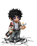
This is looking pretty snazzy, lol you and your obsession with the color green. Personally, I've never liked the color green used as mid tones for the human skin. Purples and blues are where it's at. But I like the use of your color pallet in it. Very messy and very contained at the same time. His left eye seems kinda small, not unless that was the squinty kind of look you where going for?? If so, I would have had his left eyebrow furrow more. More concentrating kind of expression. Like he's got the "What the ********?" Face. Always gotta love Bob's cynicism.
|
|
|
|
|
|
|
|
|
|
|
|
|
|
|
|
|
|
Posted: Tue Jan 29, 2008 8:36 am
Is that stuff in the bottom left supposed to be some sort of cityscape or some sort of nonchalant paint stroking
|
|
|
|
|
|
|
|
|
|
|
|
|
|
|
Posted: Tue Jan 29, 2008 1:16 pm
i love your colors and the way his face was structured using them
hes a very pretty man <333
my only complaint is... its a little dark
and its kind of distracting, not sure if thats what you were going for
but what i get about standard headshot pictures is the idea is to showcase the head? xD
brighten it up a bit just to humor me
(i might be crazy)
|
|
|
|
|
|
|
|
|
|
|
|
|
|
|
|
|
|
Posted: Tue Jan 29, 2008 1:29 pm
Tohomito Is that stuff in the bottom left supposed to be some sort of cityscape or some sort of nonchalant paint stroking Wasn't sure how to transition into the red. I tried some smearing and some sort of cross-hatching, but this looked the best.
|
|
|
|
|
|
|
|
|
|
|
|
|
|
|
Posted: Tue Jan 29, 2008 1:36 pm
Mirenes i love your colors and the way his face was structured using them hes a very pretty man <333 my only complaint is... its a little dark and its kind of distracting, not sure if thats what you were going for but what i get about standard headshot pictures is the idea is to showcase the head? xD brighten it up a bit just to humor me (i might be crazy) Brighter? 
|
|
|
|
|
|
|
|
|
|
|
|
|
|
|
|
|
|
Posted: Tue Jan 29, 2008 1:37 pm
Siin Adonai This is looking pretty snazzy, lol you and your obsession with the color green. Personally, I've never liked the color green used as mid tones for the human skin. Purples and blues are where it's at. But I like the use of your color pallet in it. Very messy and very contained at the same time. His left eye seems kinda small, not unless that was the squinty kind of look you where going for?? If so, I would have had his left eyebrow furrow more. More concentrating kind of expression. Like he's got the "What the ********?" Face. Always gotta love Bob's cynicism. It is actually drawn kind of small, yeah. I redrew it so many times that I got tired of it crying whoops.
|
|
|
|
|
|
|
|
|
|
|
|
|
|
|
Posted: Tue Jan 29, 2008 6:47 pm
The Iconoclast Tohomito Is that stuff in the bottom left supposed to be some sort of cityscape or some sort of nonchalant paint stroking Wasn't sure how to transition into the red. I tried some smearing and some sort of cross-hatching, but this looked the best. so then it's not a city?
|
|
|
|
|
|
|
|
|
|
|
|
|
|
|
|
|
|
Posted: Tue Jan 29, 2008 8:47 pm
The Iconoclast Mirenes i love your colors and the way his face was structured using them hes a very pretty man <333 my only complaint is... its a little dark and its kind of distracting, not sure if thats what you were going for but what i get about standard headshot pictures is the idea is to showcase the head? xD brighten it up a bit just to humor me (i might be crazy) Brighter? ya idk, i like that better i guess more of a personal thing i can just see your lineart more and its nice it was worth seeing xD
|
|
|
|
|
|
|
|
|
|
|
|
|
|
|
Posted: Wed Jan 30, 2008 11:44 am
The Iconoclast Siin Adonai This is looking pretty snazzy, lol you and your obsession with the color green. Personally, I've never liked the color green used as mid tones for the human skin. Purples and blues are where it's at. But I like the use of your color pallet in it. Very messy and very contained at the same time. His left eye seems kinda small, not unless that was the squinty kind of look you where going for?? If so, I would have had his left eyebrow furrow more. More concentrating kind of expression. Like he's got the "What the ********?" Face. Always gotta love Bob's cynicism. It is actually drawn kind of small, yeah. I redrew it so many times that I got tired of it crying whoops.
|
|
|
|
|
|
|
|
|
|
|
|
|
|
|
|
|
|
Posted: Thu Jan 31, 2008 6:41 am
I actually like the brighter version better. Maybe because pink and green are easier than red and green which makes my brain hurt.
|
|
|
|
|
|
|
|
|
|
|
|
|
|