|
|
|
|
|
|
|
|
|
 Posted: Wed Dec 12, 2007 5:39 pm Posted: Wed Dec 12, 2007 5:39 pm
hi biggrin my deviantart: http://masao.deviantart.comI'm mostly practicing more complex poses, so anything you think that needs to be fixed, please tell me. this one I'm mostly worried about the cape, anything you could advise would be great, thanks 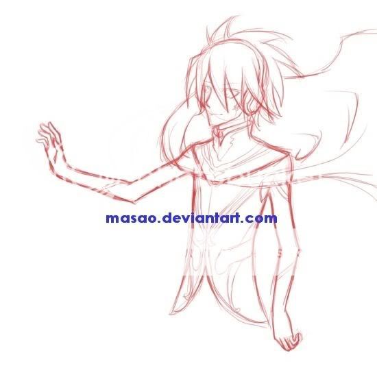
|
 |
|
|
|
|
|
|
|
|
|
|
|
|
|
Posted: Wed Dec 12, 2007 9:34 pm
Well, if you ask me I do believe the hand should be bigger. Perhaps almost as big as the entire face. About the cape, I think it should be moved a bit back, more towards his body. Correct me if I'm wrong.
|
|
|
|
|
|
|
|
|
|
|
|
|
|
|
|
|
|
Posted: Wed Dec 12, 2007 9:37 pm
hmm I dunno about the hands, if it gets too big it would look weird on his frail body
but for the cape, do you mean more down? like more falling? because I was going for the wind blowing his cape up.
|
|
|
|
|
|
|
|
|
|
|
|
|
|
|
Posted: Wed Dec 12, 2007 9:41 pm
The wind blowing up his cape reminds me of super man, lol.
Your right about that, I think meatier arms would help him look less frail, just don't beef cake out his arms.
I think his cape is too far out, it should be closer to his body. It goes as far as his elbow, I think maybe a little past his shoulder would be fine.
|
|
|
|
|
|
|
|
|
|
|
|
|
|
|
|
|
|
Posted: Wed Dec 12, 2007 9:45 pm
but he is frail D: no meat or muscles and do you mean shortening the cape? o.o anway, this is how he looks originally 
|
|
|
|
|
|
|
|
|
|
|
|
|
|
|
Posted: Wed Dec 12, 2007 9:50 pm
Kou Kou but he is frail D: no meat or muscles and do you mean shortening the cape? o.o anway, this is how he looks originally -Snip.- o .o I don't mean meat meat, just to give his arms a bit more definition. If you ask me they don't have enough curvature. As for definition, notice how in the scan you took, that his top deltoid curves down to his elbow then curves back from his forearm to his wrist, it's all about the curves. No matter how lean. 3nodding As for the cape I can give you a red line. Just a sec.
|
|
|
|
|
|
|
|
|
|
|
|
|
|
|
|
|
|
Posted: Wed Dec 12, 2007 9:51 pm
|
|
|
|
|
|
|
|
|
|
Posted: Wed Dec 12, 2007 10:01 pm
It's nothing major, just slight definition in the arms & cut back the cape a bit. 
|
|
|
|
|
|
|
|
|
|
|
|
|
|
|
|
|
|
Posted: Wed Dec 12, 2007 10:12 pm
|
|
|
|
|
|
|
|
|
|
Posted: Wed Dec 12, 2007 10:41 pm
|
|
|
|
|
|
|
|
|
|
|
|
|
Posted: Thu Dec 13, 2007 10:45 am
A post and comment for thee.
|
|
|
|
|
|
|
|
|
|
|
|
|
|
|
Posted: Thu Dec 13, 2007 3:56 pm
Hmm...if you ask me, his clavicles may need some alignment. As for his hands, I believe that they may need to be a little wider because hands usually cover about half of the face. I think the length of the hands are fine because they look like they fit the proportions of the face (from chin to hairline.)
For the cape, do you think you could try to draw the direction of the wind to clarify for me? It helps to draw that to guess how the capes folds will be, and you could also try to make the hair move in the same direction of the wind to emphasize where the cape is blowing.
So far, I like the detail you've placed on his headpiece. Anyway, I hope that helps.
|
|
|
|
|
|
|
|
|
|
|
|
|
|
|
|
|
|
Posted: Wed Dec 26, 2007 12:47 pm
lol, love the superman pose! XD
Minor thing, but his right eyebrow [the one that's on the left] shoots past the nose line. Big no no. XD
While he's supposed to look frail, I think his arms, especially his upper arms, could be a bit thicker. And then his hands won't look so... girly. XD The pink seems wierd for the left hand... and yeah, the cloak is waaaaay too far out. I think it'd be a good idea if you like drew out the direction from which the wind is blowing? or even better, take a piece of clothe and like, do some experiments with a fan? XD Because right now the wind looks like it's coming from under him. XD And depending on whether it's a strong/weak wind, I would give more angles to the edge of the cloak instead of keeping it a smooth curve.
|
|
|
|
|
|
|
|
|
|
|
|
|
|
|
Posted: Fri Dec 28, 2007 10:33 pm
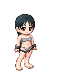
I come from a family of notoriously underweight people... your character may be intentionally frail (a lot of people are naturally thin and frail), but unless he is anorexic to the point where he needs to be hospitalized, he is too thin. Also, the thinner a person is, the easier it is to see their muscles, even if they don't work out at all and aren't strong enough to lift a shoebox. The reason for this is because (usually) fat is the only thing between the skin and the muscles, and so when there's less fat, the bulgy parts of the muscles end up closer to the skin, making them more visable. This is kind of an extreme example... (link)This girl, obviously, has no fat on her entire body. Because of this, we're able to see pretty much everything under her skin. Note how you can see the muscles on the legs and the arms? On the positive side, your line art is very smooth, and has a good flow to it. I like how you used color instead of straight black (which contrasts more with the white background), and that makes it have a very nice calm feeling, especially when combined with the pose and the character's expression. Good work.
|
|
|
|
|
|
|
|
|
|
|
|
|
|
|
|
|
|
|