Welcome to Gaia! ::

Red Line Factory

Back to Guilds

A guild for giving and receiving art critiques. This guild is dedicated to honest words; not cruel or sugar-coated words. 

Tags: redline, critique, anatomy, help, correction 

Reply Recycle Bin; old things
[CLOSED] Matt Artz. (lolz.)

Quick Reply

Enter both words below, separated by a space:

Can't read the text? Click here

Submit

Apocynthion

PostPosted: Mon Aug 27, 2007 3:51 am


sweatdrop Right...So I'm new here. Just logged in to an invite. Thought I might as well get some advice on some work while I'm at it. I've posted these in the picture post subforum, but the comments I recieved were rarely helpful. Of course, these are digital paintings. Realism attempts. rofl I made a tutorial for this on DA, which after an argument in the PP, I have to post on every damn thread. I'm sure I wont need it here.

User Image

User Image

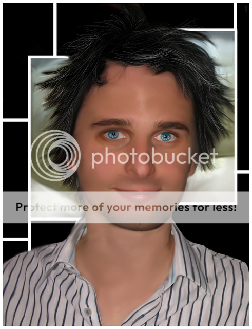
I think the eyes on the second one need a little more toning down, and it does look a lot better here on full view. But I'd really like some constructive critique for either of them, rather than the usual somewhat useless compliments I get from the PP.
PostPosted: Mon Aug 27, 2007 5:39 am


3nodding First one looks great to me, except for the headphones coming out his shirt, those obviously look cged, unfinished. And the blue line on his hand, a vein I suppose? bit to bright to seem realistic.
User Image

one of the ears needs to be darker. And the eyes were cross eyed, and that was really bugging me. And yeah, the eyes do scare me.

Drowningwaters


Shoroie

Shadowy Explorer

PostPosted: Mon Aug 27, 2007 6:05 am


-: His necklace, I'm assuming, is stands out too much. You might want to tone tone the colors such as adding more grays to the "M?" Since it's against the white shirt it would cause some of it to reflect off onto the necklace. What makes it stand out more is that there's no shadow just add a little bit shades of blue across the thread since it's lighter than the objects.

I also believe that the eyes need to tone down a bit. :-


Eyes 1

Eyes 2
PostPosted: Mon Aug 27, 2007 7:03 am


Haha..they're not headphones. It's an earpiece. XD And yeah...I need to smudge in that vein a little bit more. Make it more subtle.

Haha. I'll refer back to the reference picture for the direction of the eyes.

Yeah, I've never really drawn jewellery or necklaces as such, so I was hoping for some help there.

Yeah, the eyes are really too bright. I was hoping to not have to blur them, but they ended up coming out a bit too bright. XD

Edit:

User Image

Changed some things about the first one. Not sure if it's noticable. Tried to dull down the M, took out the heart (I just couldnt get it right XD) and added some shadowing under the stitching. Tried to blur out the sharp blue on his arm to be less noticable.

Apocynthion


Lady Emiri
Captain

PostPosted: Tue Aug 28, 2007 8:48 am


I'm not a fan of paintovers. If it's not a paintover, then wow, but anyway you use the smudge tool a lot.
It shows.

Though smudge is awesome sometimes, it's definitely really dominant in your stuff--- therefore, messy. (though, looks great on that shirt).

Also, you need to work on the "textures" (like the skin and the stubble-- they are just pixels right now). It also needs a lot more texture in the skin. It's just smudgy smoothness right now.

Also, the irises need to be dulled down on the second one.
PostPosted: Tue Sep 04, 2007 2:58 am


It's not a paintover rofl Although I get that comment a lot.

Yeah...although I've never really been that good without it...I've not had tutorials or whatever, so it's all just made up as I go along. People comment on it, but they never tell me just what to do instead.

Yeah... rofl I did those really bright because I'd gotten into a scheme of painting for my novel, where the eyes are unnaturally bright. xd

Apocynthion


kerryfox


Tipsy Muse

PostPosted: Wed Sep 05, 2007 11:15 pm


For that silly ear piece I think the problem is that it just ends, if it was in the pocket there would be a slight shadow where it meets the pocket edge. I would think that you could also get away with a bit more shadow of the piece in the pocket nothing drastic but right now the pull of the shirt reads as if there is nothing there, and isn't as well defined as the other pocket.

Feel free to ignore me too I can't draw realism to save my life I'm just pulling form what I know of fabric and stage lights, so you have my respect for you amazing skills.
PostPosted: Sat Nov 10, 2007 3:53 pm


Thanks 3nodding I'll have to try and give that a go. XD

Apocynthion

Reply
Recycle Bin; old things

 
Manage Your Items
Other Stuff
Get GCash
Offers
Get Items
More Items
Where Everyone Hangs Out
Other Community Areas
Virtual Spaces
Fun Stuff
Gaia's Games
Mini-Games
Play with GCash
Play with Platinum