Welcome to Gaia! ::

Reply Art Fags
The finished Ninja.

Quick Reply

Enter both words below, separated by a space:

Can't read the text? Click here

Submit

Parade

PostPosted: Wed Aug 03, 2005 3:17 pm


User Image

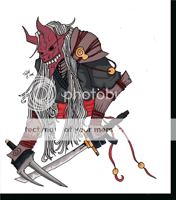
Here it is. Aperantly not half as good as I seemed to think it was. But thats okay, because I will assume it's been that way all along.

This took, roughly 4 hours. I am sure you care.

Well tell me what you think.

I am finaly at the point with my line art, that I think I can move on, and concentrate more on other areas. The first is inking. I need help with that. I can do alright with a brush, and ink well, but that finish is no good if you plan on coloring your pic afterwords.
PostPosted: Wed Aug 03, 2005 8:17 pm


I think the concept on your Ninja is cool. 3nodding

Varying line thickness would definitely help your image - since when the lines are roughly the same width it makes the viewer's eyes 'wander' over the image and thicker lines would help accentuate sections as well as provide a 'thicker' appearence to materials, weapons and what not. (^^)

Color wise, I think you captured the look of form with the shadows on his clothes as well as on his blades. The cel-like coloring seems to fit this drawing so I won't say much on here.

His right arm seems a tad odd, like the connection between his elbow and forearm don't seem to click with the current positioning of his right shoulder. I think with the way the forearm is currently positioned, the right shoulder should jut out more or, his forearm be tilted up more to show the bend of his elbow in correspondence to his shoulder's current position.

All in all, nice work. 3nodding

Elysia Lovette


Parade

PostPosted: Thu Aug 04, 2005 6:02 am


Momoshi
I think the concept on your Ninja is cool. 3nodding

Varying line thickness would definitely help your image - since when the lines are roughly the same width it makes the viewer's eyes 'wander' over the image and thicker lines would help accentuate sections as well as provide a 'thicker' appearence to materials, weapons and what not. (^^)

Color wise, I think you captured the look of form with the shadows on his clothes as well as on his blades. The cel-like coloring seems to fit this drawing so I won't say much on here.

His right arm seems a tad odd, like the connection between his elbow and forearm don't seem to click with the current positioning of his right shoulder. I think with the way the forearm is currently positioned, the right shoulder should jut out more or, his forearm be tilted up more to show the bend of his elbow in correspondence to his shoulder's current position.

All in all, nice work. 3nodding
Thanks. People have been telling me to do the line width thing a lot. Maybe I will take there advice.
Reply
Art Fags

 
Manage Your Items
Other Stuff
Get GCash
Offers
Get Items
More Items
Where Everyone Hangs Out
Other Community Areas
Virtual Spaces
Fun Stuff
Gaia's Games
Mini-Games
Play with GCash
Play with Platinum