|
|
|
|
|
|
|
|
|
 Posted: Sun Mar 27, 2005 4:37 pm Posted: Sun Mar 27, 2005 4:37 pm
Judyfay Sins http://slakin.net/miles/vampire_hunter.gif
They look so very dismayed to be skewered, but I suppose that's only natural. whee
|
 |
|
|
|
|
|
|
|
|
|
|
|
|
|
Posted: Mon Mar 28, 2005 12:37 am
Judyfay Sins ok, here you guys go. Like i said, needs some more work, like perhaps a few more frames here and there. Its set to only play once so Ill link it instead of displaying it fully. http://slakin.net/miles/vampire_hunter.gif
Your defanitly an awsome avatar editer.
|
|
|
|
|
|
|
|
|
|
|
|
|
|
|
|
|
|
Posted: Mon Mar 28, 2005 1:15 pm
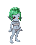
Did you see how even more ridiculously good-looking Strangeoid made me?? *gestures to her signature*
I look hot!
|
|
|
|
|
|
|
|
|
|
|
|
|
|
|
Posted: Mon Mar 28, 2005 1:20 pm
|
|
|
|
|
|
|
|
|
|
|
|
|
Posted: Mon Mar 28, 2005 1:41 pm
TheQualityofMercy Did you see how even more ridiculously good-looking Strangeoid made me?? *gestures to her signature*
I look hot!
Your guy there looks pretty good, so far. Wonderful job on the gold cross piece, belt, and paper! His hair is kinda funky, though - maybe blend a tid more? And some better contrast on the jacket-cape thing would make it uber shexy. heart domokun
|
|
|
|
|
|
|
|
|
|
|
|
|
|
|
Posted: Mon Mar 28, 2005 1:48 pm
*Mental notes* Thank you, Strange!! Just the kind of help I was looking for! whee
|
|
|
|
|
|
|
|
|
|
|
|
|
|
|
|
|
|
Posted: Mon Mar 28, 2005 2:47 pm
TheQualityofMercy Pointers please! whee  Mercy my dear, that is fabulous! I agree with strange, the highlights on the hair need a bit more blending. And the coat needs a few highlights. Also I would deepend the shadows ever so slightly on the hair where it parts.
|
|
|
|
|
|
|
|
|
|
|
|
|
|
|
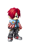
Posted: Mon Mar 28, 2005 3:00 pm
 I made this from a request by another user. Its Urza, from magic the gathering. I made everything on it myself sweatdrop The hair, I technicallly made since its edited...how can I make this better?
|
|
|
|
|
|
|
|
|
|
|
|
|
|
|
|
|
|
Posted: Mon Mar 28, 2005 3:10 pm
*Gives Judyfay a kiss on the cheek*
Well there Analog..."better" is a very tricky word and depends on all kinds of variables!
Are you working from a reference picture?
|
|
|
|
|
|
|
|
|
|
|
|
|
|
|
Posted: Mon Mar 28, 2005 3:12 pm
He gave me a bunch of pics and I just took bits and pieces from each..
|
|
|
|
|
|
|
|
|
|
|
|
|
|
|
|
|
|
Posted: Mon Mar 28, 2005 3:23 pm
Well that shoots Convenient right out the window, doesn't it? whee
Okay, well my first suggestion is to eye-ball it. Look at your pictures, look at your edit. Do they match up well enough for you?
Then you can take it a bit deeper by trying to match up folds, basic shapes, and shadows.
When you squint your eyes, the darkest colours stand out. Do that with your references and with your edit and see how they compare! xd
|
|
|
|
|
|
|
|
|
|
|
|
|
|
|
Posted: Mon Mar 28, 2005 3:27 pm
Analog Boy I made this from a request by another user. Its Urza, from magic the gathering. I made everything on it myself sweatdrop The hair, I technicallly made since its edited...how can I make this better? maybe blend some of the light and dark shading, this may just be me, but i find the change rather dramatic
|
|
|
|
|
|
|
|
|
|
|
|
|
|
|
|
|
|
Posted: Mon Mar 28, 2005 3:30 pm
Yah I'll try to blend them now. And with the comparing refrences, the hardest thing is, each image he gave me had a different art style, and as thus a different concept...like one has the gold thing, one doesnt, one has his hair spikey, one has it down, the other has it flowing X_X lol. So I did the best I think I could have done by blending them all togethor.
|
|
|
|
|
|
|
|
|
|
|
|
|
|
|
Posted: Mon Mar 28, 2005 3:38 pm
that's really where artistic licence comes in, if there is too many variables, just pick what you like, it's your interpretation
|
|
|
|
|
|
|
|
|
|
|
|
|
|
|
|
|
|
Posted: Mon Mar 28, 2005 3:39 pm
Analog Boy how can I make this better?
Another thing you could try to improve is the way you shade the materials and things, at the moment your brush is set too large to pick out any details in folds, material light, shadow etc. I generally use a 2 px brush for base shading, then touch up the details with 1 px. You should also pay attention to the way light works on shapes, casting shadows and the different types of shadows.
In short, keep practicing mate, you've quite a way to go, but are making a mighty fine start. I do like the details in the shoulder guards
|
|
|
|
|
|
|
|
|
|
|
|
|
|
|
|
|
|