| Are You a Flamer? |
| Yes |
|
7% |
[ 12 ] |
| No |
|
18% |
[ 28 ] |
| Pff, I'm just a lonely poll whore. |
|
29% |
[ 45 ] |
| THIS. IS. SPARTA! |
|
45% |
[ 70 ] |
|
| Total Votes : 155 |
|
|
|
|
|
|
|
|
 Posted: Sun May 03, 2009 11:18 am Posted: Sun May 03, 2009 11:18 am
|
|
|
|
|
|
|
|
|
|
Posted: Sun May 03, 2009 11:21 am
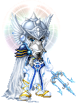
A little more critique would be nice. ^_^ It's very pink, I like it but I always feel there needs to be something that POPS something to draw a little more attention to. Maybe something you can hold?
|
 |
|
|
|
|
|
|
|
|
|
|
|
|
|
|
|
|
Posted: Sun May 03, 2009 12:29 pm
For example: Kusa's avatar has a nice hazy purple flow that causes the red eyes and fire whip to pop, drawing attention. I'm thinking "minion of darkness" here. Maybe like the captain of a battalion of dark creatures. Sort of like Beelzebub's right-hand man. Seriously, I don't know where you find some of these items. They work really well, though. If I have anything critical in particular, it'd be about the little white something-or-other on your shoulder.. maybe I'm just seeing things. It just doesn't fit quite right.
EDIT: Are they part of the zOMG monster gauntlets? At a second glance the little thing on your shoulder fits with the skulls on your hands. I assume they're part of the same item. @__@
|
|
|
|
|
|
|
|
|
|
|
|
|
|
|
Posted: Sun May 03, 2009 2:47 pm
Well, it's certainly nightmarish. The mask is wonky and the clown nose in addition to the red glasses, well, it's just too much in that part of the face. The rose is interacting poorly with the scarf and mask, I think it would do well if it were held in the hand, though. Then there's the rest of the avatar... it's just... everywhere... I know that probably sounds harsh, but let me assure you: You have the start of something great here, but right now it's just not there... RE: Kusa's Avatar — The little white part on the shoulder that isn't layering right with the Trap Jaw is part of the Monster Armor. I think it may be able to be covered up by the bandoleer thing in the Vampire Hunter item... Otherwise, I think that avatar is about where it should be. If you see something that you think should be changed about my current avatar you may say so, otherwise I'd like help with:
|
|
|
|
|
|
|
|
|
|
|
|
|
|
|
|
|
|
Posted: Sun May 03, 2009 3:09 pm
Tsuji... dude... talk about rippin' a guy apart. >< *fails at avatars completely* :XP
|
|
|
|
|
|
|
|
|
|
|
|
|
|
|
Posted: Sun May 03, 2009 3:31 pm
It's good pisces, but I feel that the green in the roses clashes too much. I think the black & red wires from the nano looked good with your avi.
|
|
|
|
|
|
|
|
|
|
|
|
|
|
|
|
|
|
Posted: Sun May 03, 2009 4:06 pm
a very nicely put together avatar the only thing tat bugs me is the orange in the eyes i know they have glowing blue eyes and if it was me i would use one of those
|
|
|
|
|
|
|
|
|
|
|
|
|
|
|
Posted: Mon May 04, 2009 9:36 am
It's really cool, a lil bit too dark, but I guess that is the point.
|
|
|
|
|
|
|
|
|
|
|
|
|
|
|
|
|
|
Posted: Mon May 04, 2009 12:04 pm
Busy busy busy...
@Spiffy — Sorry, man... I wouldn't have been that harsh if I didn't think that it had some real potential, though. >_>
|
|
|
|
|
|
|
|
|
|
|
|
|
|
|
Posted: Mon May 04, 2009 6:02 pm
It's alright, dude. I understand. I changed it around a bit.
Yours is a great start, but the poinsettia and the gloves are a bit off... They draw attention in such a way as to make them not fit... That was an awkward sentence. xd Anyway, I understand your trying to make something pop from the avatar as a whole... Perhaps something else white? Or another vivid red item in the lower portion to further include red as a part of the overall scheme.
|
|
|
|
|
|
|
|
|
|
|
|
|
|
|
|
|
|
Posted: Tue May 05, 2009 2:17 pm
I still hold the same opinion as before. I like the addition of the juggling balls
Don't make a comment on the color of my eyes. I don't have blue eyes the work with the avi
|
|
|
|
|
|
|
|
|
|
|
|
|
|
|
Posted: Tue May 05, 2009 3:20 pm
I like it actually and feel that it works well. Maybe another yellow to balance out the eyes?
|
|
|
|
|
|
|
|
|
|
|
|
|
|
|
|
|
|
Posted: Tue May 05, 2009 3:35 pm
It's nice, but is the busted up lantern really appropriate? It just doesn't seem to fit the rest of it.
|
|
|
|
|
|
|
|
|
|
|
|
|
|
|
Posted: Wed May 06, 2009 12:40 am
Very high-tech meets Mario Brothers. I like the overall look and I don't think that I would add anything to it. If you want I would like some help with this new creation of mine (Jaft got me thinking about the Deathwhisper Ravaged pose.  I think that I want something to contrast it, what do you all think about the Zombie Soul?
|
|
|
|
|
|
|
|
|
|
|
|
|
|
|
|
|
|
Posted: Wed May 06, 2009 5:56 pm
really scary. wow...but cool creepy kind of thing going on. personally, it reminds me of something out of a horror movie.
|
|
|
|
|
|
|
|
|
|
|
|
|
|