|
|
|
|
|
|
|
 Posted: Mon Apr 12, 2010 3:51 pm Posted: Mon Apr 12, 2010 3:51 pm
Hey, I think that avatar IS cute. And females know cute better than men. XP
|
 |
|
|
|
|
|
|
|
|
|
|
|
|
|
Posted: Mon Apr 12, 2010 3:56 pm
^ THIS GUY. RIGHT HERE ON THE LEFT. THIS GUY ^ IS GONNA NUTPUNCH HIM.
|
|
|
|
|
|
|
|
|
|
|
|
|
|
|
|
|
|
Posted: Mon Apr 12, 2010 3:56 pm
A masterwork engraving by Kraun. It depicts a lumberjack and Santa Clause. The lumberjack is fighting the Santa Clause. They are both meanfacing.
|
|
|
|
|
|
|
|
|
|
|
|
|
|
|
Posted: Mon Apr 12, 2010 3:57 pm
Damn it, jello, now I have to find another pic.
|
|
|
|
|
|
|
|
|
|
|
|
|
|
|
|
|
|
Posted: Mon Apr 12, 2010 3:58 pm
Man, crouching upper to the nuts. Fight over.
|
|
|
|
|
|
|
|
|
|
|
|
|
|
|
Posted: Mon Apr 12, 2010 3:59 pm
That's a awesome picture Kraun.
|
|
|
|
|
|
|
|
|
|
|
|
|
|
|
|
|
|
Posted: Mon Apr 12, 2010 4:02 pm
Lol rofl
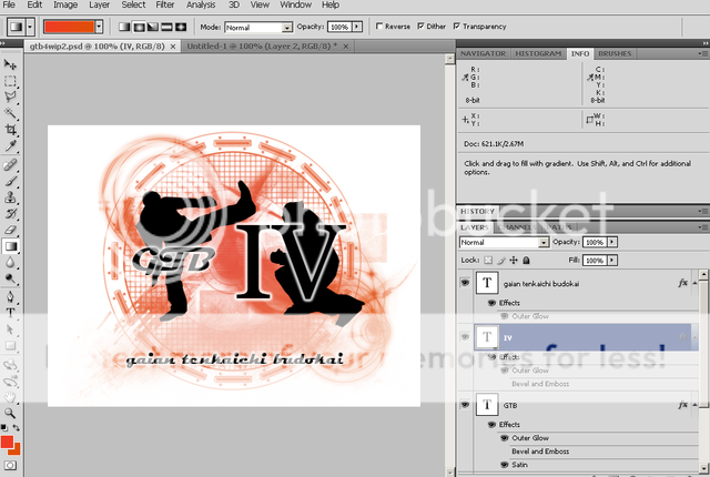
And that's a lot more eye catching. I like it a lot better. Diggin' the orange and black. Might want to add in just a dash of another color so it's not TOO much orange - but don't overdo it - just an accent.
Edit: Maybe - maybe not. Always test how it looks before committing.
|
|
|
|
|
|
|
|
|
|
|
|
|
|
|
Posted: Mon Apr 12, 2010 4:05 pm
It does look a lot better than the last one though.
Just the silhouettes are... nutpunch.
|
|
|
|
|
|
|
|
|
|
|
|
|
|
|
|
|
|
Posted: Mon Apr 12, 2010 4:17 pm
Maaaaaaaaaaaaaaaaaaaaan.
I hate wanting to write one post before another one that I -have- to write before I get to the other not as fun to write post.
Blaaaaaaaaaaah~
|
|
|
|
|
|
|
|
|
|
|
|
|
|
|
Posted: Mon Apr 12, 2010 4:24 pm
*Lays down.*
Also, just remove the silhouettes and have the GTB IV do some sort of animooted.. thing.. and no extended logo beneath it.
Or something.
EDIT:: Of course, I think black and orange go well together because they were my HS colors, so I'm used to seeing them together.
|
|
|
|
|
|
|
|
|
|
|
|
|
|
|
|
|
|
Posted: Mon Apr 12, 2010 4:27 pm
Kinda looks like the silhouettes are hiding behind the words. Weird effect.
|
|
|
|
|
|
|
|
|
|
|
|
|
|
|
Posted: Mon Apr 12, 2010 4:27 pm
The Darth Vizzle *Lays down.* Also, just remove the silhouettes and have the GTB IV do some sort of animooted.. thing.. and no extended logo beneath it. Or something. EDIT:: Of course, I think black and orange go well together because they were my HS colors, so I'm used to seeing them together. I'll try something like that later in Fireworks. 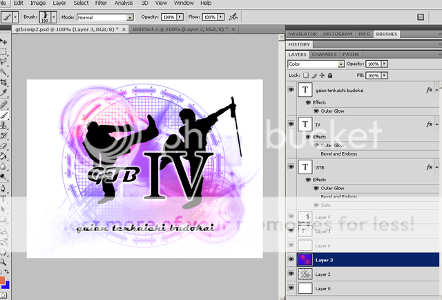 @Fox: Let me go eat then we'll get to fighting.
|
|
|
|
|
|
|
|
|
|
|
|
|
|
|
|
|
|
Posted: Mon Apr 12, 2010 4:30 pm
Okay so I'm hungry, but I have very little food.
I could go to the grocery store, but I'm so ridiculously sore that carrying up the groceries to my room seems like a situation I'd rather avoid.
So I believe the situation is, as always, make pasta.
|
|
|
|
|
|
|
|
|
|
|
|
|
|
|
Posted: Mon Apr 12, 2010 4:30 pm
That looks nowhere as good as orange and black.
*Biased.*
|
|
|
|
|
|
|
|
|
|
|
|
|
|
|
|
|
|
Posted: Mon Apr 12, 2010 4:31 pm
The Darth Vizzle That looks nowhere as good as orange and black. *Biased.* You get no say in it till you win the next GTB. *grabs spaghetti, hinting at Hero* I'll bb.
|
|
|
|
|
|
|
|
|
|
|
|
|
|