|
|
| Do you collect fonts? |
| Heck yes! I drain those font foundry websites down to the last letter! |
|
41% |
[ 12 ] |
| Kinda. I've done my share of font scrounging, but I can live without the fancy ones. |
|
51% |
[ 15 ] |
| Nah. I don't need anything but the fonts that come pre-installed on my computer. |
|
6% |
[ 2 ] |
|
| Total Votes : 29 |
|
|
|
|
|
|
|
|
 Posted: Thu Jul 05, 2007 3:57 pm Posted: Thu Jul 05, 2007 3:57 pm
Serali88 Um could you make a font for the Käläli script I posted a few post above please when you're done with this one? Oh and the fonts kick a**! Sure, but it may be a little while. Real life's catching up to me again...
|
 |
|
|
|
|
|
|
|
|
|
|
|
|
|
Posted: Thu Jul 05, 2007 7:51 pm
Wheeeeeeeeee! mrgreen Really appreciate it! Just to let you know I'm leaving for camp on the 18th. So even if I'm not here when you're done with it it'll make another nice "Welcome Home" gift. Either way I'll be happy! mrgreen
|
|
|
|
|
|
|
|
|
|
|
|
|
|
|
|
|
|
Posted: Fri Jul 06, 2007 5:40 pm
I'm already working on it. I should have it done sometime over the weekend.
It's a little more complicated than the script you made for Niora, and some of the symbols will have to be mapped to keys that might not make much sense at first, but it's already coming along nicely. domokun
EDIT:
Woah. Um.
You have "h" listed twice... Once with two symbols, and a second time with a single symbol.
Also, I can't tell the i and ä vowels apart and some of them look a little ambiguous.
a - single dot above
e - pair of dots below
i - pair of dots above
o - triangle of dots below
u - circle above
ae - right-facing curve above
ei - circle below
ä - pair of dots above (same as i??)
oi - tilde above
Is this right?
|
|
|
|
|
|
|
|
|
|
|
|
|
|
|
Posted: Sat Jul 07, 2007 1:32 am
OMG OMG OMG OMG *spoot* eek I figured out how to do kerning pairs!!! cool But~ Even though it's technically a simple process... Having to go through EVERY POSSIBLE COMBO PAIR OF LETTERS and adjust kerning is really freaking, extremely, completely, unfathomably, exceedingly time consuming. And equally as tedious, if not more so. SO. Although YES I can do kerning pairs now, this will NOT be a standard service for most fonts. Just as well, since not all programs supporting custom fonts support kerning pairs (as far as I know). If you want me to do kerning pairs, be prepared to pay me in some way. I'm not greedy. Gold, donation items, kinky sex acts gift credits, something. Yes, it's that time consuming and tedious. Also, you might also have to make yourself available via some sort of live chat, such as an IRC channel or Instant Messenger, so that I can communicate with you. This may not be necessary, I won't know until it is. For those curious, yes, I CAN go back and add kerning pairs to fonts I've already finished and released. This will probably involve a required payment in addition to any prior payments or charitable donations you may have provided. And yes, I can delete all kerning pairs in a font in one fell swoop if for some reason it's not working out. I guess I'll be a nice guy and implement a money-back-guarantee if you really don't like the kerning I've applied to your font. *slick* However, since I need kerning practice, Serali88 gets to be my guinea pig. twisted I will see what I can do as far as moderate kerning goes on her font, free of charge. I won't kern every POSSIBLE combination (which would be ideal for a fancy font), just mainly the consonant + vowel combinations. This way, the vowel marks will show up nicely centered on each consonant, regardless of its thickness. Serali88, if you don't want any kerning, just let me know and I'll hit the big red button that sets off the emergency alarms to stop all kerning pair production immediately. It will get your font done faster without kerning, but your vowel dots and such will be... rather off center. It's not bad, but to me it's a little unpleasant looking to have the "two dots below" show up too far to the right on a wide symbol, but right in the middle on a skinnier one (for example). Oh, and my previous post still applies. Get back to me ASAP on that, please. surprised EDIT: I realize that many/most of you probably don't even know what kerning and kerning pairs are, so I'll save you a Googling and just provide you a Wikipedia link!
|
|
|
|
|
|
|
|
|
|
|
|
|
|
|
|
Eccentric Iconoclast Captain
|
Posted: Mon Jul 09, 2007 12:08 pm
Uh, if you applied kerning to Askripandi, would the off-centeredness perhaps go away? surprised
If yes, I've got MOAR STUFF to fork over to have that done. mrgreen
|
|
|
|
|
|
|
|
|
|
|
|
|
|
|
Posted: Mon Jul 09, 2007 4:48 pm
That was one of the first things I thought of when I figured out how to do kerning pairs~
But honestly, I don't think it will make much of a difference. I think the off-centeredness comes from how fonts handle spacing in the first place. English fonts (or any fonts I know of, actually), are not made to 'construct' symbols piece by piece but rather to have a solid symbol ready at the push of a key. The only sure-fire method to prevent off-centeredness would be to take every POSSIBLE Askripandi symbol and give it it's own key, which would require a lot of trial-and-error to use as there are so many possible symbols. You'd probably have to use a custom keyboard layout or even just a character map (and copy-paste one symbol at a time? Might as well use Photoshop then...).
I will indeed give it a shot, and if it even makes a slight improvement, I'll let you know. Luckily, it's only the vowel parts that are off-center, so I will only have to do consonant + vowel and maybe consonant + vowel + dot combinations. Shouldn't take too long unless there are unexpected complications (once I get around to it, that is...).
~ ~ ~
I think I'm gonna have to PM Serali88 to get her attention. sweatdrop
|
|
|
|
|
|
|
|
|
|
|
|
|
|
|
|
|
|
Posted: Fri Jul 13, 2007 4:28 pm
Ehhh. Kerning has no effect on most of the fonts I've done for you guys. The vowel mark retrofitting technique I use -- which is nothing more than a spacing trick -- literally causes kerning to make the font look WORSE. Because there's no way to do kerning "triplets" (meaning 3 keys instead of 2 of course), then no matter what pairs I kern, it comes out with the spacing all wonky. An example~~~ In English, if I were to type WAVE and I wanted to kern it, I could kern WA a bit closer together, then AV a bit closer together -- so that the diagonal lines don't look too far apart. You can't do WAV all at once, though, but in English there's really no need for a triplet like that.. The E is irrelevant. In these conscripts, it's not so simple. Say typing "ba" produces a single symbol with a vowel mark (maybe a symbol and a dot, or a symbol with a bar attached). I can kern "ba" so that the dot or bar line up nicely, but then whatever comes after the "ba" won't show up right, because the "a" part's spacing has been affected by the kerning. Sure, I can kern the "a" part with whatever letter comes after it, but then the "a" won't show up right in "ba" anymore. So, if your conscript has any 'retrofitted vowel marks' or other accents that are added to a symbol separately, unfortunately, I won't be able to effectively kern your font. For a font like Forgedawn's Kintaran, I might be able to kern it as there is only the one accent which only applies to a few specific symbols, but for the most part, don't bet on it. Kerning was invented for English-style alphabets (German, etc) back in the days of manual printing presses and stuff, so... Naturally it's not intended to accomplish the spacing adjustments I had hoped for in your conscript fonts. On a lighter note... ~ ~ ~ Serali88's font is finished. (I think!) ------ 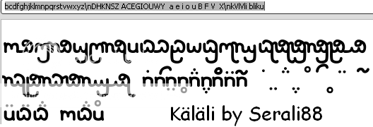 ------ It's easy to use, and is a lot like the Niora font (since Serali88 designed them both). bcdfghjklmnpqrstvwxyzDHKNSZThese keys produce the base consonant symbols. ACEGIOUWYThese keys produce the "lone vowels" which do not attach over/under consonants. aeiouBFVXThese keys produce the retrofitted vowel marks. And that's about it! Download Link!
|
|
|
|
|
|
|
|
|
|
|
|
|
|
|
Posted: Fri Jul 13, 2007 6:04 pm
Um how do I say this... OMG OMG OMG OMG OMG OMG OMG OMG OMG OMG OMG OMG OMG OMG OMOMGMGMGMGMGMGGGGGGGG! THANK YOU! YAAAAAAAAAAAAAAAAAAAAAAAAAAAAAAAAAAAAAAY!
|
|
|
|
|
|
|
|
|
|
|
|
|
|
|
|
|
|
Posted: Fri Jul 13, 2007 7:00 pm
|
|
|
|
|
|
|
|
|
|
Posted: Sat Jul 14, 2007 8:03 pm
You're about to become a busy person....I warned you For example....... mrgreen
|
|
|
|
|
|
|
|
|
|
|
|
|
|
|
|
|
|
Posted: Sat Jul 14, 2007 9:18 pm
Serali88 You're about to become a busy person....I warned you For example....... mrgreen Um. I don't want to sound rude saying this, but I'm not making fonts for just anyone. I offered my services here because I'm familiar with dang near every one of you guys (referring to the more active CLG members, of course), and it seemed like no one here actually knew how to make fonts or had the resources (except Forgedawn and maybe one other member). I also wanted to put my fonting abilities to the test and hone them a bit, which has been quite the case. So... Please don't go around telling people I will make fonts for them. Making a font isn't really hard labor or anything, but it IS time consuming, and I DO put a lot of tedious work into them to produce the nicest looking fonts my abilities allow. If your friends really want fonts very badly, then they can come join the CLG -- and Gaia if they aren't on here -- and then maybe I'll see what I can do for them. Otherwise, if they still REALLY want fonts, you'll be paying on their behalf. No offense to anyone, but I'm not making free fonts as favors to people I don't know in the slightest. (Again, I apologize if any of that comes off as rude~ ) ~ ~ ~ Also, on a slightly unrelated note, my fall semester (college sophomore, wooo confused ) will be starting about this time next month. So, in a week or two, I will kind of go on hiatus. I may still be able to do the occasional font if I'm not too burdened down by schoolwork, but don't count on it, you guys. I'm gonna be working my a** off to bring my GPA up after last semester's dismal turnout. gonk
|
|
|
|
|
|
|
|
|
|
|
|
|
|
|
Posted: Sun Jul 15, 2007 1:59 am
You're familiar enough with me to make me a font... right? confused
|
|
|
|
|
|
|
|
|
|
|
|
|
|
|
|
|
|
Posted: Sun Jul 15, 2007 10:00 am
Xeigrich Serali88 You're about to become a busy person....I warned you For example....... mrgreen Um. I don't want to sound rude saying this, but I'm not making fonts for just anyone. I offered my services here because I'm familiar with dang near every one of you guys (referring to the more active CLG members, of course), and it seemed like no one here actually knew how to make fonts or had the resources (except Forgedawn and maybe one other member). I also wanted to put my fonting abilities to the test and hone them a bit, which has been quite the case. So... Please don't go around telling people I will make fonts for them. Making a font isn't really hard labor or anything, but it IS time consuming, and I DO put a lot of tedious work into them to produce the nicest looking fonts my abilities allow. If your friends really want fonts very badly, then they can come join the CLG -- and Gaia if they aren't on here -- and then maybe I'll see what I can do for them. Otherwise, if they still REALLY want fonts, you'll be paying on their behalf. No offense to anyone, but I'm not making free fonts as favors to people I don't know in the slightest. (Again, I apologize if any of that comes off as rude~ ) ~ ~ ~ Also, on a slightly unrelated note, my fall semester (college sophomore, wooo confused ) will be starting about this time next month. So, in a week or two, I will kind of go on hiatus. I may still be able to do the occasional font if I'm not too burdened down by schoolwork, but don't count on it, you guys. I'm gonna be working my a** off to bring my GPA up after last semester's dismal turnout. gonk No it doesn't sound rude. I understand where you're coming from. I have one question though. What font program did you use to make the fonts?
|
|
|
|
|
|
|
|
|
|
|
|
|
|
|
Posted: Sun Jul 15, 2007 12:23 pm
Serali88 No it doesn't sound rude. I understand where you're coming from. I have one question though. What font program did you use to make the fonts? I use FontLab Studio 5. It's a $600 font software suite, almost literally the Photoshop of font software. (This info is all available somewhere in the first two posts of this thread) FontLab Studio 5 isn't very easy to use, and it's actually criticized for its unintuitive GUI, but it's the ONLY high level font software still in production. http://www.fontlab.com/ has several lower-level font editing and font creating programs of varied pricing, most of which have fully functional trial periods. As far as I know, there is no truly free font software out there. I think I found one a LONG time ago (it may have been a hacked version of a trial program), but it sucked anyway.
|
|
|
|
|
|
|
|
|
|
|
|
|
|
|
|
|
|
Posted: Thu Jul 19, 2007 6:15 pm
Hawk_McKrakken You're familiar enough with me to make me a font... right? confused Ooops, I never saw your post! Sorry~ But yeah, I'll make you a font if you want. I've got another font on the way. It's a personal font I've just made for my latest conlang. I'll upload it later when it's complete.
|
|
|
|
|
|
|
|
|
|
|
|
|
|
|
|
|
|