|
|
|
|
|
|
|
|
|
 Posted: Mon Apr 03, 2006 9:20 pm Posted: Mon Apr 03, 2006 9:20 pm
divineseraph 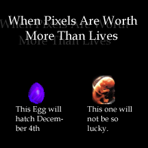 any better? 1.5 point font change It sbigger, but still no less fuzzy. Try using bold text.
|
 |
|
|
|
|
|
|
|
|
|
|
|
|
|
Posted: Tue Apr 04, 2006 3:13 pm
hey, i found a way to make some kickass metal in photoshop... basically, what you want to do is have black and white for your colors, then go to filter and select clouds... so, you make some black and white clouds... then duplicate the layer twice. with those two new layers, flip one horizontal and one verticle, then set thier blending options to "lighten" (double click on their layer to get to the menu, it's the topmost bar)... ok,. now this is important... flatten the layers. if you don't it will come out funky and bad. alright, now go to filter, lighting efects... put the light type to "omni", and make it encompass almost the whole thing, with the edges of the circle going over the edges of the stage by a little... crank the bars up to shiny and metalic, respectivly. there are two color boxes in this screen as well... if you're going for silver or steel, select some shade of grey. if gold, select a brownish yellow, play around with it and see what you like best. then click ok. what you will get is sort of like a nugget of the metal, like a gold nugget. to make it look flat, take the smudge tool and push around the colors. i used it on a suit of armor, did a bit of shading (it's hard to use the burn too on gold, it turns it more yellow- instead, go over it with black with an opacity of about 30, smudge-tool it around a bit to make it look linear and natural, then burn the black. it will look more like shadow that way) and it turned out quite nice, if you can, try it out.
you can also make aquatic-type scenes... do the same thing for gold, but when you get to lighting effects, choose a shade of blue for the top box and dark red for the bottom... it looks like a saphire or underwater or something, very pretty.
|
|
|
|
|
|
|
|
|
|
|
|
|
|
|
|
|
|
Posted: Sun May 07, 2006 6:05 am
I wish I had photoshop... I also wish I could use layers. I generally play around in Jasc Paint Shop Pro 8, but I still haven't figured out the layers... I gave up on ever being able to use them a year ago...
|
|
|
|
|
|
|
|
|
|
|
|
|
|
|
Posted: Sat May 13, 2006 2:52 pm
I editted the hanger banner a little 
|
|
|
|
|
|
|
|
|
|
|
|
|
|
|
|
|
|
Posted: Sat May 13, 2006 5:01 pm
could you slow it down a little? it goes by a bit too fast to read the text... and if you don't mind me posting my revision to the pro-life guild banner... @ the creator of whom i am too lazy to go and find right now, if you don't like me altering your work, let me know and i'll remove it. i've been holding it on my desktop for a few months and would like to post it now. 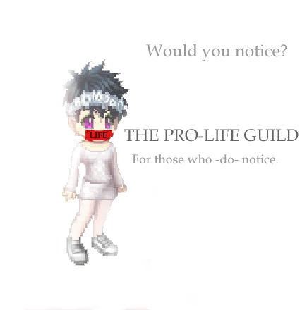 crap... i just realized that there is some dark stuff going on at the bottom, i'll get around to fixing it later
|
|
|
|
|
|
|
|
|
|
|
|
|
|
|
Posted: Sat May 13, 2006 6:51 pm
Is that better? I slower it down x 4
|
|
|
|
|
|
|
|
|
|
|
|
|
|
|
|
|
|
Posted: Wed May 24, 2006 11:19 am
 Short, simple, and to the point. whee Short, simple, and to the point. whee
Just made it a few minutes ago.
|
|
|
|
|
|
|
|
|
|
|
|
|
|
|
Posted: Tue May 30, 2006 2:08 am
Akshamala Short, simple, and to the point. whee
Just made it a few minutes ago. cute biggrin
|
|
|
|
|
|
|
|
|
|
|
|
|
|
|
|
|
|
Posted: Tue May 30, 2006 5:47 am
Akshamala Short, simple, and to the point. whee
Just made it a few minutes ago.
|
|
|
|
|
|
|
|
|
|
|
|
|
|
|
Posted: Wed May 31, 2006 12:25 pm
Glad you guys liked it. whee
|
|
|
|
|
|
|
|
|
|
|
|
|
|
|
|
|
|
Posted: Tue Jun 13, 2006 11:19 pm
divineseraph *insert awesome banner here* It was mine, dearest.
No problem! If anything, I'm glad you re-made it into something kickass.
heart
|
|
|
|
|
|
|
|
|
|
|
|
|
|
|
Posted: Wed Jun 14, 2006 4:44 am
aww, thanks! i still have to remove that grey shading down at the bottom sweatdrop
|
|
|
|
|
|
|
|
|
|
|
|
|
|
|
|
|
|
Posted: Wed Jun 14, 2006 1:32 pm
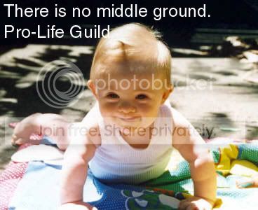
Oh well! The shading isn't what matters, it's the message!
4laugh
|
|
|
|
|
|
|
|
|
|
|
|
|
|
|
Posted: Sat Jun 17, 2006 7:20 pm
 I made this super fast, it's just lettering but it fit my mood. It would make more sense if Tyler had more visible down syndrome.
|
|
|
|
|
|
|
|
|
|
|
|
|
|
|
|
|
|
|