|
|
|
|
|
|
|
 Posted: Mon Aug 14, 2006 11:28 am Posted: Mon Aug 14, 2006 11:28 am
Cute Kuro!!!
I just wish I had my computer so i could put up my new art >.< *pout*
|
 |
|
|
|
|
|
|
|
|
|
|
|
|
|
Posted: Tue Aug 15, 2006 2:40 pm
[ KB ] Kewl.
Ah, Sai's still got the same old rack, pretty good odds that means KB'd still lose to her.
Keep up the good work Sai, your art is really picking up. You know how much I love sketches. sweatdrop
Kuro. Gwarharhar. You should make more art for the BC.
Kuro, I love it, and thanks for the comment bout the design! heart
|
|
|
|
|
|
|
|
|
|
|
|
|
|
|
|
|
|
Posted: Mon Aug 21, 2006 10:43 pm
|
|
|
|
|
|
|
|
|
|
Posted: Tue Aug 22, 2006 3:26 pm
Call me crazy, but I prefer the simpler pencil version or whatever you used. I don't suppose you inked it over, but I know next to nothing about art. S'far as I'm concerned your work with color is nice, but a lot of your work without it has also proven itself to be very nice.
I dunno, maybe it's just personal preference. Were I to see that colored in pencils or down by spiffy computer graphics, I think in the end I'd still fall back to the original sketch-looking version. Depends on the mood of the drawing and the intent, as you can tell the end figure by both from what I've seen from pre-draws to finished works.
For example, the lack of color, empty space,a nd just overall 'Ghosty' feel as I like to think of sketches or pencil lends to depressed, airy, or simply lonesome styling work. Also helps set the mood on things that seem as though they're supposed to be lost forgotten or bland, such as a few highly intricate drawings I've seen of farms and stuff. Color doesn't make a picture any better in any way shape or form.
But bleh, I'm rambling.
|
|
|
|
|
|
|
|
|
|
|
|
|
|
|
|
|
|
Posted: Wed Aug 23, 2006 3:29 am
I get what your Saying KB Dont Worry. I was bored and decided to color it. But do Agree the original sketch version is best, but the colors are so pretty! 3nodding and what i like bout the colored one, i really brought out Sai's Eyes and simple expression. i like them both...well ig uess cause i drew them xD
|
|
|
|
|
|
|
|
|
|
|
|
|
|
|
Posted: Wed Aug 23, 2006 2:13 pm
Uhhh... Keep petting your ego. whee
|
|
|
|
|
|
|
|
|
|
|
|
|
|
|
|
|
|
Posted: Wed Aug 23, 2006 2:40 pm
[ KB ] Uhhh... Keep petting your ego. whee
|
|
|
|
|
|
|
|
|
|
|
|
|
|
|
Posted: Tue Sep 05, 2006 11:32 am
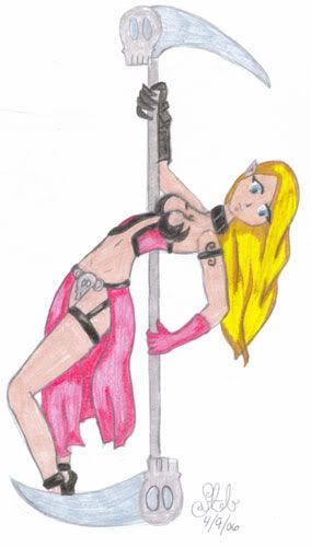 meh. did this one really late so there are parts of the body is a little off...but its ok for me atleast.
|
|
|
|
|
|
|
|
|
|
|
|
|
|
|
|
|
|
Posted: Wed Sep 06, 2006 2:32 pm
Cool! Youre really good Sairys
|
|
|
|
|
|
|
|
|
|
|
|
|
|
|
Posted: Thu Sep 21, 2006 3:03 pm
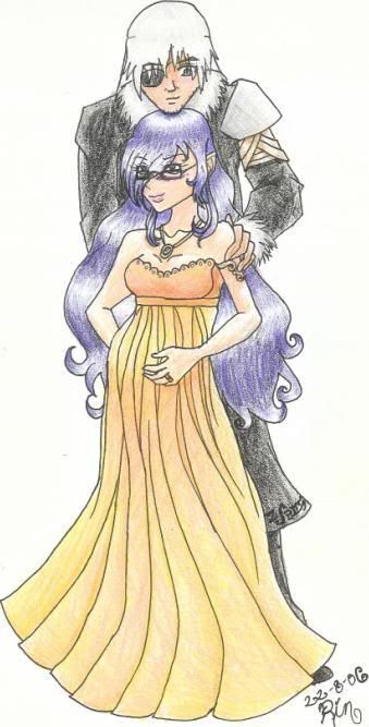 New art ...Phi pregant D being all cute about it I guess *shrug* I just like phi's dress...the long part should be more flowy but it looks heavy....c'est la vie....
|
|
|
|
|
|
|
|
|
|
|
|
|
|
|
|
|
|
Posted: Thu Sep 21, 2006 3:09 pm
Nice; for some reason I like that one a lot domokun
|
|
|
|
|
|
|
|
|
|
|
|
|
|
|
Posted: Thu Sep 21, 2006 3:18 pm
.......(insert a joke that's actually good here) xp
|
|
|
|
|
|
|
|
|
|
|
|
|
|
|
|
|
|
Posted: Thu Sep 21, 2006 7:25 pm
thanks...I have how my scanner killed the colors though
|
|
|
|
|
|
|
|
|
|
|
|
|
|
|
Posted: Mon Oct 09, 2006 2:04 pm
|
|
|
|
|
|
|
|
|
|
|
|
|
Posted: Mon Oct 09, 2006 4:48 pm
Wow.... awesome pic..... that'd be a hell of a good pic for the dojo thread's first post. Back ground somewhat reminds me of D's mansion, though in that pic it's more of a castle. It has awesome dynamic and the text font seems so unusual yet fitting. Very nice find and excellent job on the Black Company label.
|
|
|
|
|
|
|
|
|
|
|
|
|
|


![[ KB ]'s avatar](https://a1cdn.gaiaonline.com/dress-up/avatar/ava/8e/da/1743559e1bda8e_flip.png?t=1196322341_6.00_00)