Welcome to Gaia! ::

The 4th Element

Back to Guilds

A guild for Graffiti and Street Artists. Been up since 2006! 

Tags: GRAFFITI, STREET ART, STYLES, BURNERS, SOEP ONE 

Reply Graffiti Lab - Pictures
SKETCHES Goto Page: [] [<] 1 2 3 ... 4 5 6 7 8 9 ... 26 27 28 29 [>] [>>] [»|]

Quick Reply

Enter both words below, separated by a space:

Can't read the text? Click here

Submit

Tackle The Gazelle

PostPosted: Mon Jan 22, 2007 11:00 pm


i got one comin upfor you guys, this time its a doozie

too bad my damn camera died gonk
PostPosted: Wed Jan 24, 2007 2:39 pm


Latest sketch, cant wait to put it up...

User Image

Tackle The Gazelle


Kazzoh

Codger

PostPosted: Wed Jan 24, 2007 2:54 pm


The silver's kinda blinding. I can't read it, but it looks pretty sound keep it up.
PostPosted: Wed Jan 24, 2007 4:09 pm


damn tack dats hot!! erm only thing i suggest is next time try 2 position it so that it wont get cut off 4laugh

Still G.I.Z.


Minnie.Mousie.

PostPosted: Thu Jan 25, 2007 11:40 am


Rawr.. hi ^^ Might as well get some of my stuff posted up right away, nyeh?

I really only do 2-D stuff right now.. and my 'blackbook' is a 70 pg. spiral right now.. plus a thick black journal I own.. but it's all on lined paper. >.< I get intimidated by a blank white page...

Oh, and all my stuff is done by hand with a black ballpoint pen. My poor, poor writing fingers are sore by the end of school >.<

User Image
^ The first sketch I did of my name (not my frist sketch at all, just of this name). It's kinda scratchy, I know.. but it's actually really small on a peice of paper.

User Image
^ Second one of my name. It really sucks and there are some parts I wanted to white-out, but apparently white-out isn't allowed at my school 0.o;
I fudged it up by trying to go over it in markers to make it bolder anyway.

User Image
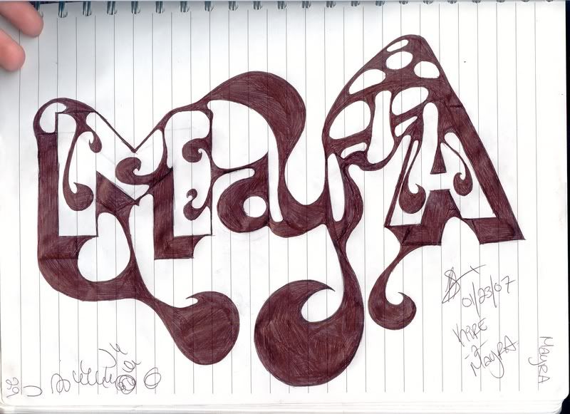
^Third of my name. It's alright, but it's a little off balence and I messed up several times on the 'e' before getting it somewhat reasonable.. The overcurve on the 'R' (above the 'e') needs to be fixed a bit too..

User Image
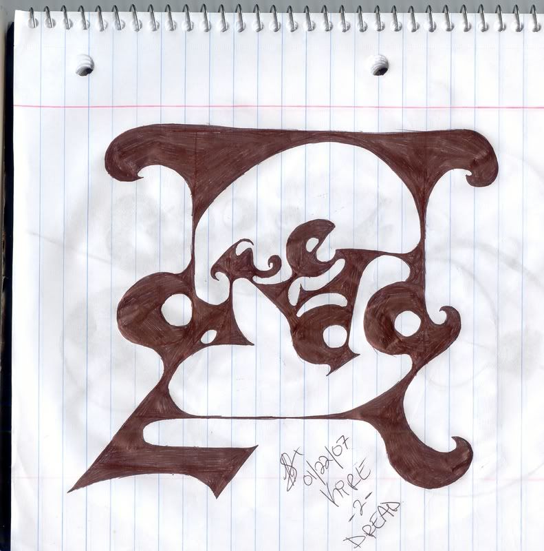
^ Done for someone on a different forum. Says 'dread'. I fudged up some of the symmetrical stuff.. but it's alright since all I had to work with was the pen.

User Image
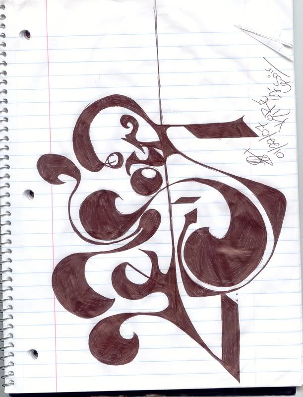
^ Done for someone else on a different forum. Reads 'LeSoir'. I need to work on my lower case 'r's.

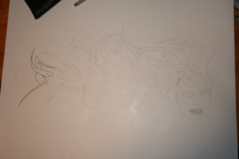
I'll get more scanned once I go back to school tomorrow. As fo rnow, I'm enjoying a sick day. ^^

Oh yeah, and here's some really old stuff that's kinda hard to see, back when I sucked... actually, on second thought I'm not gonna post it.. it really does suck. >.< Sorry about the page stretch. I'll reduce to links only if it helps.
PostPosted: Thu Jan 25, 2007 11:45 am


It's nice, but doesn't seem like something you'd see on a wall D:

[ADx] Peloidra Shakai


Kazzoh

Codger

PostPosted: Thu Jan 25, 2007 11:52 am


^^^^^^What he said. Those are more......exhibitionist. Than real gritty street stuff. But it's still good. 3nodding
PostPosted: Thu Jan 25, 2007 12:09 pm


I did one up on a wall once.. well, half of one.. It was really cold outside and my paint was beind dumb so I got up to 'K-i' then I quit and went home for some hot chocolate. My fingers were almost frozen >.< It was a variation of the 3rd one I was doing.

Minnie.Mousie.


Kazzoh

Codger

PostPosted: Thu Jan 25, 2007 12:18 pm


Don't get me wrong it looks great. I'm just saying it looks like it's from a museum, not like a bronx wall.
PostPosted: Thu Jan 25, 2007 12:19 pm


That's completely awesome!

So I'd be the (maybe almost) the first one doing this kind then?

Minnie.Mousie.


Kazzoh

Codger

PostPosted: Thu Jan 25, 2007 12:40 pm


In the guild yes. In the world, no. I don't know to many famous for that type of style. But I know cats have probably done it.
PostPosted: Thu Jan 25, 2007 12:42 pm


Score!

I'm totally wanting to be famous for it now, just to show the world that you don't have to stick to one style to be good.

I wish I had a scanner at home though >.< I always have to wait for the school one.

Minnie.Mousie.


Minnie.Mousie.

PostPosted: Fri Jan 26, 2007 8:31 pm


Alright, I need help for this one:

User Image

It reads "Mayra".. Ignore the URL. it tells lies. (And typos!)

I have no clue if I even like it at all.. I know the A is too small (width wise) and the "r" needs to be more prominant, and the mushroom makes the image lopsided and was much better before I put in the little spots.. and the fact that it's on lined paper, but ignore that 'cause I'm intimidated by blank white sketch pages anyway.... and the top of the smaller 'a' is fudged up..

But besides those technical details, is there anything else in the style itself that should be changed?(Don't say the whole style. 0.o; someone actually told me that.. I was like 'wtf?! xp you crazy!') I already got different suggestions, like either compress the words more or spread 'em out more, or make 'em look more 'gooey' or something.. but I have no clue other than that..

The end with my rambling text (which I seem to do a lot)

Edit: Dangit! What is up with Gaia? I clicked the EDIT button, but it still posted it as a new post! 0.o;; something is freaky over here!.. so sorry about the doubt post >.<
PostPosted: Thu Feb 08, 2007 4:02 pm


New one. Im gorunded so i have a lot of time on my hands.
(> ' . ')> heres the sketch....
User Image

heres the final one... <(' . ' <)
User Image

.disconected.


Minnie.Mousie.

PostPosted: Thu Feb 08, 2007 9:11 pm


that's completely awesome

I don't really like the head, but it all balences out nicely.

I'm just gonna sit here and drool now.
Reply
Graffiti Lab - Pictures

Goto Page: [] [<] 1 2 3 ... 4 5 6 7 8 9 ... 26 27 28 29 [>] [>>] [»|]
 
Manage Your Items
Other Stuff
Get GCash
Offers
Get Items
More Items
Where Everyone Hangs Out
Other Community Areas
Virtual Spaces
Fun Stuff
Gaia's Games
Mini-Games
Play with GCash
Play with Platinum