Commenting on
this one.
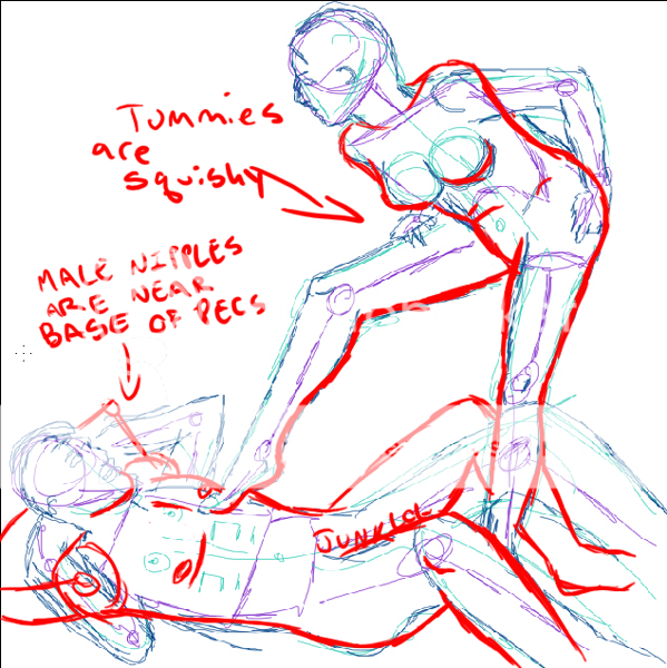
I like the anatomy. I don't have much to crit there, other than the n****e on our left looks kind of weird. I think that if it was stiff enough to be seen clearly through the shirt like that, it would make a tiny n****e-shaped bulge in the fabric, like
this. The lines defining the camel toe also seem a little bit random. Given the nature of camel toes, the only thing that's strikingly obvious are the lips of the v****a, so I think that a single curved line in the middle would work better than the three you currently have.
The rendering could use a lot of work. There are highlights, but no visible shadows, so it looks really flat. Also, the straight white against the dark skin looks kind of... bland. Try using warmer versions of your base color for highlights and colder ones for your shadows.
Your lineart is generally very smooth, but some places look wobbly or erratic... what kind of pen are you using? It looks like a ballpoint... I would advise against those, because their flow is generally very inconsistent, which makes them harder to use. The only way I've found to get a thin, clean line with a ballpoint is to hold the pen at a 90-degree angle from the paper and press very lightly, but doing this for a prolonged period of time gives me some serious arm cramps. Not fun.
My favorite kind of pen to use is a calligraphy marker, but you might not like them because they tend to make thick lines on long strokes... I'd suggest using metal-nibbed pens, or some good marker or brush-tipped pens. (Faber-Castell makes some really good marker / brush tips.)
As for your lines themselves... Definitely add some variation in there. It adds a lot of life to a piece.
Here is a good lineart tutorial.
Nice work as always. Your knowledge of anatomy has improved leaps and bounds since you first started coming here... I'm guessing this was a commission, right? How did they like it?