|
|
|
|
|
|
|
 Posted: Wed Aug 26, 2009 8:51 am Posted: Wed Aug 26, 2009 8:51 am
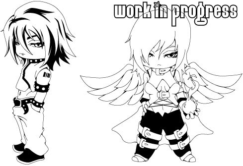
I NEED HALP!!! 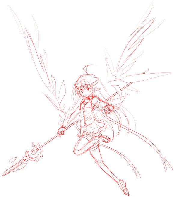 the feet are really bothering meeeee... any way to fix it? I'm drawin this for an anime heroine contest xp
|
 |
|
|
|
|
|
|
|
|
|
|
|
|
|
Posted: Wed Aug 26, 2009 10:49 am
the feet? umm, maybe changing shoes so they are either more foot-shaped, like ballet shoes or whatever, or bigger and like... not foot-shaped xD what about them is it that bothers you really? here are my drowning ww2 german soldiers. i'm so not looking forward to doing the water xp any tips? my grade depends on this x.x 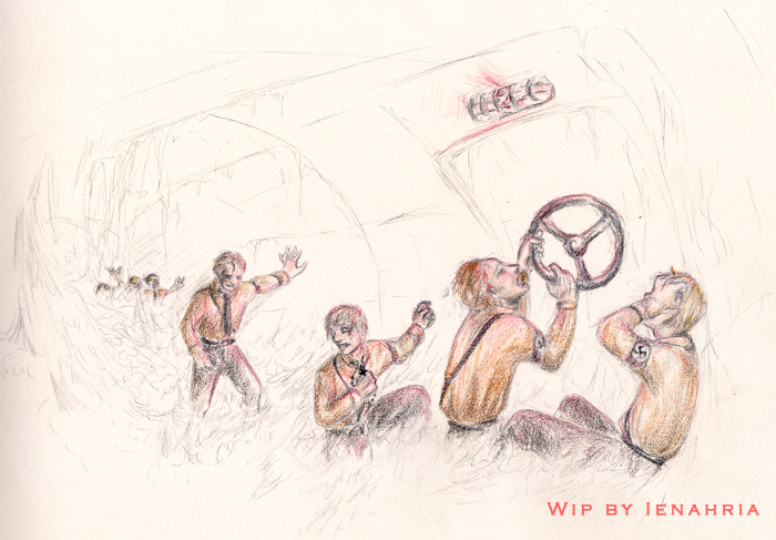
|
|
|
|
|
|
|
|
|
|
|
|
|
|
|
|
|
|
Posted: Wed Aug 26, 2009 11:05 am
oh.. lol
I meant the legs. XD
|
|
|
|
|
|
|
|
|
|
|
|
|
|
|
Posted: Wed Aug 26, 2009 11:12 am
Purdoy--the bent leg looks fine to me. The leg that's straight--the main 'issue' I see is that she doesn't really have much of a calf muscle and I don't think the heel of her foot protrudes out enough. Combined, the two just makes that leg look a bit flat. I think it's pretty easily fixed and over all, I really love it. :3 The foreshortening on her upraised arm is really great. Annnnd...I don't normally scan my pictures while in progress but this was a special case. So:  The one thing I hate about traditional art is trying to get the scanner to cooperate and actually capture the colors correctly. It never wants to. crying
|
|
|
|
|
|
|
|
|
|
|
|
|
|
|
|
|
|
Posted: Wed Aug 26, 2009 12:13 pm
Angela Celeste Purdoy--the bent leg looks fine to me. The leg that's straight--the main 'issue' I see is that she doesn't really have much of a calf muscle and I don't think the heel of her foot protrudes out enough. Combined, the two just makes that leg look a bit flat. I think it's pretty easily fixed and over all, I really love it. :3 The foreshortening on her upraised arm is really great. Annnnd...I don't normally scan my pictures while in progress but this was a special case. So: The one thing I hate about traditional art is trying to get the scanner to cooperate and actually capture the colors correctly. It never wants to. crying oohhh watercolors? biggrin I should practice watercolors. XD Hmmm okay I tried to fix those and I came up with this. 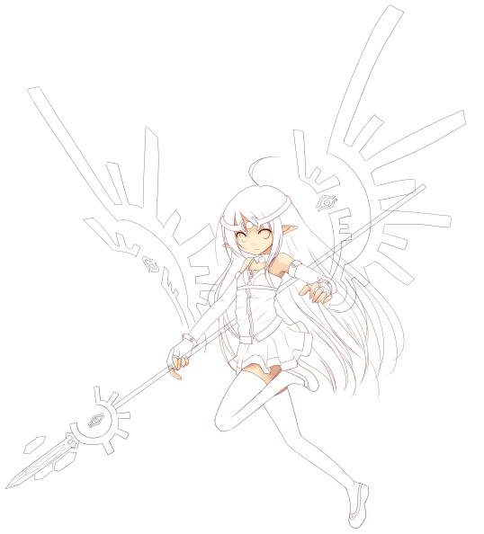 you think the wings look nicer here? She now looks like some rune warrior. But the theme is supposed to be "heroine"
|
|
|
|
|
|
|
|
|
|
|
|
|
|
|
Posted: Wed Aug 26, 2009 12:13 pm
purdoy: haha, makes more sense cuz i think the feet looks nice^^
yup, as celeste said, just give her a bump on the back of the leg ;D
celeste: that's why photoshop exists x333 you do very nice colors btw
edit: that looks nice, purdoy. i think the design on the first pair looked very exciting, but there's nothing wrong with a rune heroine, is there?
|
|
|
|
|
|
|
|
|
|
|
|
|
|
|
|
|
|
Posted: Wed Aug 26, 2009 12:22 pm
Ienahria purdoy: haha, makes more sense cuz i think the feet looks nice^^ yup, as celeste said, just give her a bump on the back of the leg ;D celeste: that's why photoshop exists x333 you do very nice colors btw edit: that looks nice, purdoy. i think the design on the first pair looked very exciting, but there's nothing wrong with a rune heroine, is there? haha. yeah.~ biggrin rune heroines are cool. llol
|
|
|
|
|
|
|
|
|
|
|
|
|
|
|
Posted: Wed Aug 26, 2009 12:24 pm
@Iena: I have GIMP only. D: I was trying to adjust the colors but GIMP was being stupid so I gave up. Sometimes it can be really difficult to catch the subtle colors--in the original, the yellow in the background isn't nearly as prevalent and her dress doesn't look nearly so flat. :
@Purdoy: I could be biased, but I think everyone should try watercolors at least once. They're incredibly fun. =3 Also, yes her leg looks much better now.
I really think the first wings had a very nice flow to them that the second set is lacking. But now they carry over the design from her staff, which is nice too.
She's still cute as all get out though. heart heart
|
|
|
|
|
|
|
|
|
|
|
|
|
|
|
|
|
|
Posted: Wed Aug 26, 2009 12:32 pm
aw, you need ps, watercolor scans don't work without them. can you adjust the colors with your scanner? i have this old canon scanner, but it does pretty good levels and curves and brightness/contrast. and i agree, watercolors are so fun, and there's so much different stuff you can buy that is based on watercolor. i've got these awesome inktense pencils that works just as watercolor pencils, only the color is brighter. did this with them. runes ftw i'm looking forward to seeing the result 3nodding
|
|
|
|
|
|
|
|
|
|
|
|
|
|
|
Posted: Wed Aug 26, 2009 1:06 pm
I have a cannon as well. Usually it does pretty well but those light cadmium yellow washes always confuse it for some reason. :B
The versatility of watercolors is one of the things I love about them. So many products and you can layer them with markers and colored pencils and all sorts of fun things. =3
That's a really great piece too--I love his hair. ^_^
|
|
|
|
|
|
|
|
|
|
|
|
|
|
|
|
|
|
Posted: Wed Aug 26, 2009 1:31 pm
wip for zackie. xD
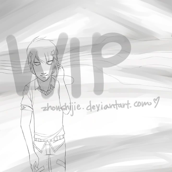 sorry if this stretches for any of you guys. o: -goes to resize a bit-
|
|
|
|
|
|
|
|
|
|
|
|
|
|
|
Posted: Wed Aug 26, 2009 7:46 pm
@Purdoy - I like both wings~ The second one is really interesting. Ugh thick lineart. D< 
|
|
|
|
|
|
|
|
|
|
|
|
|
|
|
|
|
|
Posted: Wed Aug 26, 2009 7:52 pm
|
|
|
|
|
|
|
|
|
|
Posted: Wed Aug 26, 2009 11:59 pm
Angela Celeste @Purdoy: I could be biased, but I think everyone should try watercolors at least once. They're incredibly fun. =3 Also, yes her leg looks much better now. I really think the first wings had a very nice flow to them that the second set is lacking. But now they carry over the design from her staff, which is nice too. She's still cute as all get out though. heart heart heehee I've already been using watercolors but I'm lazy that's why I don't use it much. x_x. They are really good for portraits. XD. I adjusted the legs even moar! ... are the colors and wings OK? 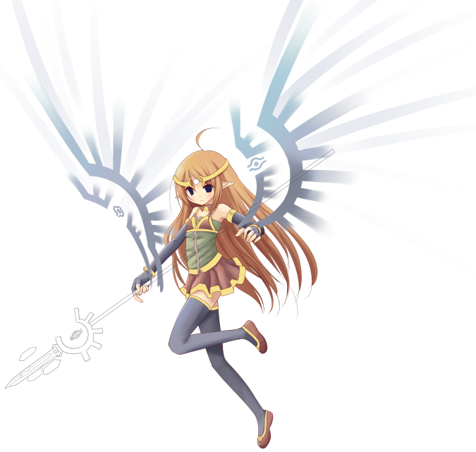
|
|
|
|
|
|
|
|
|
|
|
|
|
|
|
|
|
|
Posted: Thu Aug 27, 2009 4:40 am
it looks great purdoy, i love what you did with the legs, she looks way more relaxed and natural now 3nodding i also like how you made that gradient on the wings.
|
|
|
|
|
|
|
|
|
|
|
|
|
|