|
|
| Do you collect fonts? |
| Heck yes! I drain those font foundry websites down to the last letter! |
|
41% |
[ 12 ] |
| Kinda. I've done my share of font scrounging, but I can live without the fancy ones. |
|
51% |
[ 15 ] |
| Nah. I don't need anything but the fonts that come pre-installed on my computer. |
|
6% |
[ 2 ] |
|
| Total Votes : 29 |
|
|
|
|
|
|

Eccentric Iconoclast Captain
|
 Posted: Mon Jun 25, 2007 7:23 pm Posted: Mon Jun 25, 2007 7:23 pm
Ooh, that's awesome!
biggrin
Thanks for making this font, by the way.
|
|
|
|
|
|
|
|
|
|
|
|
|
|
|
Posted: Mon Jun 25, 2007 10:01 pm
OHMIGOSH, I almost forgot.
gonk
I need another character made. I can't believe I forgot it. >.>
Go to Punctuation. You see those dots there? I'm going to need a separate dot at the same height as those to go in between the letters.
Otherwise my language will lack spaces. >.>
|
|
|
|
|
|
Eccentric Iconoclast Captain
|
|
|
|
|
|
|
|
|
|
|
|
Posted: Tue Jun 26, 2007 1:56 am
This dot... Does it go between each letter, or just between words?
I'm assuming either way that you will still want the spacebar to produce a blank space...
|
|
|
|
|
|
|
|
|
|
|
|
|
|
|
Posted: Tue Jun 26, 2007 7:20 am
Between words. sweatdrop
No blank spaces in Askripandi. Unless you're not writing there.
It'd actually be nice if you could get the spacebar to do that, but you could use another key if the spacebar isn't configurable.
|
|
|
|
|
|
Eccentric Iconoclast Captain
|
|
|
|
|
|
|
|
|
|
|
|
Posted: Tue Jun 26, 2007 1:44 pm
The spacebar is indeed configurable, just like any other typing key.
Dot for spacebar. Done.
(And this way, you can at least see spaces between the words if you change the font :b )
EDIT: I'm currently trying to take care of some real-life issues, namely some financial aid reapplication paperwork (FAFSA and an inevitable 4506-T form for IRS tax non-filing), and waiting for the rain and thunder to die down so I can run to Valero and make a money order. My apartment "utility fees" are just about over due. I don't want my cable being shut off and the maintenance guy coming to steal our washer and dryer. eek
EDIT EDIT: (I hit Submit too early). So this means fonts may be on hold for today at least, depending on what gets done otherwise.
|
|
|
|
|
|
|
|
|
|
|
|
|
|
|
Posted: Tue Jun 26, 2007 1:46 pm
It'll probably be the only thing that makes sense.
|
|
|
|
|
|
Eccentric Iconoclast Captain
|
|
|
|
|
|
|
|
|
|
|
|
Posted: Thu Jun 28, 2007 4:40 am
I'm working on the "Askripandi" font now, but OMG! It's so complicated! xp
I mean, I can do it, but.... This font may not be very easy to use.....
The A and O vowels show up 3 different ways each. For "A" it's upper left half-line, lower right half-line, and lower left half-line ("ra" only). The "O" is the same except the hooks are top forward, bottom backward, and bottom forward respectively on the half-lines (third one is "ro" only).
The E vowel shows up 4 different ways. Upper left line with backward flag, lower right line with forward hook, bottom diagonal forward hook (for "qe" and "xe"), and lower left backward hook (for "re").
The U, A:, and I show up as the some other vowel parts plus dots of 4 different heights. Upper middle (just above middle line), lower middle (just below middle line), top, and bottom.
The Y, E:, and O: show up as some other vowel parts and appear to involve dots of 6 different heights, but it may be less. I'm seeing bottom, top, upper middle, lower middle, center, and low (for "J" -- not quite bottom).
This font will only work if ALL the consonant parts are aligned exactly the same so that the retrofitted vowel marks show up correctly on each one, regardless of curve, flag, hook, or line.
The consonant parts look easy since they don't seem to have any irregular forms like the vowels do. 13 base components plus bottom, middle, and top lines for different forms.
I think I remember you (EI) saying that Aquenandi uses base-16 or something like that, so is it safe to leave out the Arabic numerals (digits 0 through 9) out? I may have to use them for some of the vowel parts.
... burning_eyes
EDIT/UPDATE:
I'm actually importing the glyphs from Illustrator now. I've got the basic consonant shapes in, and the lone vowels. The lone vowels have been assigned to 1 - 9 because it was the only place I could fit them with some sense to the system. Currently... the vowel keys produce the vowel parts such as "upper left half-line" for lowercase "a" and "lower right half-line" for uppercase "A." This basic principle should work for most of the vowels, but I'm still not sure how I'm going to work in all the different dots and the extra vowel parts (from the irregular bits).
It'll definitely all fit, but it might not be the most comfortable configuration possible. Also, tweaking everything to line up perfectly is going to be a b***h. But like I said before, I'm up for the challenge. twisted
|
|
|
|
|
|
|
|
|
|
|
|
|
|
|
Posted: Thu Jun 28, 2007 3:35 pm
Okay, sounds good! surprised
I'm not looking for easy to use, because I recognise that that would be near impossible. I just need to be able to type it. mad D
I'll learn.
|
|
|
|
|
|
Eccentric Iconoclast Captain
|
|
|
|
|
|
|
|
|
|
|
|
Posted: Thu Jun 28, 2007 5:08 pm
Once I managed to break down your system into manageable parts, I had a fairly easy time putting the font together.
As of right now, the font works, and all the different parts are in place. It is indeed complicated to use. Unfortunately, not all of the random pieces match up smoothly -- some don't even connect to form whole letters, but only with fairly small gaps (no big problem).
One of the bigger bumps I've run into is the E vowel's left-facing flag. It's the only piece that sticks out to the left and it likes to run into some of the other pieces. I'll probably have to modify the shape, size, or length if I can't find a simpler solution.
|
|
|
|
|
|
|
|
|
|
|
|
|
|
|
Posted: Fri Jun 29, 2007 7:52 pm
That's perfectly fine with me. ;Þ
|
|
|
|
|
|
Eccentric Iconoclast Captain
|
|
|
|
|
|
|
|
|
|
|
|
Posted: Sat Jun 30, 2007 9:58 am
Hey, EI, can I get some font-friendly Aquenandi samples? I need some "natural looking" samples so that I can test out the font and make sure it looks right when used to spell real Aquenandi words (rather than random gibberish I've been using). Handwritten or digitally arranged Askripandi with romanized equivalents (for clarification) would be great, if it's not a problem. Doesn't need to be fancy and clean, I just want to make sure this font looks okay. I still need to adjust some of the spacing, too, which I'm working on right now. Also, it doesn't matter what the samples say. I won't understand it anyway. XD EDIT: Meh, I'll post this in two places so you'll be more likely to see it. Sample of Font-So-Far (PNG)I snatched a sample from one of your Aquenandi thread posts... Hopefully I did it right, and hopefully it turned out ok. I left the preview typed text in there so you can see what it looks like typing this monster in just to get some Askripandi in the output. Brain not worky so goodly this now. And Yes, if you notice the breaks and jags in a couple of the vowels... That's been pissing me off for hours. I have no idea why they show up a pixel too left or right sometimes. They're all perfectly aligned, so I guess it's just how the font happens to render or something. Maybe it will show up better in some other places, I dunno.
|
|
|
|
|
|
|
|
|
|
|
|
|
|
|
Posted: Sun Jul 01, 2007 5:37 pm
*off-key fanfare* confused I finally got it done. *wheeze* It's not perfect. Despite the hours and hours I put into this project trying to perfect it, it just WILL NOT cooperate. For some reason, I still can't get the vowel parts to line up on the consonants correctly. Other than that one problem, this is the best font I've made yet, I think. So... Eccentric Iconoclast's font is done! Download Link!-------- 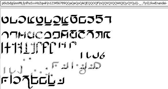 -------- Compli-freaking-cated, but not as bad as I originally feared. To type a consonant, just type the letter lowercase, except for a couple which are capitals (GMLNSHZ). Capital L is actually a form of "m" used when it takes vowels. I forgot capital N in the sample. sweatdrop To type vowels alone, either before a consonant at the beginning of a word or after a consonant already taking a vowel, use the number keys 123456789. To type a vowel onto a consonant, type lower case a, e, or o for top-left vowel parts. Type uppercase A, E, or O for bottom-right vowel parts, except for x and q which take capital F instead of E. For the "r" consonant's vowel parts, use VXW (capitals) for AEO respectively -- these are the bottom-left vowel parts. For letters requiring dots, there are 5 different dots. The keys iIyYu produce dots at different heights. Just type the key for the dot after you type a vowel. As for punctuation, backslash and hyphen produce start and end marks, comma produce some sort of comma thing, and there's a question mark... mark. The underscore produces a sort of bar thing. Spacebar produce a space with a big dot in the middle. Just in case, I made capital Q produce a blank space (which is why the sample pic shows so many Q's in between all the letters in the preview input line). I don't know any Aquenandi, so I don't know what all that stuff is really for. :b Oh, and for some reason, when I tested the font in notepad, it will automatically put the spacebar dot in the middle of whichever consonant or other symbol you type first, unless you start the line with a spacebar space. It didn't do this in OpenOffice.org's Writer, though. I don't think this will be a problem for anyone, though. Also, this is still considered to be in the Alpha stage. I'll move it up to Beta if Eccentric Iconoclast has me make any changes, OR... if I fix that god-awful glitch that keeps the vowels parts from randomly showing up a couple pixels off.
|
|
|
|
|
|
|
|
|
|
|
|
|
|
|
|
Eccentric Iconoclast Captain
|
Posted: Sun Jul 01, 2007 8:15 pm
NOW I realise something I've forgotten! mad D Fortunately, I think this will be easy to add. http://img216.imageshack.us/img216/9531/moariv8.pngI'd like them to be marked as the semicolon and the comma respectively. That comma you already have isn't so important, so I'd prefer it to be a colon or something. Without these, it will be impossible to type most clauses or more than one sentence in a row. gonk ;Þ I hope I'm not being too picky. It looks very nice already, especially considering how difficult it must be to create.
|
|
|
|
|
|
|
|
|
|
|
|
|
|
|
Posted: Sun Jul 01, 2007 9:32 pm
Why do I love this thread so much? mrgreen Yeah I would like another font please! It's for my conlang Käläli. I'll post the script tomorrow. Thanks! I love you! lol! Seriously I do! mrgreen
|
|
|
|
|
|
|
|
|
|
|
|
|
|
|
|
|
|
Posted: Mon Jul 02, 2007 1:10 am
Eccentric Iconoclast NOW I realise something I've forgotten! mad D Fortunately, I think this will be easy to add. http://img216.imageshack.us/img216/9531/moariv8.pngI'd like them to be marked as the semicolon and the comma respectively. That comma you already have isn't so important, so I'd prefer it to be a colon or something. Without these, it will be impossible to type most clauses or more than one sentence in a row. gonk ;Þ I hope I'm not being too picky. It looks very nice already, especially considering how difficult it must be to create. Ah, jeez! I won't even bother scanning them in, I'll just take the comma and the little bracket marks and modify them and move stuff around. Glad you like it though. Is the inexplicable and random crookedness of the vowel parts a bother? ~ ~ ~ Serali88 - K... It's not to complicated is it? If it's anything more complicated than the script for Niora, I'm gonna have it on hold for quite a while, possibly even after I finish Forgedawn's font. That Askripandi seriously wore me out. burning_eyes
|
|
|
|
|
|
|
|
|
|
|
|
|
|
|
|
|
|