|
|
|
|
|
|
|
|
|
 Posted: Thu Nov 15, 2007 5:53 pm Posted: Thu Nov 15, 2007 5:53 pm
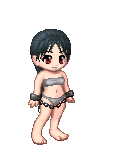
I think it looks fine so far. It reminds me of those old Betty Paige pin-ups. A couple things, though; on a curvy girl like her, I think that her butt would be just a bit more pronounced. Right now it kinda blends in with the leg. Also, is she sucking in her stomach? It wouldn't be out of place if she were, a lot of pin-up girls do. If she's not, however, then gravity would be a definite factor, and her tummy would droop just a little.
|
 |
|
|
|
|
|
|
|
|
|
|
|
|
|
Posted: Fri Nov 16, 2007 9:21 am
I guess she's sucking 'cause I don't want her to look fat! gonk
~~Updated~~
|
|
|
|
|
|
|
|
|
|
|
|
|
|
|
|
|
|
Posted: Fri Nov 16, 2007 4:14 pm
First off, I really like the attention to detail you've put forth on the trees so far. I think that they would look better if they were just a little more 'clumpy'. As for the fire... Since it's right near that one tree, the leaves would catch really quickly, and then spread to the other trees (although thinly, at first). Just do your best on the multiple light sources. I would suggest that you make marks on a separate layer as to where the strongest light sources would be. Then make different markings on the opposite ends of each individual light source. Where two light sources cancel out each others' shadows, there will be soft, ambient light. If it helps, try filling in each stage individually. For instance, starting with the purple area you've put down, make markings on the girl and landscape where all the highlights would be if that light were the only light source. Then, not paying attention to your previous highlights, go back and do the same for each individual source. Fill in the shadows last, going by where they were present in the guidelines I suggested earlier. I hope that helped! It's turning out really nice.
|
|
|
|
|
|
|
|
|
|
|
|
|
|
|
Posted: Fri Nov 16, 2007 6:59 pm
I don't understand... *lament*
|
|
|
|
|
|
|
|
|
|
|
|
|
|
|
|
|
|
Posted: Fri Nov 16, 2007 8:41 pm
Errmm.. it's like in that coloring tutorial I made earlier. See how I wrote out 'light' and 'shadow' before I started shading? Doing that makes multiple light sources easier for me. With multiple sources, I write out all the separate spots in the picture where the light would be coming from, then move to the opposite end and write 'shadow'. If there is a light close to a shadow, then the light sources cancel out the shadow, and create ambient light. Multiple light sources often create ambient light. This is what ambient light looks like. Notice how it is very soft, and so the light sources are barely visible. The reason behind this is because the multiple light sources cancel out most of the shadows... as opposed to light with one source, in which the shadows are plainly visible and have hard edges. Make more sense?
|
|
|
|
|
|
|
|
|
|
|
|
|
|
|
Posted: Sat Nov 17, 2007 5:06 pm
Yes and no... I think I'm hopeless... because I really don't know where the fire would cast light/shadows...
Gaw, I'm sorry. gonk
|
|
|
|
|
|
|
|
|
|
|
|
|
|
|
|
|
|
Posted: Mon Nov 19, 2007 8:57 am
|
|
|
|
|
|
|
|
|
|
Posted: Wed Nov 21, 2007 9:39 am
Teh Prurient Pirate Queen
Yes and no... I think I'm hopeless... because I really don't know where the fire would cast light/shadows...
Gaw, I'm sorry. gonk
...what might help you with this, is to look on google or something for pictures of fires or some such thing, and look at the light sources. Or go the pyromaniac approach, and make your own fires (I guess you could use a candle?) And observe the way the lighting looks. Take pictures if you need too.... I hope this helps a bit?
|
|
|
|
|
|
|
|
|
|
|
|
|
|
|
|
|
|
Posted: Wed Nov 21, 2007 9:51 am
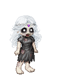
On that last one you posted..... did she have eyebrows? or were they covered up by her hair....
And the nose seems kinda small/pointy to me... sweatdrop
great job though. I really like the design. 3nodding
|
|
|
|
|
|
|
|
|
|
|
|
|
|
|
Posted: Wed Nov 21, 2007 5:48 pm
Yeah, the hair covered the eyebrows.
You can not believe how HARD it was to get the details in there because they were so small. Stupid me decided to shrink the image before I was finished. rolleyes
About the nose, I tried to make it look like a triangle cat nose. Fail?
Thanks for the advice. ^_^
|
|
|
|
|
|
|
|
|
|
|
|
|
|
|
|
|
|
Posted: Sun Nov 25, 2007 7:02 pm
Please note: I will be on hiatus the next couple days. I have a LOT of work to do for school, plus moving, plus actual work... gonk Throw a bit of sleeping, eating, and sex time in there and ... well, there is just no time left.
|
|
|
|
|
|
|
|
|
|
|
|
|
|
|
Posted: Tue Nov 27, 2007 9:06 pm
tee hee... sex time. always good to throw that in there to prevent the going of insaneness... >_____>;;;; yea. anyways. cat nose?? Try not to put nostrils in it then? if you're going for the pure triangle cat nose... and try to define the bridge with more gradual shading, rather than the *almost* lines that you have. ...i kinda shaded the basic idea (becaus I would have failed in words.) I kept the small nose, but made it...less pointy? and less liney... i still didnt do it exactly right though...  aaaannndd.. here's my quick rendidtion of a cat nose.../dog nose. they're basically the same, one's just bigger.... 
|
|
|
|
|
|
|
|
|
|
|
|
|
|
|
|
|
|
Posted: Wed Nov 28, 2007 6:41 am
gonk I thought you meant another picture.
No no no, that one that she's chained up isn't a cat. The one with purple fire is a cat.
I fail. xp
|
|
|
|
|
|
|
|
|
|
|
|
|
|
|
Posted: Wed Nov 28, 2007 7:57 am
Ooooohhhh.... >___> I'll go look at that one sharpish...
but the nose shading thing still stands. since you love drawing w/o the lines, it really stands out, and doesnt fit very well....
but still. I'm seeing improovment!! 4laugh
|
|
|
|
|
|
|
|
|
|
|
|
|
|
|
|
|
|
Posted: Wed Nov 28, 2007 7:59 am
Yes, yes. The cat nose was done very well.
but the wiskars look a bit too...bold?
try making them a bit thinner and not so long, i thinks...
3nodding
|
|
|
|
|
|
|
|
|
|
|
|
|
|
|
|
|
|