|
|
|
|
|
|
|
 Posted: Tue Jan 19, 2010 12:59 pm Posted: Tue Jan 19, 2010 12:59 pm
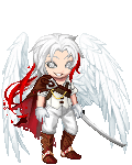
8/10 looks good but the slippers seem out of place
|
 |
|
|
|
|
|
|
|
|
|
|
|
|
|
Posted: Tue Jan 19, 2010 6:31 pm
Pain does not exist... oh i quite like it, except the pink kinda clashes with the red... 8/10...in my dojo
|
|
|
|
|
|
|
|
|
|
|
|
|
|
|
|
|
|
Posted: Tue Jan 19, 2010 6:32 pm
I love it, it's fun and unique! 9/10
|
|
|
|
|
|
|
|
|
|
|
|
|
|
|
Posted: Wed Jan 20, 2010 8:35 am
Nyu-sama I love it, it's fun and unique! 9/10 11/10 I always love your avatars :]
|
|
|
|
|
|
|
|
|
|
|
|
|
|
|
|
|
|
Posted: Wed Jan 20, 2010 2:11 pm
Pain does not exist... 8.7/10
Nice and simple, pretty interesting color scheme. Could use a tad more excitement, but I like it ^^ ...in my dojo
|
|
|
|
|
|
|
|
|
|
|
|
|
|
|
Posted: Wed Jan 20, 2010 2:14 pm
9.5/10 tis good,rele good..^^
|
|
|
|
|
|
|
|
|
|
|
|
|
|
|
|
|
|
Posted: Wed Jan 20, 2010 2:23 pm
Pain does not exist... I stand by my previous assessment. I love it... but the Pink hair (with no other pink anywhere else) Kinda clashes with the red, and also the purple should be a bit more evenly distributed. Also I don't like how the hat has gold and silver things that also are not distributed throughout... it kinda just throws it off a bit more. But it is a very adorable avi ^^ and the balance of it all (not too top or bottom heavy, doesn't look like it's about to fall over, etc) is very well done, and I like the color scheme ^^
8.9/10 (i think i hit the wrong button last time, cuz it's definitely higher ranking than an 8 ><)...in my dojo
|
|
|
|
|
|
|
|
|
|
|
|
|
|
|
Posted: Wed Jan 20, 2010 2:28 pm
Oyogu Ageha Pain does not exist... I stand by my previous assessment. I love it... but the Pink hair (with no other pink anywhere else) Kinda clashes with the red, and also the purple should be a bit more evenly distributed. Also I don't like how the hat has gold and silver things that also are not distributed throughout... it kinda just throws it off a bit more. But it is a very adorable avi ^^ and the balance of it all (not too top or bottom heavy, doesn't look like it's about to fall over, etc) is very well done, and I like the color scheme ^^
8.9/10 (i think i hit the wrong button last time, cuz it's definitely higher ranking than an 8 ><)...in my dojo [/quotethere is gold in it other then the hat,but it seems to be covered by other things,and lookin at it i guess addin purple for the under color of the vest dosen't work but i likes it..^^
|
|
|
|
|
|
|
|
|
|
|
|
|
|
|
|
|
|
Posted: Wed Jan 20, 2010 9:49 pm
Pain does not exist... ooh i likes it very much more now ^^
10/10 ^^...in my dojo
|
|
|
|
|
|
|
|
|
|
|
|
|
|
|
Posted: Tue Jan 26, 2010 8:11 pm
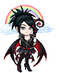
9/10
Everything matches and look good. I think it might be a tad random.
|
|
|
|
|
|
|
|
|
|
|
|
|
|
|
|
|
|
Posted: Wed Jan 27, 2010 6:49 pm
Thanks... yea it was my first attempt at a random/goofy type avi... I think it worked out pretty spiffy. Normally I have really elegant type avis ><
9.7/10
I really like yours, the color choice is different and works really well together. The matching is well done and it's not cluttered. I think it's a tiny bit plain, and could use a bit more spunk, but other than that it's awesome... altho I might like to see a tad bit more of that navy color towards the bottom to help balance it a bit more...
|
|
|
|
|
|
|
|
|
|
|
|
|
|
|
Posted: Thu Jan 28, 2010 6:20 am
|
|
|
|
|
|
|
|
|
|
|
|
|
Posted: Thu Jan 28, 2010 7:19 am
|
|
|
|
|
|
|
|
|
|
Posted: Sun Jan 31, 2010 5:16 pm
8/10 i like the red that peeks through the black and blue
|
|
|
|
|
|
|
|
|
|
|
|
|
|
|
|
|
|
Posted: Sun Jan 31, 2010 5:37 pm
7/10 tis good but a tad too dark
|
|
|
|
|
|
|
|
|
|
|
|
|
|