|
|
| Do you collect fonts? |
| Heck yes! I drain those font foundry websites down to the last letter! |
|
41% |
[ 12 ] |
| Kinda. I've done my share of font scrounging, but I can live without the fancy ones. |
|
51% |
[ 15 ] |
| Nah. I don't need anything but the fonts that come pre-installed on my computer. |
|
6% |
[ 2 ] |
|
| Total Votes : 29 |
|
|
|
|
|
|
|
|
 Posted: Sat Jun 23, 2007 6:11 pm Posted: Sat Jun 23, 2007 6:11 pm
Homurakitsune Xeigrich I already plan to do that, I just haven't taken the time yet. I'd like to have each download link accompanied by a decent looking sample of the font, with a small paragraph of instructions (because some of them are/will be difficult to use), as well as a link to the font's associated conlang, if any. EI's gonna have me working for days on that one. gonk Bring it on! domokun Homurakitsune -- Yes, the C key is used for the CH symbol. I kind of assumed that subconsciously, so I guess that's why I forgot to mention it. Glad you like it! 3nodding Thanks! ^_^ Uh... but the whole syllable thing seems not to have worked. The symbols still appear, but the consonant is like... at least a full tab away from the vowel. confused That's not right. It works fine for me, and the others who tried it didn't seem to have any problems. What program are you typing in? Have you tried using the font in any other programs? For me, the font works fine even in simple Notepad. EDIT: Can you take a screenshot (Alt + PrintScreen) and show me how the font looks? I'd like to make sure it's working right, especially for you since you're the one I made it for in the first place.
|
 |
|
|
|
|
|
|
|
|
|
|
|
|
|
Posted: Sat Jun 23, 2007 6:33 pm
|
|
|
|
|
|
|
|
|
|
|
Eccentric Iconoclast Captain
|
Posted: Sat Jun 23, 2007 6:49 pm
Xeigrich EI's gonna have me working for days on that one. gonk Fortunately, as you can see, it all operates on a system (and is thus much easier to learn than it looks. mad D) Try experimenting with the vowel tails; see if you can have them be extra characters that end up on top of the previous characters when you type them, so that the stem that goes straight is a separate character labeled A, the one that goes away from the vowel is labeled E, the one that curls around the vowel is O, and so on. Since there aren't many basic letterforms, there'll be extra letters such as b, d, w, m, and so on. I'd prefer it if you keep the basic keys used to those specified below (although preferably without capitalisation):  I specified N as its own letterform because the bar on top is at a different level than for the rest of the characters. You can cut that and make the bar typable, but it might be easier just to make it its own letter. It's the best script I've ever made by a long shot. Not only does it look nice, but it's highly functional, which many really æsthetic scripts lack. >.>
|
|
|
|
|
|
|
|
|
|
|
|
|
|
|
Posted: Sat Jun 23, 2007 7:11 pm
*fanfare* Vajra's font is done! Download Link!-------- 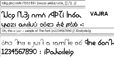 -------- There's nothing complicated about this font, except that some of the letters are set to punctuation keys. As you can see in the sample above, the keys [];,' produce letters. I included the basic digits, and of course a couple of extra punctuation marks like ^ and the underscore. There you go, Vajra. cool
|
|
|
|
|
|
|
|
|
|
|
|
|
|
|
|
|
|
Posted: Sat Jun 23, 2007 7:13 pm
Xeigrich Homurakitsune Xeigrich I already plan to do that, I just haven't taken the time yet. I'd like to have each download link accompanied by a decent looking sample of the font, with a small paragraph of instructions (because some of them are/will be difficult to use), as well as a link to the font's associated conlang, if any. EI's gonna have me working for days on that one. gonk Bring it on! domokun Homurakitsune -- Yes, the C key is used for the CH symbol. I kind of assumed that subconsciously, so I guess that's why I forgot to mention it. Glad you like it! 3nodding Thanks! ^_^ Uh... but the whole syllable thing seems not to have worked. The symbols still appear, but the consonant is like... at least a full tab away from the vowel. confused That's not right. It works fine for me, and the others who tried it didn't seem to have any problems. What program are you typing in? Have you tried using the font in any other programs? For me, the font works fine even in simple Notepad. EDIT: Can you take a screenshot (Alt + PrintScreen) and show me how the font looks? I'd like to make sure it's working right, especially for you since you're the one I made it for in the first place. Yeah, sure. I'll type the alphabet. (It works if I put caps lock on and just type it without using syllables...) (And I'm using Word 2003) Here: When I copied it and put it in paint, it seemed to work a little better... that's curious, perhaps its just my crappy computer... confused Oh, dear...apparently it works in all my programs except word, including notepad! I'm sorry for troubling you if its just my stupid computer... -------- Is there a way to use the font in on Gaia? confused
|
|
|
|
|
|
|
|
|
|
|
|
|
|
|
Posted: Sat Jun 23, 2007 7:28 pm
They've turned out quite beautifully biggrin I'm gonna redraw the characters, unless you can do it well... I don't like how it looks in mine... I've got an idea, but I'm not really sure hwo to go about doing it, so I might be a while. Kintaran (originally) was supposedly done with what was like a brush, but not really .... ok, I'll just say it. Leaves. They used leaves on sticks as brushes with ink. So maybe a brush would work to draw the letters for the font. Gonna go play with my art supplies. twisted
|
|
|
|
|
|
|
|
|
|
|
|
|
|
|
|
|
|
Posted: Sat Jun 23, 2007 7:38 pm
Homurakitsune -- I tried the Niora font in OpenOffice.org's Writer (an MS Word open source (free) alternative), and it's giving me even worse problems than those you're describing. I think I might know what is causing the problem. I'm gonna go check that out now, but it's still working perfectly fine for me in Notepad and Paint. It must be something with how word processors handle TTF fonts conflicting with the vowel retrofitting technique I used.
EDIT: Aha! I fixed it! Now it's working fine for me in Writer, too.
The problem was fairly simple. When you define a glyph (a single symbol), you have left boundaries and right boundaries that you can move left or right to show how wide the letter is -- or how much empty space you want. When I pulled the right boundary in, I accidentally pulled them PAST the left boundary. It seems I did this on all the vowel marks... And this caused the word processors to notice this and go wonky, where the simpler programs like Notepad and Paint don't care.
BUT, it's working now. I'll upload the fixed font and update the download links, so try downloading it and reinstalling it.
Note: to reinstall a font, you have to go into the Fonts folder and actually DELETE the old font file before you can drag the new one in.
EDIT 2: Alright, the updated font is ready to download. Both the archive link on the first page (end of second post), and in the "Font complete!" post are updated and will take you to the fixed font.
|
|
|
|
|
|
|
|
|
|
|
|
|
|
|
Posted: Sun Jun 24, 2007 9:31 am
Xeigrich Homurakitsune -- I tried the Niora font in OpenOffice.org's Writer (an MS Word open source (free) alternative), and it's giving me even worse problems than those you're describing. I think I might know what is causing the problem. I'm gonna go check that out now, but it's still working perfectly fine for me in Notepad and Paint. It must be something with how word processors handle TTF fonts conflicting with the vowel retrofitting technique I used. EDIT: Aha! I fixed it! Now it's working fine for me in Writer, too. The problem was fairly simple. When you define a glyph (a single symbol), you have left boundaries and right boundaries that you can move left or right to show how wide the letter is -- or how much empty space you want. When I pulled the right boundary in, I accidentally pulled them PAST the left boundary. It seems I did this on all the vowel marks... And this caused the word processors to notice this and go wonky, where the simpler programs like Notepad and Paint don't care. BUT, it's working now. I'll upload the fixed font and update the download links, so try downloading it and reinstalling it. Note: to reinstall a font, you have to go into the Fonts folder and actually DELETE the old font file before you can drag the new one in. EDIT 2: Alright, the updated font is ready to download. Both the archive link on the first page (end of second post), and in the "Font complete!" post are updated and will take you to the fixed font. Oh! Okay, thank you. ^_^
|
|
|
|
|
|
|
|
|
|
|
|
|
|
|
|
|
|
Posted: Sun Jun 24, 2007 2:37 pm
Eccentric Iconoclast Xeigrich EI's gonna have me working for days on that one. gonk Fortunately, as you can see, it all operates on a system (and is thus much easier to learn than it looks. mad D) Try experimenting with the vowel tails; see if you can have them be extra characters that end up on top of the previous characters when you type them, so that the stem that goes straight is a separate character labeled A, the one that goes away from the vowel is labeled E, the one that curls around the vowel is O, and so on. Since there aren't many basic letterforms, there'll be extra letters such as b, d, w, m, and so on. I'd prefer it if you keep the basic keys used to those specified below (although preferably without capitalisation): I specified N as its own letterform because the bar on top is at a different level than for the rest of the characters. You can cut that and make the bar typable, but it might be easier just to make it its own letter. It's the best script I've ever made by a long shot. Not only does it look nice, but it's highly functional, which many really æsthetic scripts lack. >.> GAH! gonk You used PNG's with Transparency enabled... I went through and saved all the linked images from your ImageShack thing, and when I went to open them.... Huge black rectangles, and nothing else. I have to use Paint.NET to view them, but I might have to go through and convert them so they show up right in IrfanView. o_o ... I need to figure out how to import images as outlines in my font software so I don't have to redraw everything by hand.
|
|
|
|
|
|
|
|
|
|
|
|
|
|
|
Posted: Sun Jun 24, 2007 4:21 pm
|
Eccentric Iconoclast Captain
|
|
|
|
|
|
|
|
|
|
|
|
Posted: Mon Jun 25, 2007 1:00 am
I'm gonna put this font stuff on hold for just a bit. I'm trying to get a hold of Adobe Illustrator so I can TRY to find a way to take pre-drawn symbols and just copy them over to FontLab, which doesn't seem to work from ANY of the graphics programs I use, including Inkscape (freeware vector image editor and super-lightweight Illustrator alternative) and Paint.NET (freeware lightweight Photoshop alternative).
It's gonna cost me another toe and probably a few more men will lose their lives, but it must be done. I just hope it's worth it. If I can figure out how to open a regular (raster) image in Illustrator and tweak it into some sort of stroke/fill vector object, then I should be able to copy and paste it straight into FontLab.
If I can accomplish that, then "Askripandi" shouldn't be as much of a problem, since I will only have to figure out which glyphs go where and how to reconstruct the writing system into something keyboard compatible. I won't have to worry about redrawing EACH PIECE by hand.
I should have access to Illustrator by Monday afternoon (US Central time!), so by Monday evening I should be able to get some practice and see if I can even get close. I have found tutorials describing similar things to what I want to do, but they all involve DRAWING the glyphs in Illustrator (not opening them as raster and converting them to vector), and they always refer to much older versions of both Illustrator and FontLab... But I should be able to make do.
If ANYONE has experience with Illustrator, or especially if anyone actually HAS Adobe Illustrator, please let me know as I may have a few questions or I may ask you to try something out for me (if it's not a problem!).
~ ~ ~ Boy do I love making these long posts. sweatdrop
|
|
|
|
|
|
|
|
|
|
|
|
|
|
|
Posted: Mon Jun 25, 2007 1:09 pm
FREAKING SWEET!
I got Illustrator working and I figured out how to take images from Illustrator and put them straight into FontLab.
Eccentric Iconoclast, those transparent PNGs, while a pain otherwise, actually helped quite a bit. I used one of them as the guinea pig and the results were impressive. SO, I should be able to directly use the original source materials you provided to make your font. This means your font will look almost exactly like the symbols you provided.
Now it's just a matter of copy-pasting, tweaking, and getting the font itself to work right with EI's crazy conscript
As a note to others, don't worry about transparent PNG's. If you don't mind me redrawing your letters by hand, which usually produces a lower quality font because it's a pain to do it by hand and almost impossible to reproduce 100% accurately, you can still submit handwritten or other "non-clean" conscript originals. However, if you want me to be able to take the original source image(s) you give me and copy the symbols over to FontLab, the image(s) must meet the following requirements:
arrow Image (file) type PNG, BMP, or GIF.
arrow Symbols must be clean with sharp, tidy edges.
arrow Empty (white) space must be as clean as possible.
*Go into MS Paint or something and clean it up, it helps a lot!
*JPG is acceptable only if you can disable compression.
*Try to keep the lines or marks somewhat thick and solid colored.
*See Eccentric Iconoclast's image post for examples. You DON'T have to make the image transparent, I can easily do that myself if you follow the arrow'ed requirements above.
This way, it's a HELL of a lot easier for me to vectorize in Illustrator to copy over to FontLab. It'll save me a lot of time and frustration, which I can save for the actual font making process.
If you don't bother to provide a clean, clear image -- or you don't have the resources to do so -- I can still try to do the cleaning up myself. It's not a big deal, but it's best if you can do it yourself. I didn't design your script... I don't necessarily know what's what and how such-and-such symbol should look, so the cleaner the better.
I'll copy this over to the first page when I have time later on.
|
|
|
|
|
|
|
|
|
|
|
|
|
|
|
|
|
|
Posted: Mon Jun 25, 2007 1:51 pm
...I have Illustrator, but I don't use it. Can't figure out most of it... to me, it's like Photoshop, but you HAVE to use vectors, and I actually can't figure out how to use them... I click and click and they don't do what I thought they'd do. So I give up. neutral
♥Photoshop.
Speaking of which... I finally found my disc! I can reinstall from the übercrash! Yay!
|
|
|
|
|
|
|
|
|
|
|
|
|
|
|
Posted: Mon Jun 25, 2007 4:30 pm
Can I email you the files? I'm about out of upload space sweatdrop
(But I have clean and pretty kintarasesa writing ready to go biggrin )
|
|
|
|
|
|
|
|
|
|
|
|
|
|
|
|
|
|
Posted: Mon Jun 25, 2007 6:46 pm
I've never liked Illustrator OR Photoshop. Neither of them ever do what I want them to do, and even in Photoshop, I can't ever understand all the complicated interface stuff. Too much bloat and extra crap that I don't need. I tried The GIMP but it was even WORSE than Photoshop. That's why I prefer to use Paint.NET... It's FREE, and it's a heck of a lot easier to use than Photoshop. Sure, it doesn't have all the fancy features, but it has layers and other medium-level features that I DO understand and DO use.
As for the files, yeah, email is fine.
tonyjones17 AT yahoo DOT com
I can't guarantee I'll get it done any time too soon, though. "Askripandi" is going to take a while, and I just bought two more Castlevania games which will definitely be whining for me to play them (in addition to the one I'm currently working my way through).
I'll get to it ASAP, though. mrgreen
|
|
|
|
|
|
|
|
|
|
|
|
|
|
|
|
|
|