|
|
|
|
|
|
|
 Posted: Tue Sep 07, 2004 2:56 pm Posted: Tue Sep 07, 2004 2:56 pm
I think it's a city in australia...
... no wait, that's canberra... sweatdrop
|
 |
|
|
|
|
|
|
|
|
|
|
|
|
|
Posted: Tue Sep 07, 2004 3:03 pm
*cracks open a labatt's*
canadaaaa!!
|
|
|
|
|
|
|
|
|
|
|
|
|
|
|
|
|
|
Posted: Tue Sep 07, 2004 5:03 pm
sorry if i hurt anyones felling im a clover-irsih
|
|
|
|
|
|
|
|
|
|
|
|
|
|
|
Posted: Tue Sep 07, 2004 5:04 pm
Potto The Magnificent Vorty SO am I! well, not really. I just needed an excuse to shout at ian >>calm down, peeps... he did say sorry if he offended anyone. It was a joking remark, take it with humour. Quiet you! *launches nuclear silo* ( xd j/k) Its just a lot of people don't understand a lot of Canada and say all kinds of crazt things, like its only in Quebec that francophones live, which is not true. Its because of people like that that we're going to lose all of our french schools if Quebec seperates sad Anyways, its fun to yell at Ian, since he has the same name as that shopkeeper we're all angry at for putting fairy wings at such a high price... *hugs ian* heh, I like this guy *gives noogy* I asid i was sorry geez people the clover is sorry,.
|
|
|
|
|
|
|
|
|
|
|
|
|
|
|
|
|
|
Posted: Tue Sep 07, 2004 5:30 pm
The Iconoclast  Updated. This ones form is the best, make me think to Full Metal Alchemist...
|
|
|
|
|
|
|
|
|
|
|
|
|
|
|
Posted: Tue Sep 07, 2004 6:48 pm
ian1158 Potto The Magnificent Vorty SO am I! well, not really. I just needed an excuse to shout at ian >>calm down, peeps... he did say sorry if he offended anyone. It was a joking remark, take it with humour. Quiet you! *launches nuclear silo* ( xd j/k) Its just a lot of people don't understand a lot of Canada and say all kinds of crazt things, like its only in Quebec that francophones live, which is not true. Its because of people like that that we're going to lose all of our french schools if Quebec seperates sad Anyways, its fun to yell at Ian, since he has the same name as that shopkeeper we're all angry at for putting fairy wings at such a high price... *hugs ian* heh, I like this guy *gives noogy* I asid i was sorry geez people the clover is sorry,. I'm not angry at you.
|
|
|
|
|
|
|
|
|
|
|
|
|
|
|
|
|
|
Posted: Tue Sep 07, 2004 9:08 pm
Iceketch The Iconoclast Updated. This ones form is the best, make me think to Full Metal Alchemist... Haha redface Thank you, they are kind of like that, aren't they?
|
|
|
|
|
|
|
|
|
|
|
|
|
|
|
Posted: Tue Sep 07, 2004 9:36 pm
Ok... the first of several banner ideas I have:  - I liked the idea of having the avatar silohouettes in the banner as seen in previous ideas. -Size is 429x429 - could be resized easily if needed sweatdrop -Fixed ring issue
|
|
|
|
|
|
|
|
|
|
|
|
|
|
|
|
|
|
Posted: Tue Sep 07, 2004 9:45 pm
Hey thats pretty nice. I would maybe make it a little smaller. And the seal around the medal doesnt match quite right but I think its cool.
Seal looks better now, but I still think because of the design type, it's a little too big. For example the shadows of the avatars is a little too distorted from being enlarged. I would keep them the original size and maybe format the rest to fit them. Or at least just test it and see how it looks.
|
|
|
|
|
|
|
|
|
|
|
|
|
|
|
Posted: Thu Sep 09, 2004 4:30 pm
Judyfay Sins Hey thats pretty nice. I would maybe make it a little smaller. And the seal around the medal doesnt match quite right but I think its cool. Seal looks better now, but I still think because of the design type, it's a little too big. For example the shadows of the avatars is a little too distorted from being enlarged. I would keep them the original size and maybe format the rest to fit them. Or at least just test it and see how it looks.Ah... I'll change the av shadows tonight and see how it looks. I wanted the distortion, actually. To me, it has meaning, but if it doesn't hold right, then I'll change it. As for size, would the size of my shop banner (in my signature) be better?
|
|
|
|
|
|
|
|
|
|
|
|
|
|
|
|
|
|
Posted: Thu Sep 09, 2004 5:07 pm
Yeah that is what I thought when I saw it. That size is great. It lets you kind of absorb it all at once instead of looking it over.
|
|
|
|
|
|
|
|
|
|
|
|
|
|
|
Posted: Thu Sep 09, 2004 6:34 pm
first one: 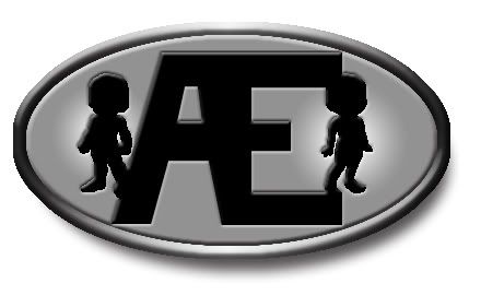 i said to myself im an infographist its my job to do logo/banner so let do some blaugh heart
|
|
|
|
|
|
|
|
|
|
|
|
|
|
|
|
|
|
Posted: Thu Sep 09, 2004 6:53 pm
Cool stuff, everyone!
Too bad I'm horrible at designing something cool and original, so I don't think I'd participate in this event much (and if I do, I wouldn't nominate my work to be the official uniform or logo). Love seeing everyone else's stuff, though!
PS: Canada rocks!
|
|
|
|
|
|
|
|
|
|
|
|
|
|
|
Posted: Thu Sep 09, 2004 10:53 pm
Banner Entries 1) -Ok - it's smaller with the avatar shadows sans distortion. Two more banners: 2) 3) Uniforms Second Uniforms submission:
|
|
|
|
|
|
|
|
|
|
|
|
|
|
|
|
|
|
Posted: Fri Sep 10, 2004 12:56 pm
-~o..Klody..o~- first one: i said to myself im an infographist its my job to do logo/banner so let do some blaugh heart I like it but it needs blue remember? Also somthing about the lighting seems off. But the design is cool. Kudos to... Shock? (sorry if I mixed you up Vorty) For coming up with the Avvy sillouette idea in the first place.
|
|
|
|
|
|
|
|
|
|
|
|
|
|