|
|
|
|
|
|
|
|
|
 Posted: Tue Jan 01, 2008 8:13 pm Posted: Tue Jan 01, 2008 8:13 pm
I -think- I got her foot in the right perspective. oldObviously, it's not very refined, 'cause I just did a sketch to see if it looked right. What else needs fixed? ((I already started laying down the flat colors, but I hid them while I was drawing the foot. I'll post an update on those once I get done with this.))
|
 |
|
|
|
|
|
|
|
|
|
|
|
|
|
Posted: Thu Jan 03, 2008 3:39 am
Finished my flats. Sorry that it's bigger than usual.. when I shrunk it down to 700px, my colors got warped. gonk This was as close as I could get without it being wonky. old
|
|
|
|
|
|
|
|
|
|
|
|
|
|
|
|
|
|
Posted: Fri Jan 04, 2008 7:31 pm
Getting along. Still need to blend most of it. Everything look okay so far? old
|
|
|
|
|
|
|
|
|
|
|
|
|
|
|
Posted: Sat Jan 05, 2008 12:47 am
X{D I'm on a roll! oldFinished with.... whatever the Hell the black material is, unless you guys point something out. Going to start blending the skin. There's two light sources in this: The first (and most important) is a yellow light coming from the upper left, placed somewhere around the left of her head. The second minor one is the Angelic Pendant: it's a tiny blue light that doesn't extend much farther than the upper chest. Does everything look consistent?
|
|
|
|
|
|
|
|
|
|
|
|
|
|
|
|
|
|
Posted: Sat Jan 05, 2008 6:45 pm
The main thing that's kind of bothering me is that the black material seems really bizarre with how well its texture blends in with the skin on the legs and face. I like the gold details, though, and I look forward to see how you color them. I'm trying to figure out what the black lines on and around her chest are because, unshaded, it makes the breasts seem misshapen.
The light source is both well-done and interesting, but maybe you could add a little more blue highlights to the skin (I'm not sure if you're done with that part yet).
|
|
|
|
|
|
|
|
|
|
|
|
|
|
|
Posted: Sun Jan 06, 2008 9:56 pm
I was kinda going for that with the legs and face. My original idea for the Soot Face item was to draw it like it was someone's face naturally (which is why the eyes don't really have pupils) and I just sorta followed through with the legs. Which black lines do you mean? The ones defining the breasts, or the ones that are attached to the Solar Headdress? Or all of 'em? And no, I haven't added the blue highlights yet. I wanna get the Pendant shaded in before I start adding those. 3nodding Thanks!
|
|
|
|
|
|
|
|
|
|
|
|
|
|
|
|
|
|
Posted: Sun Jan 06, 2008 11:57 pm
I suppose I meant the lines that are attached to the Solar Headdress... I totally didn't realize that this was gaia-related until your last post... That explains a lot *shot*
|
|
|
|
|
|
|
|
|
|
|
|
|
|
|
Posted: Mon Jan 07, 2008 7:15 pm
Haha, yeah. X{D It's my Gaia avvi from before I got hacked. I took quite a bit of creative license with the items, though, 'cause drawing pre-made items just seems boring to me.
|
|
|
|
|
|
|
|
|
|
|
|
|
|
|
|
|
|
Posted: Wed Jan 09, 2008 8:36 pm
My hand is cramping soooo bad from this. x_x oldIf you'll excuse me, I'm going to go soak my mangled claw in hot water...
|
|
|
|
|
|
|
|
|
|
|
|
|
|
|
Posted: Sat Jan 19, 2008 12:45 am
Okay...this is my first time actually commenting here, but I couldn't help but make some pointers for you.
First of all - the black section of the closure in front where it passes over the top of the chest is very distracting from the actual lines of the top. I think perhaps, if you moved them slightly and curved them more so they follow the line of the body and not look like stray lines. To me it looks very odd and draws from the natural line of the figure.
Second - the belly button needs to be moved up, it should be below the natural waist line.
Third - you should define a little musculature along the abdomen so it appears a little less flat, if you want to put it that way. O_o;
Other than that, you are on the right track. Your shading could use some more depth, especially on the metal pieces, but it's still looking pretty awesome. 8D When you start on your next piece, be sure to keep in mind the length of the neck, the perspective of the body, and the direction of your light source, as well as the color, brightness, and expanse of the source. Take care for now~. Keep up the good work.
|
|
|
|
|
|
|
|
|
|
|
|
|
|
|
|
|
|
Posted: Sat Jan 19, 2008 11:15 am
I really like your use of colours, it looks very nice adding purple/blue in with the black, it adds depth. The glowing pendant looks nice, too.
Some crit...the white you added to the gold pieces as shine should be a little more white, they seem opaque and blend into the rest of the gold, which takes away from the depth of the gold pieces.
Also, her breasts are a little uneven (although that's natural on some women, so it's up to you).
|
|
|
|
|
|
|
|
|
|
|
|
|
|
|
Posted: Tue Jan 22, 2008 5:05 pm
Tweaked it a bit, but I didn't add everything 'cause I was a little uncertain. 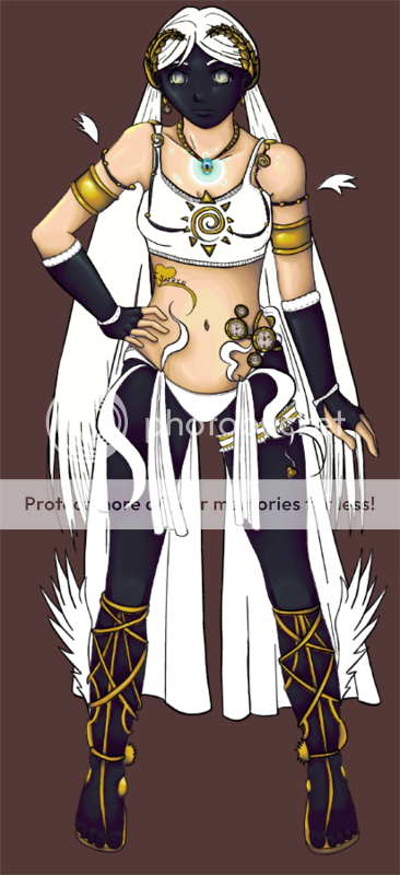 Also, new sketch: 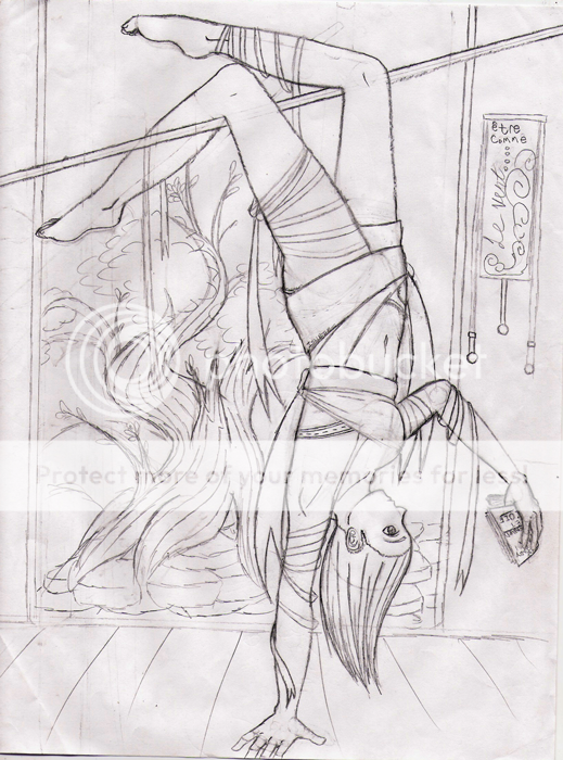 Sorry that her fingers got chopped off at the end of the page like that... I didn't fix it in MS before I posted it because I'll probably end up reworking the sketch in pencil a lot anyway, and I'd rather finish the hand in the final edition of the sketch. @Xyirii: Thanks for commenting! I put the belly button up higher -tried- messing with the shading on her skin, but I don't think that it's very visible. What do you think I should do to add more depth? As for the lines on the chest... you mean the black part of the Solar Headdress, right? Pomato Soup already mentioned it, but I guess they look a lot worse than I originally thought. I'll start on them. @Phoonty: Thanks for stopping by. I added a little more white and messed with the shading a bit, do you think it looks better? As for the breasts... It was a little intentional, because when the shoulder raises it also pulls up the breast attached to it, but I might have overdone it... I'll lower it a bit.
|
|
|
|
|
|
|
|
|
|
|
|
|
|
|
|
|
|
Posted: Wed Jan 23, 2008 9:58 pm
I'm sorry, I don't really see any differences with the new picture sweatdrop ...
The white seems even more blended now, are you using a softer brush?
I sort of meant like a dab of white...
This tutorial may help a bit more....
http://erroriambic.deviantart.com/art/Simple-Metal-painting-Tutorial-53315590
When the white stands out from the rest of the piece, it really adds the glare effect.
^^
|
|
|
|
|
|
|
|
|
|
|
|
|
|
|
|
|
|