|
|
|
|
|
|
|
 Posted: Sat Dec 22, 2007 2:30 pm Posted: Sat Dec 22, 2007 2:30 pm
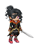
I got my mouse to work again 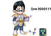 Made the edit below on my laptop with my finger cause my mouse wasnt working. Took me about 1hour 45mins. give or take 
|
 |
|
|
|
|
|
|
|
|
|
|
|
|
|
Posted: Sat Dec 22, 2007 10:06 pm
|
|
|
|
|
|
|
|
|
|
|
|
|
Posted: Sun Dec 23, 2007 2:29 am
0.o
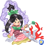
XD now this has been done for a month now... and is released now cause My shop finally reached it's 100th page. yes actual avatar size... meaning the Tallest are taller then you .... OMG "I blame gravity." yes actual avatar size... meaning the Tallest are taller then you .... OMG "I blame gravity."
|
|
|
|
|
|
|
|
|
|
|
|
|
|
|
Posted: Mon Dec 24, 2007 5:31 am
I'd love to be more active, hmm what should i do? Maybe I'll try Katara from ATLA
|
|
|
|
|
|
|
|
|
|
|
|
|
|
|
|
|
|
Posted: Fri Dec 28, 2007 7:15 pm
Those edits are awesome, Ray. :3 Especially for using a touchpad on the second! o.o
Hegemon, those are cool!!
Nice, Rakura Lynn. XD
New Years limiteds for my shop. ^__^ 
|
|
|
|
|
|
|
|
|
|
|
|
|
|
|
Posted: Sun Jan 06, 2008 3:29 pm
|
|
|
|
|
|
|
|
|
|
|
|
|
Posted: Mon Jan 07, 2008 2:20 pm
|
|
|
|
|
|
|
|
|
|
Posted: Tue Jan 08, 2008 7:45 am
 I like how this came out, especially the hair, but the bust area on the dress is bothering me. otherwise I love it. first time I did a base/pose edit OR custom eyes. c+c = <3
|
|
|
|
|
|
|
|
|
|
|
|
|
|
|
|
|
|
Posted: Tue Jan 08, 2008 7:46 am
I agree, the third red one looks best. they all need some more highlights O:
|
|
|
|
|
|
|
|
|
|
|
|
|
|
|
Posted: Tue Jan 08, 2008 11:17 am
s y n c beat I like how this came out, especially the hair, but the bust area on the dress is bothering me. otherwise I love it. first time I did a base/pose edit OR custom eyes. c+c = <3 love the hair and the eyes are cute. I agree the boobs need a bit more shading but other than that its cute. Who is she? Looks familiar
|
|
|
|
|
|
|
|
|
|
|
|
|
|
|
|
|
|
Posted: Tue Jan 08, 2008 1:51 pm
s y n c beat I agree, the third red one looks best. they all need some more highlights O:
Problem is, if I highlight it TOO much, it turns out like the first purple one x_x jewels are impossible
Ooh, the reposition on your edit is adorable. There does need to be more shading around the bust, though, and around the outlines of the hair and clothes in general.
Awesome for a first reposition, though~
|
|
|
|
|
|
|
|
|
|
|
|
|
|
|
Posted: Tue Jan 08, 2008 7:15 pm
Ray Valentine s y n c beat I like how this came out, especially the hair, but the bust area on the dress is bothering me. otherwise I love it. first time I did a base/pose edit OR custom eyes. c+c = <3 love the hair and the eyes are cute. I agree the boobs need a bit more shading but other than that its cute. Who is she? Looks familiar satoko Houjou from Higurashi no Naku Koro ni :3 yeah, I didn't want to go too heavy on the bust cause she is only like 12.. D: and I slimmed down the base for her already. @izumi: thanks biggrin I'll try sharpening up the hair/ dress edges and playing with shading on the dress. also her shoes are bothering me. on a separate note, I've been thinking about opening an edit shop but I Don't have enough recent examples.. anyone know a good place to find commissions? people don't seem to go for avatar edits as much as they used to. O:
|
|
|
|
|
|
|
|
|
|
|
|
|
|
|
|
|
|
Posted: Tue Jan 08, 2008 7:17 pm
Izumi Hanae s y n c beat I agree, the third red one looks best. they all need some more highlights O:
Problem is, if I highlight it TOO much, it turns out like the first purple one x_x jewels are impossible
Ooh, the reposition on your edit is adorable. There does need to be more shading around the bust, though, and around the outlines of the hair and clothes in general.
Awesome for a first reposition, though~ sankyuu :3 try adding a few pixels-width line across the "gem" area as a highlight. a bit of white on low opacity or overlay in photoshop. might give it a sparkly look.
|
|
|
|
|
|
|
|
|
|
|
|
|
|
|
Posted: Wed Jan 09, 2008 7:34 pm
I fixed it up a bit and added a stamp for my sig :B
|
|
|
|
|
|
|
|
|
|
|
|
|
|
|
|
|
|
Posted: Fri Jan 11, 2008 8:46 am
I luff how this turned out - totally different from my original concept which was a much more traditionally styled wedding dress, and I think I like this better. .
.
.
.
.
.
.While it's not perfect, I'm much happier with this now than I was when I originally considered calling it finished. I uploaded it to my gallery and then pulled it down when I saw how crappy it looked next to my other wigs - just lacking in contrast and form.
|
|
|
|
|
|
|
|
|
|
|
|
|
|


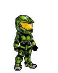 ) I'm fairly happy with the results. The recolored versions are supposed to be Multiplayer models, and I realize the blue one is exceedingly dark, but I didn't like it when I brightened things up.