|
|
|
|
|
|
|
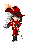
 Posted: Fri Feb 27, 2009 4:08 am Posted: Fri Feb 27, 2009 4:08 am
Miss Splatter, if we go to that line. biggrin
Leviatan items have been a bit troublematic, but damn those do look nice with water and anniversary sash.
8/10
|
 |
|
|
|
|
|
|
|
|
|
|
|
|
|
Posted: Sat Feb 28, 2009 4:35 pm
the body itself is put together really well, but the snow background doesn't fit in at all...
6/10
(I'm sorry Kazuma; I didn't mean to cause you permanent damage. It's totally worth the patch, though. 3nodding )
|
|
|
|
|
|
|
|
|
|
|
|
|
|
|
|
|
|
Posted: Wed Mar 04, 2009 5:54 pm
A bit off-topic but I just finished a sprite and wanted to share it with you. I've made only two of these, and use them in my rando-sig. =P  ...It's my avatar as a Trainer. I'll show the other too... 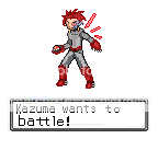 I don't like the new one as much as my old one...it feels....flat. =/
|
|
|
|
|
|
|
|
|
|
|
|
|
|
|
Posted: Fri Mar 06, 2009 7:11 pm
Okay, So...since my Alruna evolved to it's final level, I decided to put together the avi I made for the horns. I think this is the avi I made, but it was so many months ago. gonk
I originally had nothing in my hands, but I hate that so I added the gift of the gods (hades). I'm just disapointed that it's color scheme doesn't coincide with my own, the black isn't purple-ish and the freaking bottom tip has just a little gold. gonk
|
|
|
|
|
|
|
|
|
|
|
|
|
|
|
|
|
|
Posted: Sat Mar 07, 2009 7:12 am
|
|
|
|
|
|
|
|
|
|
Posted: Sat Mar 07, 2009 4:38 pm
7/10 - Too simple for my tastes - though it goes well with your username.
|
|
|
|
|
|
|
|
|
|
|
|
|
|
|
|
|
|
Posted: Sat Mar 07, 2009 10:04 pm
Would you mind terribly to restate that with more depth. Telling me it's good, while a polite gesture, is not going to give any advice. It is also a very vague thing to say; Getting a cookie is good, but so is finding 50 bucks on the street. Perhaps someone else would care to rate me? ________________________________________________________________________________________ As for you souiji: I really like the mech look. (It's a personal fave) It's almost perfect to me except for two things. The feet seem too gray and I think that the light blue type of those boots might do better, but then again...it might make it too blue; too bad there aren't any better boots for this. The lunar scythe is just that tad bit off to connect the wings and it bothers me, but that's impossible to fix. 9/10
|
|
|
|
|
|
|
|
|
|
|
|
|
|
|
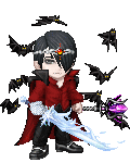
Posted: Mon Mar 09, 2009 6:05 pm
I really like the body, with the armor and collar together. That mask has always looked a bit off to me, kind of off-center, but you've used it pretty well. Likewise with the scales. I think the Gift of the Gods actually fits pretty well; I didn't even notice the gold before you pointed it out.
7/10
|
|
|
|
|
|
|
|
|
|
|
|
|
|
|
|
|
|
Posted: Tue Mar 10, 2009 3:44 pm
I remembered what I used now!
I also thought that the mask was...off...in a way, but nothing was working. Then the carols came around and made the avi better! I only remembered the mask, but this updated version was the one I wanted to use. blaugh
It's better with the face paint, no?
|
|
|
|
|
|
|
|
|
|
|
|
|
|
|
Posted: Wed Mar 11, 2009 3:50 pm
Yeah, I like the face paint!
|
|
|
|
|
|
|
|
|
|
|
|
|
|
|
|
|
|
Posted: Wed Mar 11, 2009 6:39 pm
Raven, I like yours IT'S SHINY! Yes, I am one of THOSE people. Anyways, I like the blend of colors. I like the gold and blue green color....whatever it's called. They go good together anyways. The blue hair thing sticks out, claiming the spotlight.
I like the shininess. YAY SHINY! Heh heh, sorry. sweatdrop
I give it an......8/10
|
|
|
|
|
|
|
|
|
|
|
|
|
|
|
Posted: Wed Mar 11, 2009 8:48 pm
8/10 - I like it, though I'm not a fan of the weird colored skins. Nicely put together and not cluttered.
|
|
|
|
|
|
|
|
|
|
|
|
|
|
|
|
|
|
Posted: Fri Mar 13, 2009 2:47 pm
8/10 on your's, though I think I miss the old whirling ball of colors look back from when I joined the guild. You should try that one again sometime.
|
|
|
|
|
|
|
|
|
|
|
|
|
|
|
Posted: Sun Mar 15, 2009 7:15 pm
Hm, I like the overall look, but I have a couple complaints. The purple stands out and clashes with the red, for one. I'd try a different staff, maybe the Gift of the Gods, like Kazuma's got. The torso also seems pretty bare in comparison with the rest, and I'd say try something on your head if you can find something that fits.
6/10
|
|
|
|
|
|
|
|
|
|
|
|
|
|
|
|
|
|
Posted: Mon Mar 16, 2009 4:05 pm
( Raven's comment to my staff is now invalid since I changed >: D )
Not as bubbly as your last one Raven, but it isn't bad. It makes me think of a scantly clad female warrior being attacked by a necromancer.
Unfortunatly for you, those shoulder pauldrons are differently pixelated than the rest of the avi and stand out far too much for me. ( They always do D: )
I also do not like the Holy Gauntlet's amulet, it pulls too much attention into it's vortex of pure white. @_@
Your avi has room for improvement. Unfortunatly....I can't think of anything without changing your color scheme. ( mythrill armor would add little annoying gold =/ )
6/10
|
|
|
|
|
|
|
|
|
|
|
|
|
|