|
|
|
|
|
|
|
|
|
 Posted: Tue Mar 31, 2009 2:26 pm Posted: Tue Mar 31, 2009 2:26 pm
Sorry for the delay. I forget to check in sometimes, lol!
xD
@ fading_clover
Well, to start off, it looks a bit uneven. The wing-thing on the left side doesn’t straighten out the white pixie wings on the right. I would really go with one or the other. I understand you want to incorporate the green and gold and white into it more…but it just looks off-balance. Think about it, `kay.
=]
Also, the green butterfly (one of the Coocoon stages right?) shouldn’t be there. Place it somewhere else, maybe? I just think there’s too much green by her feet.
Other than that, it looks good!
Overall, 6/10
|
 |
|
|
|
|
|
|
|
|
|
|
|
|
|
Posted: Tue Mar 31, 2009 2:29 pm
@ Magadei
Aha, you were right when you said I would get you for the too-many Fallen Wishes. Seriously Dei, couldn’t you come up with other items to add?
It’s too simple. The avatar in general needs more (and I’m not telling you to add another Fallen Wish!) Oh, and the Frostbite Blade’s staff part isn’t working with the look! The color’s too dark, and doesn’t go with anything. Add some more of that color, or get rid of it.
Overall, 2/10
|
|
|
|
|
|
|
|
|
|
|
|
|
|
|
|
|
|
Posted: Wed Apr 01, 2009 3:59 pm
|
|
|
|
|
|
|
|
|
|
Posted: Thu Apr 16, 2009 6:41 am
|
|
|
|
|
|
|
|
|
|
|
|
|
Posted: Tue Apr 21, 2009 7:12 pm
May I have a very good rate? I want to know how I can improve my avatar. ((I really like this one too!!))
|
|
|
|
|
|
|
|
|
|
|
|
|
|
|
Posted: Thu May 07, 2009 2:43 pm
Grrr, sorry for my long absence.
I've been kinda...tied up with everything that's going on here irl!
I'll try to stop in more and keep up, lol.
Don't hesitate to ask for a rate though!
I will get to your avatar, I promise!
n.n
|
|
|
|
|
|
|
|
|
|
|
|
|
|
|
|
|
|
Posted: Thu May 07, 2009 2:44 pm
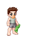
@ alligator2
So…it kind of looks like your avatar’s playing soccer with whatever it is that’s sitting by his feet. I don’t understand the purpose of the rose though. I think it doesn’t fit so my suggestion would be to get rid of it.
In general, the avatar’s very simple! I don’t mind the simplicity, but it just doesn’t impress me, even though it looks decent. The colors, for some reason, bother me ever so slightly though... ninja
Overall, 2/10
|
|
|
|
|
|
|
|
|
|
|
|
|
|
|
Posted: Thu May 07, 2009 2:51 pm
@ LadyKayHearts
I like it too!
n.n
But a few things do bother me…
First of all, I with the heart pin was more GOLD, know what I mean? For some reason, when I see it, it just looks really really dull and apart from the rest of the gold items of accent. I would also, if the layering makes it at all possible (because I know layering can be a pain sometimes), put on another gold anklet. It just distributed the gold evenly more so than it already does.
Secondly, I think the black/gray is a little overpowering. It’s defiantly the first thing I noticed when I looked at your avatar. Maybe lose Pop Top Class Coat? I think that might just do the trick to make things more even.
Lastly, I think the Gimpi is unnecessary. The bird just looks..random~ sweatdrop Maybe Demonic Anklets would work better, as long as no red shows cause I know one of the options has a red gem.
I do like how you distributed the brown! It’s not at all overpowering! =]
Overall, 5.6/10
|
|
|
|
|
|
|
|
|
|
|
|
|
|
|
|
|
|
Posted: Sat Jul 11, 2009 10:21 pm
|
|
|
|
|
|
|
|
|
|
Posted: Sun Jul 12, 2009 2:36 am
Nothing is certain except for...
Uh... Rate me too?
...Death, Taxes and Human Stupidity.
|
|
|
|
|
|
|
|
|
|
|
|
|
|
|
|
|
|
Posted: Sun Jul 12, 2009 10:42 pm
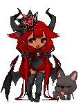
its grace SMILE // Well well let’s see here. I do like how it’s so very colorful. But, the thing is, all the colors are there, but they don’t match up to the other similar colors. The green tattoos on the legs are off and don’t go along with the other brighter greens throughout the rest of the avatar. I can understand wanting green on the legs to even it out, but because the colors are different, I think it would look fine without.
Next, too much black on the upper half. So, simply put, either get rid of the Coco, or add more black to the bottom half, but I would really go for the Coco, because if you added more black, that would just look strange. But that’s up to you!
Then I am going to have to complain about the shirt underneath…the music note one. The colors don’t match that of anything else on the avatar…and same goes for the leg warmers. It would be ideal if the colors were the same…but Gaia doesn’t like to be quite that nice~
;]
Lastly, I really don’t like the puffy things on the arms…they just seem out of place. Maybe it’s just me, but yeah.
As for the good parts, I really like the where you used orange and red. They are pretty even, although the flower is a bit overpowering…but it’s cute! > w<
Your gold is also used quite well!
Overall, 4/10
|
|
|
|
|
|
|
|
|
|
|
|
|
|
|
Posted: Sun Jul 12, 2009 10:45 pm
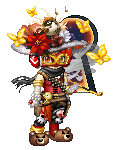
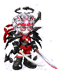
Epic Flawless // I must say, you certainly do like black and white! xD Seriously, whenever I see your avatar, those are the colors I see!
Anyway, you defiantly did a good job on splitting your avatar in half evenly with black and white. So kudos to you on that. Because of the theme your avatar has going, I really don’t have much to critique about it. In my humble opinion, I would add just a speck of white evenly near the feet, and then the same with black for the top. Like…if I chose the items, I would have you add the smaller horns of the demon and then like…some kind of white things around the feet…but I’m drawing a blank at the moment so blah~
Overall, 4.3/10
|
|
|
|
|
|
|
|
|
|
|
|
|
|
|
|
|
|
Posted: Mon Jul 13, 2009 3:04 am
|
|
|
|
|
|
|
|
|
|
Posted: Mon Jul 13, 2009 9:15 am
thanks :D
i knew there was a reason for PMing you xD
|
|
|
|
|
|
|
|
|
|
|
|
|
|
|
|
|
|
Posted: Thu Jul 16, 2009 12:41 pm
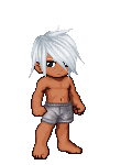
ahovi // Pretty simple avatar. The cargo pants don’t really sit well with me because they seem out of place, and same with the scythe cause the silver doesn’t really match. The red in the shoes are also off compared to the hair and scarf.
I would say try different shoes and maybe a different accessory/what the avatar is holding. Also, Maybe different pants and a red belt?
Overall, .8/10
|
|
|
|
|
|
|
|
|
|
|
|
|
|
|
|
|
|