|
|
|
|
|
|
|
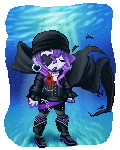
 Posted: Sat Jun 20, 2009 9:11 pm Posted: Sat Jun 20, 2009 9:11 pm
8/10 It's not bad but I'm just not feeling the color scheme.
|
 |
|
|
|
|
|
|
|
|
|
|
|
|
|
Posted: Sun Jun 21, 2009 9:52 am
Launch the polaris,
The end doesnt scare us!
Not much you can do to make it better.
10/10 When will this cease? The warheads will all rust in peace!
|
|
|
|
|
|
|
|
|
|
|
|
|
|
|
|
|
|
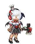
Posted: Sun Jun 21, 2009 9:59 am
I like it, but not exactly the Shadow Spirit.
^^;
9//1o
|
|
|
|
|
|
|
|
|
|
|
|
|
|
|
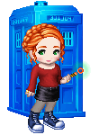
Posted: Sun Jun 21, 2009 10:00 am
9/10 More skin! More Skin!
|
|
|
|
|
|
|
|
|
|
|
|
|
|
|
|
|
|
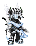
Posted: Sun Jun 21, 2009 10:06 am
o.o I... for once I actually have no suggestions for improvement. The blacks actually work well together, the style of the clothing (not just the color) work for the theme. 10/10
|
|
|
|
|
|
|
|
|
|
|
|
|
|
|
Posted: Sun Jun 21, 2009 10:07 am
9.5/10
Very nice, maybe just a tad more silver to go with the headband and katana?
|
|
|
|
|
|
|
|
|
|
|
|
|
|
|
|
|
|
Posted: Sun Jun 21, 2009 10:16 am
They match each other; there is really nowhere left on the avatar to equip more silver, and none of the other items can be replaced.
As for yours (be aware that I am seriously picky and none of this should ever be taken as a personal insult)... You have too much there that makes no sense. The horns probably need to go, since the WTF hat obscures the third one and the two that are visible just look... awkwardly placed.
Also, whatever those shoulder pads are, they don't go. At all. The white on them is a very bright white that isn't found anywhere else on your avatar, so they look out of place. I'm not a huge fan of the three red dots on one of your gloves, either, since that color isn't found anywhere else on your avatar. The rest of the upper body is fine, though.
As for the lower body, my only real problem is the pants. The jacket thing, hat, and most of the scarf are a 'soft' sort of worn-out looking black. The pants are much... blacker. But other than that, you're good.
|
|
|
|
|
|
|
|
|
|
|
|
|
|
|
Posted: Sun Jun 21, 2009 10:21 am
O.o
9/10 I think it matches for the most part but it's just an awkward color scheme.
|
|
|
|
|
|
|
|
|
|
|
|
|
|
|
|
|
|
Posted: Sun Jun 21, 2009 10:30 am
works pretty well ,like the demonic theme ^^ i say 10/10
theres nothing i can point out ,its well put together
|
|
|
|
|
|
|
|
|
|
|
|
|
|
|
Posted: Sun Jun 21, 2009 12:02 pm
Launch the polaris,
The end doesnt scare us!
Barton shoes and the Mythril Armor need to go.
8/10 still. When will this cease? The warheads will all rust in peace!
|
|
|
|
|
|
|
|
|
|
|
|
|
|
|
|
|
|
Posted: Sun Jun 21, 2009 4:27 pm
Suggestion: Create a completely new avi with a diff color scheme. I know you can do it Blood!
|
|
|
|
|
|
|
|
|
|
|
|
|
|
|
Posted: Sun Jun 21, 2009 4:32 pm
Reallly nice. o: I'd say 9/10 because nothing can be truly perfect. >:u
|
|
|
|
|
|
|
|
|
|
|
|
|
|
|
|
|
|
Posted: Sun Jun 21, 2009 5:33 pm
8.5
The hair color bugs me a little, and I think it could maybe just you a little something extra (but the hair color change might do it)
|
|
|
|
|
|
|
|
|
|
|
|
|
|
|
Posted: Sun Jun 21, 2009 5:54 pm
9/10
Looks nice, but i don't really like the eyes
And your other hand looks empty
But it's realy nice
|
|
|
|
|
|
|
|
|
|
|
|
|
|
|
|
|
|
Posted: Sun Jun 21, 2009 7:44 pm
7/10, because the gauntlets don't really do much and really just contrast far too much. The older look seems better for you.
|
|
|
|
|
|
|
|
|
|
|
|
|
|