|
|
|
|
|
|
|
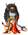
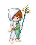
 Posted: Mon May 29, 2006 12:01 pm Posted: Mon May 29, 2006 12:01 pm
Awesome, Wedsday! Those look great. Amazing shading on the skirt.... nice boobage work too, lol. Superb! 4laugh
|
 |
|
|
|
|
|
|
|
|
|
|
|
|
|
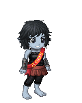
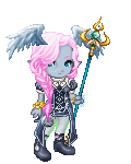
Posted: Mon May 29, 2006 1:47 pm
Good job Weds.
Here's mine
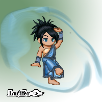
Image:
|
|
|
|
|
|
|
|
|
|
|
|
|
|
|
|
|
|
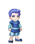
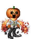
Posted: Mon May 29, 2006 4:26 pm
Im trying to make a blue vest that matches the little blue belt and its sorta hard to make it look puffy and suggestions?
|
|
|
|
|
|
|
|
|
|
|
|
|
|
|
Posted: Tue May 30, 2006 7:20 pm
|
|
|
|
|
|
|
|
|
|
|
|
|
Posted: Wed May 31, 2006 2:06 am
Thanks guys!
Lucifer: I like the pose change, something I always have trouble with too.
Sharpie5: I usually blend to make it a little fuzzy, then highlight in bubbles.
& Fate: Gorgeous dress! I love how her eyes complement everything.
|
|
|
|
|
|
|
|
|
|
|
|
|
|
|
Posted: Thu Jun 01, 2006 1:27 am
I'm doing this for another website (Zantarni.com) and it's going to be more pixel art then the usual Gaian edits. Let me know if there's any problems with the basic outline/anatomy/etc. I haven't refined the outline yet, so don't worry about how chunky it is atm.  Feel free to do a red line draw-over thing. And be harsh! I promise to refrain from chewing on your face. wink (And in case you're wondering, yes, she'll have hair by the time I'm done with her.)
|
|
|
|
|
|
|
|
|
|
|
|
|
|
|
|
|
|
Posted: Thu Jun 01, 2006 5:14 pm
JuneBerry I'm doing this for another website (Zantarni.com) and it's going to be more pixel art then the usual Gaian edits. Let me know if there's any problems with the basic outline/anatomy/etc. I haven't refined the outline yet, so don't worry about how chunky it is atm. Feel free to do a red line draw-over thing. And be harsh! I promise to refrain from chewing on your face. wink (And in case you're wondering, yes, she'll have hair by the time I'm done with her.) I'm usually a big stickler on anatomy. But June, I think you nailed it dead on. If there's anything wrong I can't spot it. I look forwards to seeing the finished version! Anyways.  The medieval section of my shop has gotten completely out of hand.
|
|
|
|
|
|
|
|
|
|
|
|
|
|
|
Posted: Thu Jun 01, 2006 8:30 pm
Thanks, Kiddo. Those edits are great. And the 2 edits in your sig are absolutely fabulous. biggrin
|
|
|
|
|
|
|
|
|
|
|
|
|
|
|
|
|
|
Posted: Sat Jun 03, 2006 5:33 pm
 I tryed the tutoial with robin, and I thinks its ok but not good I tryed the tutoial with robin, and I thinks its ok but not good
|
|
|
|
|
|
|
|
|
|
|
|
|
|
|
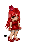
Posted: Sat Jun 03, 2006 10:04 pm
Snazzy Sharpie ^_^
I think you could use a little shadow under her hands, and the left side of the dress would go straight down, instead of slightly tilting to the left, 'cause of gravity. Of course, that doesn't count if there's a slight breeze or something. Love the color and the pose =D
|
|
|
|
|
|
|
|
|
|
|
|
|
|
|
|
|
|
Posted: Sun Jun 04, 2006 2:23 am
Ok, folks, this one's for a contest so tell me which you prefer (and a why would be nice wink ). Background or no background? Any other suggestions are also welcomed. 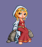 
|
|
|
|
|
|
|
|
|
|
|
|
|
|
|
Posted: Sun Jun 04, 2006 4:41 am
I'd reccommend no background, as the shade of
violet you're using there detracts from the impact
of the actual drawing. The character seems to stand
out much more on a transparent background.
Plus, you've already got a rock there,
so you needn't clutter it with much else.
Lovely pixels by the way. I like the hair you managed to devise. :3
|
|
|
|
|
|
|
|
|
|
|
|
|
|
|
|
|
|
Posted: Tue Jun 06, 2006 12:05 pm
Ok, one more time. I've made a couple of slight changes (and decided to ditch the background wink ). Ok, the first one is the "before" version which is just like the no-background one in my previous post. In the second one, I've gotten rid of some of the bangs so that you can see her eyebrows, and I've also moved her pendant that was a necklace to be a jewel on her headband. Which do you prefer?  Oh, and just for fun, I thought I'd share what I had originally intended the whole thing to look like (and I'm still gonna try, but I'm not sure I'll have enough time before the contest ends). It has a background. ooooo surprised hehe 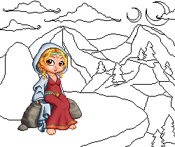 C+C on anything within this post is uber-welcomed. mrgreen
|
|
|
|
|
|
|
|
|
|
|
|
|
|
|
Posted: Tue Jun 06, 2006 9:31 pm
I think I like the second one on the top row better. Being able to see her eyebrows shows a little bit more contrast on her face. Having the little jewel/pendant over the dress looks good too. I would probably keep that there and not on the headband, but loose the bangs. I looks great!!
As for the background you were originally trying for... That would look awesome. If you had time to do it, I would say go for it, maybe with greens and some yellows? But if not... it still looks great. ^_^
|
|
|
|
|
|
|
|
|
|
|
|
|
|
|
|
|
|
Posted: Wed Jun 07, 2006 8:35 pm
Shwee!! My latest edit, and my latest self-portait!

And thank you my dearest Judyfay for my FANtastic new signature!!
*dances*
|
|
|
|
|
|
|
|
|
|
|
|
|
|