|
|
|
|
|
|
|
|
|
 Posted: Sat Oct 04, 2008 7:16 pm Posted: Sat Oct 04, 2008 7:16 pm
I'm so sorry I haven't been around!
I will get to all of you hopefully by the end of this weekend.
=]
Just hang in there~
;D
|
 |
|
|
|
|
|
|
|
|
|
|
|
|
|
Posted: Sat Oct 04, 2008 7:27 pm
@ cheshirechic2010
First off, WAY too many creatures. It’s too cluttered, whether you like animals or not. You can express your like of animals without having so many on an avatar.
Moving on, the outfit is kinda random, don’t you think? It looks like you just put stuff on your avatar without really caring as to what colors match and so on. Re-do the clothing options based on the few animals you choose to keep. Just re-do is kay!
=]
Overall, 0/10
|
|
|
|
|
|
|
|
|
|
|
|
|
|
|
|
|
|
Posted: Sat Oct 04, 2008 7:58 pm
@ kreature123
Well, to start off, I really like what your avatar looks like! xD
It’s really cute. n.n
I would say there is too much white around her legs/bottom though. I wish the bottoms had like black or gold on them, that would be nice. It’s not that big of a deal though.
The bow on her head is a little grey but that’s not a big deal either.
Overall, 7.8/10 <3
|
|
|
|
|
|
|
|
|
|
|
|
|
|
|
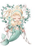
Posted: Sat Oct 04, 2008 8:00 pm
@ ~Love Will Tear Us Apart~
I must say, the colors are spread out quite well. But there is too much gold around her face. It wouldn’t be such a good idea to get rid of the gold strings and just have gold bracelets [I see one I think already]
So I really don’t have much else to say…it looks good.
Overall, 7/10
|
|
|
|
|
|
|
|
|
|
|
|
|
|
|
|
|
|
Posted: Sat Oct 04, 2008 8:01 pm
@ ~Love Will Tear Us Apart~
So cute~ n.n Does look a little busy around the torso but it works!
I seriously don’t have complaints… 0.o
Overall, 7.9/10
|
|
|
|
|
|
|
|
|
|
|
|
|
|
|
Posted: Sat Oct 04, 2008 8:03 pm
@ keito melfina
It’s not that great, I must say~ You just have different things going on; and those things don’t go together. The grey at the bottom doesn’t match anything, the top is random and needs to be re-done completely, and it just looks like a hassle of monthly collectables and cash shop items. Try something different…stick with ONE theme and spend time on it.
Overall, 0/10
Oh…did you want me to rate your ninja avatar?
|
|
|
|
|
|
|
|
|
|
|
|
|
|
|
|
|
|
Posted: Sat Oct 04, 2008 8:04 pm
@ its grace SMILE
It’s very simple, and I like it! I would suggest some white shoes though…I don’t like avatars with nothing shoe-like on their feet.
I would say get rid of the tattoos, they aren’t necessary.
Just find little items and accessories to make the avatar look more interesting. Keep them small and simple though; there is nothing wrong with being subtle.
Overall, 5.7/10
--------------------
[Dream Avatar] Interesting…but needs some work.
The avatar is heavy on its right[our left] so that should probably be evened out with something.
Too much dull green on her feet…I would say get rid of it and replace it with something else.
Just add some different things…make it look more interesting, and see if it improves.
Overall, 4/10
|
|
|
|
|
|
|
|
|
|
|
|
|
|
|
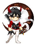
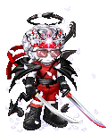
Posted: Sun Oct 05, 2008 5:40 am
Yes. Rate the ninja one please!!!
* I'll try working to improve my current Avi...
|
|
|
|
|
|
|
|
|
|
|
|
|
|
|
|
|
|
Posted: Sun Oct 05, 2008 9:02 am
scream to be heard
O:
i almost got a 6 :D
tankies x] like you needed any more attention
|
|
|
|
|
|
|
|
|
|
|
|
|
|
|
Posted: Sun Oct 05, 2008 10:52 am
|
|
|
|
|
|
|
|
|
|
|
|
|
Posted: Sun Oct 05, 2008 3:01 pm
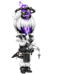
@ keito melfina
[Dream Avatar] Yes, I do get the feeling of the theme, but unfortunately, things are wrong with this avatar.
First of all, why is the shrine in the background? I really don’t like the Gaia background items, I don’t find them necessary. There is also nothing to match on the avatar itself. If you can make it look good, by all means, keep it. But if you can’t, get rid of it.
Secondly, the purple flames are a distraction. When I first looked at the avatar, the flames are what I saw[along with the shrine] and not the actual avatar. The shuriken is kinda purple-ish in a way, but that doesn’t make up for the flame colors itself. I would say get rid of them. What do flames have to do with a ninja? Is should be smoke or something instead, if you want some kind of effect.
So the shoes/socks…don’t match. It’s like BAM, white! Ninjas should blend together in every aspect, so the white is really distracting.
In general, go over everything again and edit the avatar. Take out the unnecessary, change the distractions, and really focus on the ninja theme you are trying to accomplish.
Overall, .5/10
----------------
@ its grace SMILE
Yep!
x3
Keep workin` at it!
<3
@ ~Love Will Tear Us Apart~
No prob~
=]
|
|
|
|
|
|
|
|
|
|
|
|
|
|
|
Posted: Sun Oct 05, 2008 4:32 pm
Could I have a rate please? ^^
|
|
|
|
|
|
|
|
|
|
|
|
|
|
|
|
|
|
Posted: Sun Oct 05, 2008 4:56 pm
scream to be heard
i got a new dream avi ;D
but i wont show you [[ yet x] ]]
cause i already asked you to rate like 9138749187 things xD like you needed any more attention
|
|
|
|
|
|
|
|
|
|
|
|
|
|
|
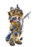
Posted: Sun Oct 05, 2008 5:24 pm
May I please have a rate.
-Thank you in Advance-
I am going for a Masquerade theme.
|
|
|
|
|
|
|
|
|
|
|
|
|
|
|
|
|
|
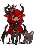
Posted: Mon Oct 06, 2008 9:14 am
Love me, Dread me...
Can I have a rating?
...Eternal Dread me.
|
|
|
|
|
|
|
|
|
|
|
|
|
|
|
|
|
|