|
|
|
|
|
|
|
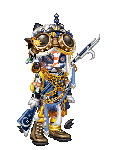
 Posted: Sat Nov 01, 2008 1:44 pm Posted: Sat Nov 01, 2008 1:44 pm
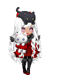
Your avis a little to cluttered with commons. Mabey spread it out more? -1
I don't like the mask. It seems out of place. -1
And only those 3 colors makes it look very plain. -1
And the head band over the mask looks out of place also -1
6/10
|
 |
|
|
|
|
|
|
|
|
|
|
|
|
|
Posted: Sat Nov 01, 2008 4:53 pm
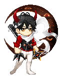
9.5! No complaints, except for that sliver of gray, is that a lunar scythe??? The dark gray color is a bit irking me...
|
|
|
|
|
|
|
|
|
|
|
|
|
|
|
|
|
|
Posted: Sat Nov 01, 2008 6:49 pm
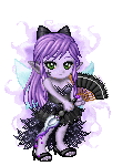
I like it. Even though the cape dose'nt really match. It just seems to go for me c: I think it's the purple and golds together, it's looks pretty heart lol I'd add a little more or a little less to it though. Some of it dose'nt seem to go together 8/10
|
|
|
|
|
|
|
|
|
|
|
|
|
|
|
Posted: Sat Nov 01, 2008 9:23 pm
|
|
|
|
|
|
|
|
|
|
|
|
|
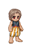
Posted: Mon Nov 03, 2008 2:38 am
There isn't a whole lot there, but despite that, it just seems to piece together well with what it's got.
7/10
:]
|
|
|
|
|
|
|
|
|
|
|
|
|
|
|
Posted: Mon Nov 03, 2008 4:50 pm
Check yes Juliet
Are you with me?
Rain is falling down on the sidewalk
I won't go until you come outside.
Check yes Juliet
Kill the limbo
I'll keep throwing rocks at your window
There's no turning back for us tonight.
Lace up your shoes
Eh Oh Eh Oh
Here's how we do. •••••••Angelic•••••••
9/10
Simple, but effective.
x3
But since the Cocoon thinger is a really dark purple, you should try to find something that matches it. 3nodding
But other than that, it looks good :3
•••••••Demon••••••• Run, baby, run
Don't ever look back.
They'll tear us apart if you give them the chance.
Don't sell your heart.
Don't say we're not meant to be.
Forever we'll be
You and me.
|
|
|
|
|
|
|
|
|
|
|
|
|
|
|
|
|
|
Posted: Mon Nov 03, 2008 9:27 pm
Black and white distribution is near-flawless,
but the gold is disappointing. Not only is gold
an overused color with black & white (which
indicates high expectations), but there is
considerably more gold on your top half. I
would suggest removing the wing, which I believe
makes the avatar look unbalanced. The golden
strings are too large of a gold object compared
to the small vestiges of gold elsewhere on the
avatar. I know gold items are hard to find, but
when incorporating gold into an outfit, it must be
blended in so that there are not only accessories
that add the new color. Still, I like it: it's clean
and simple. x3 6.5/10
|
|
|
|
|
|
|
|
|
|
|
|
|
|
|
Posted: Tue Nov 04, 2008 6:38 am
9/10, your avatars cool, but could use a little more blueish color....
|
|
|
|
|
|
|
|
|
|
|
|
|
|
|
|
|
|
Posted: Wed Nov 05, 2008 1:42 pm
3/10
Sorry but I don't see how it all goes together.
|
|
|
|
|
|
|
|
|
|
|
|
|
|
|
Posted: Wed Nov 05, 2008 8:51 pm
5/1o
At first glance, it looks kinda okay, but the different components altogether, like the panda and the Biancamella, it just doesn't work for me.
:]
|
|
|
|
|
|
|
|
|
|
|
|
|
|
|
|
|
|
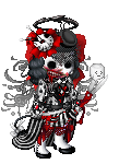
Posted: Wed Nov 05, 2008 10:13 pm
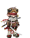
5/10
i dont see why people put buck teeth and stupid glasses on...
|
|
|
|
|
|
|
|
|
|
|
|
|
|
|
Posted: Sat Nov 08, 2008 5:24 pm
scream to be heard
7.5/10
robin:: well.. some people think they look good [[ like meh! ]]. calling something "stupid" is an opinion :P :] like you needed any more attention
|
|
|
|
|
|
|
|
|
|
|
|
|
|
|
|
|
|
Posted: Sun Nov 09, 2008 4:13 am
9/10
The colors flow perfectly.
I'll get back to you if I notice any potential flaws.
xB
|
|
|
|
|
|
|
|
|
|
|
|
|
|
|
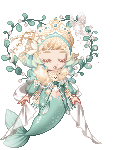
Posted: Sun Nov 09, 2008 12:45 pm
The hat and the moon make it look a little top-heavy,
and I don't think you need the extra elf items, but I
like the avatar in general. ^^ 7.5/10
|
|
|
|
|
|
|
|
|
|
|
|
|
|
|
|
|
|
Posted: Sun Nov 09, 2008 4:21 pm
scream to be heard
8/10
its unique as usual x]
the other thing thats bothering meh it the gold leg because its not the same shade of yellow D:
maybe a tattoo would be better..? like you needed any more attention
|
|
|
|
|
|
|
|
|
|
|
|
|
|