|
|
|
|
|
|
|
 Posted: Fri Oct 06, 2006 12:03 pm Posted: Fri Oct 06, 2006 12:03 pm
Your art is very good. I can see the improvements you've made from the first post to the last. Very good. 3nodding
|
 |
|
|
|
|
|
|
|
|
|
|
|
|
|
Posted: Sat Oct 07, 2006 2:40 pm
Zephyr87 Your art is very good. I can see the improvements you've made from the first post to the last. Very good. 3nodding I've improved that much? Thank you! mrgreen
|
|
|
|
|
|
|
|
|
|
|
|
|
|
|
|
|
|
Posted: Sat Oct 07, 2006 4:06 pm
Woglinde Zephyr87 Your art is very good. I can see the improvements you've made from the first post to the last. Very good. 3nodding I've improved that much? Thank you! mrgreen
|
|
|
|
|
|
|
|
|
|
|
|
|
|
|
Posted: Sat Dec 16, 2006 3:44 pm
|
|
|
|
|
|
|
|
|
|
|
|
|
Posted: Tue Jan 09, 2007 4:47 pm
A crappy doodle spawned during a Punnett square lecture during biology. I have one thing to say about it, TITTIES!!! xd : 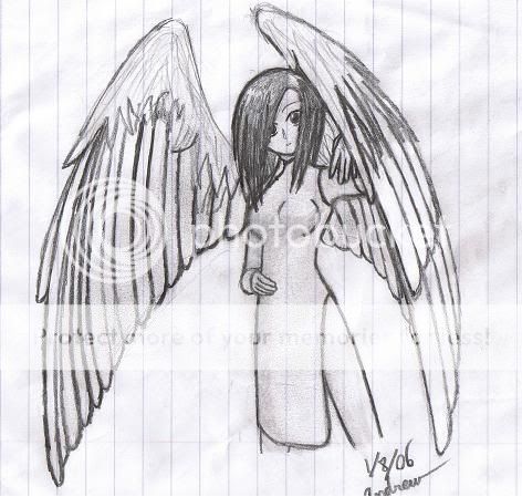 Painted with a crappy calligraphy brush smaller than my finger. Hard to control: 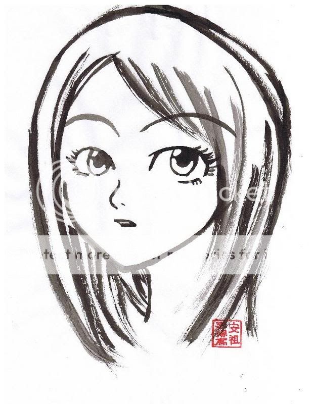 This is also my first (anime) painting, so I know I made ALOT of mistakes (V.V)
|
|
|
|
|
|
|
|
|
|
|
|
|
|
|
Posted: Tue Jan 09, 2007 5:13 pm
As for the ink painting, I think you did well with the eyes and face. However, the hair looks quite scratchy and sloppy. I think you should have stuck with the smooth style you did the face with. It'd also be nice to see some more free-flowing pieces. Ink is one of those medias that you can just swoosh around with graceful, un-calculated lines and come up with some beautiful stuff. I think you should experiment more with line texture and width, and try using long graceful strokes. smile Here's a few examples: 12The first drawing is pretty good. I like where you were going with the pose. The hand on our left could use a bit of work... it looks quite small. Her books also look unnaturally round. XD But yeah, it's a nice drawing.
|
|
|
|
|
|
|
|
|
|
|
|
|
|
|
|
|
|
Posted: Tue Jan 09, 2007 6:51 pm
Very nice, I see improvements too.
If I try hard enough, I might be able to match some of your sketches.
=B
I'm not all to good at drawing faces.
|
|
|
|
|
|
|
|
|
|
|
|
|
|
|
Posted: Wed Jan 10, 2007 8:54 pm
Tawney As for the ink painting, I think you did well with the eyes and face. However, the hair looks quite scratchy and sloppy. I think you should have stuck with the smooth style you did the face with. It'd also be nice to see some more free-flowing pieces. Ink is one of those medias that you can just swoosh around with graceful, un-calculated lines and come up with some beautiful stuff. I think you should experiment more with line texture and width, and try using long graceful strokes. smile Here's a few examples: 12The first drawing is pretty good. I like where you were going with the pose. The hand on our left could use a bit of work... it looks quite small. Her books also look unnaturally round. XD But yeah, it's a nice drawing. Thank you for the constructive criticism. I just bought a new and bigger brush for painting! <3 The older brushes I used were smaller than my middle finger XD So that should help me be ALOT more comfortable whan I paint next 3nodding Books? What books do you speak o Oh wait, Nevermind! xd
|
|
|
|
|
|
|
|
|
|
|
|
|
|
|
|
|
|
Posted: Thu Feb 01, 2007 6:06 pm
thats nice.........cool arties
|
|
|
|
|
|
|
|
|
|
|
|
|
|
|
Posted: Fri Feb 02, 2007 4:09 pm
NicoleB.Real thats nice.........cool arties Thank you! (^^)
|
|
|
|
|
|
|
|
|
|
|
|
|
|
|
|
|
|
Posted: Tue Apr 10, 2007 11:45 pm
My first colored picture! (^o^)/ 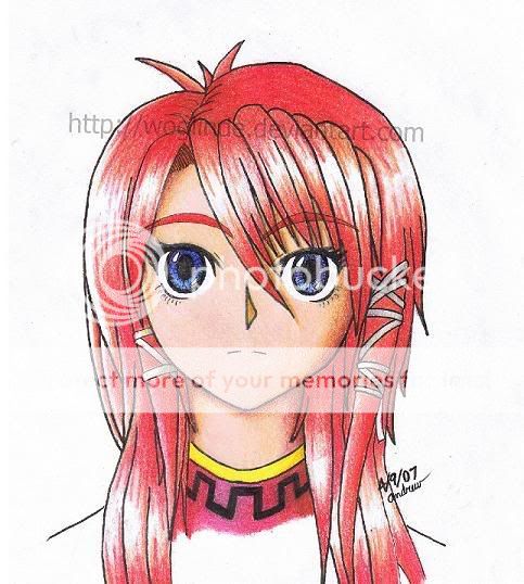
|
|
|
|
|
|
|
|
|
|
|
|
|
|
|
Posted: Sat Apr 28, 2007 3:02 pm
Another drawing in my "Mathbook" series! (Named creatively for where they are drawn!) Anyway I spent many math periods on this and seriously, uh...displeased...... my math teacher... >.> 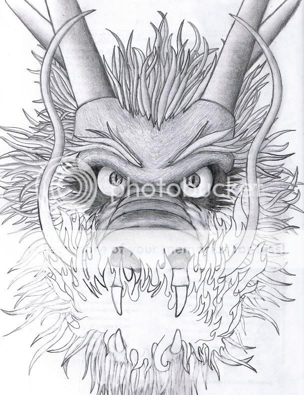
|
|
|
|
|
|
|
|
|
|
|
|
|
|
|
|
|
|
Posted: Tue May 01, 2007 11:01 am
Woglinde Tawney As for the ink painting, I think you did well with the eyes and face. However, the hair looks quite scratchy and sloppy. I think you should have stuck with the smooth style you did the face with. It'd also be nice to see some more free-flowing pieces. Ink is one of those medias that you can just swoosh around with graceful, un-calculated lines and come up with some beautiful stuff. I think you should experiment more with line texture and width, and try using long graceful strokes. smile Here's a few examples: 12The first drawing is pretty good. I like where you were going with the pose. The hand on our left could use a bit of work... it looks quite small. Her books also look unnaturally round. XD But yeah, it's a nice drawing. Thank you for the constructive criticism. I just bought a new and bigger brush for painting! <3 The older brushes I used were smaller than my middle finger XD So that should help me be ALOT more comfortable whan I paint next 3nodding Books? What books do you speak o Oh wait, Nevermind! xd For very thin lines I have a small suggestion that you may like to consider =) Completely free as well. Find some small but sturdy twigs. If there is any bark, scrape it off and you can shape the twig to fit your needs. They achieve a very nice consistent thin line, and well... it's free 3nodding Good job. I like your art. Bravo wink
|
|
|
|
|
|
|
|
|
|
|
|
|
|
|
Posted: Tue May 01, 2007 11:03 am
Good job for your first colored =) Love the shading.
|
|
|
|
|
|
|
|
|
|
|
|
|
|
|
|
|
|
Posted: Tue May 01, 2007 5:27 pm
Thank you! mrgreen So what do I do with the twigs? Use them as a ruler?
|
|
|
|
|
|
|
|
|
|
|
|
|
|