|
|
|
|
|
|
|
|
|
 Posted: Fri Oct 10, 2008 2:17 pm Posted: Fri Oct 10, 2008 2:17 pm
9/10
The bells are kind of offsetting, and something about the goggles...too bad they don't come in brown Other than that pretty sweet!
|
 |
|
|
|
|
|
|
|
|
|
|
|
|
|
Posted: Fri Oct 10, 2008 2:55 pm
7/10
Eh, umm... not too sure what going on here. Can't exactly grasp the theme.
|
|
|
|
|
|
|
|
|
|
|
|
|
|
|
|
|
|
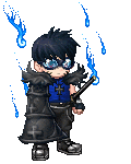
Posted: Fri Oct 10, 2008 3:20 pm
8/10
Like the Blue/White theme. It goes well together. I know that you are going for a Henshin Hero... I just don't think it looks like one... Otherwise, it is cool.
|
|
|
|
|
|
|
|
|
|
|
|
|
|
|
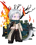
Posted: Fri Oct 10, 2008 3:33 pm
7.5/10 for your avatar. It's got the shinigami theme that a lot of the guild is sporting, though this one is slightly more complex than some others. For the most part, it matches the black and white color scheme, though for two reasons I didn't rate it higher: first, you have that random straw hat and the armor, and second, black and white is a slightly abused theme and I'd like to see a third color used consistently in the mix. Other than that, it's good, it suits you and I'm sure your character as well. Good job bud.
|
|
|
|
|
|
|
|
|
|
|
|
|
|
|
|
|
|
Posted: Fri Oct 10, 2008 3:46 pm
9.5/ 10
i like the way that everything flows with it, the only thing i dont like is the black body dye.
|
|
|
|
|
|
|
|
|
|
|
|
|
|
|
Posted: Fri Oct 10, 2008 3:50 pm
8/10
It's nice, but a bit empty, I do like the white and silver colour scheme thought.
|
|
|
|
|
|
|
|
|
|
|
|
|
|
|
|
|
|
Posted: Fri Oct 10, 2008 7:24 pm
((This is just a side note, so the next person who votes should rate Spellbound, not me.
Trust me, I tried coming up with another way to have the skin work out. The problem is that there isn't a brown body dye, and I couldn't find any good items that would cover the face and arms without looking extremely tacky or out of place. So instead of going with the normal skin color or the masterpiece's white, I decided on the death whisper consume because it places a passive color in its stead without making it stand out; the brown is much more dominant over the black. Besides that, it plays in with my "steampunk soldier" theme because it acts like soot, so yeah. I worked out all the kinks. ^^ ))
|
|
|
|
|
|
|
|
|
|
|
|
|
|
|
Posted: Fri Oct 10, 2008 7:28 pm
((I used to love to do this! ^^ ))
8.5/10 I like it a lot, but the boy standing next to you kind of throws the whole thing off.
|
|
|
|
|
|
|
|
|
|
|
|
|
|
|
|
|
|
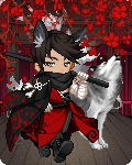
Posted: Fri Oct 10, 2008 7:31 pm
xZxThanatosxZx ((Lol I was hoping I wouldnt have been judged until I finished editing my avi. Damn lol =3 well Its been edited now =3 Re-Judge! =3 scream )) It looks rather awesome now. Sorry for bad timing... 9/10! Spellbound: 9/10. I know it's your character, which is always cute, but the litle dude kinda throws me off. Bonus point for the extra touch provided by the wing, though! Ara (You are the last poster; why don't I just rate you both!): I rather like the overall theme; looks like an aviator to me. The katana makes me think of a paratrooper, the soot face looks like you just saw combat, and the notebook makes me imagine that you're writing a novel about it. 10/10! EDIT: Why'd ya cut me off, Evil?! I've never been a fan of the items that just change your character into something... 5/10. I know your character transforms into a wolf; it's just my preference.
|
|
|
|
|
|
|
|
|
|
|
|
|
|
|
Posted: Fri Oct 10, 2008 7:37 pm
~Click them please~8/10
It's okay, but the kitty throws it off a little bit.
|
|
|
|
|
|
|
|
|
|
|
|
|
|
|
|
|
|
Posted: Fri Oct 10, 2008 7:41 pm
It's okay; it's a character detail, so it's sort of meant to give that effect. (I just need a kitsune to top it off... Damn you, market prices!)
Also: 8/10 for silly un-matching pants. Are you keeping them as Shinigami pants, or do you lack funds as well?
|
|
|
|
|
|
|
|
|
|
|
|
|
|
|
Posted: Fri Oct 10, 2008 7:42 pm
They're part of my character. xD
|
|
|
|
|
|
|
|
|
|
|
|
|
|
|
|
|
|
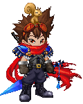
Posted: Fri Oct 10, 2008 9:27 pm
8.5/10 I like the cape you added. Though the design could use a bit more consistency, though.
Lol, removed the celebrity date due to the opinions *ships him off to my main*
And on a random note, I designed a Hollow Michi XD

|
|
|
|
|
|
|
|
|
|
|
|
|
|
|
Posted: Sat Oct 11, 2008 6:26 am
10/10 the Hollow Michi is freakin awesome if only I had the money to make a hollow version of my character.
Starts banging his head on a wall
|
|
|
|
|
|
|
|
|
|
|
|
|
|
|
|
|
|
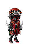
Posted: Sat Oct 11, 2008 11:13 pm
7/10
Its interesting. like a masked bandit.
|
|
|
|
|
|
|
|
|
|
|
|
|
|
|
|
|
|