|
|
|
|
|
|
|
|
|
 Posted: Tue Sep 11, 2007 11:59 pm Posted: Tue Sep 11, 2007 11:59 pm
Errol McGillivray There isn't enough detail to need the images to be that big. It makes the lines look clunky and we can see every little place where lines don't meet well or get wobbly. A suggestion along the same vein as this one that I would make is to vary your line weights. Instead of having all of your lines uniform and the same thickness, put emphasis on certain aspects to the drawing. You can do this in several different ways, such as measuring distance (objects closer 'the viewer' are 'heavier'), or make the extreme-outer-edge of the drawing heavier (as an outer-outline, if that makese sense). An example of what I mean, when used to measure distance, if this helps at all (I have no idea if it does). Anyway - not only does changing up the weight of your lines add visual interest to the picture, it's also an excellent, sneaky way to "cover up" jagged points.
|
 |
|
|
|
|
|
|
|
|
|
|
|
|
|
Posted: Sat Sep 15, 2007 11:20 pm
|
|
|
|
|
|
|
|
|
|
|
|
|
Posted: Tue Sep 18, 2007 10:15 am
I really like your drawings, they are nice. Although, as everyone has been saying, you need to work on some anatomy. I find that you should focus on the hands and breasts first (everything else is better). Sometimes hands are hidden, but I wouldn't suggest going out of your way to hide them (I have to admit I am guilty of that too though). Remember, a female's fingers should be slim and long (unless you're purposely making her hands look masculine). Also, see if you can't find a good female anatomy tutorial and study how the breasts look at different angles. They should be more rounded, not so pointy (unless you want her to look like Madonna! haha).
All in all, you are improving so keep up the good work! ^_^
|
|
|
|
|
|
|
|
|
|
|
|
|
|
|
Posted: Tue Sep 18, 2007 4:48 pm
thanks. and yeah. i need to find some. and yeah hands are one of my very big week points crying along with legs and getting the curves right on a guy. and guys are hard for me cuz they're so straight.
|
|
|
|
|
|
|
|
|
|
|
|
|
|
|
|
|
|
Posted: Tue Sep 18, 2007 5:57 pm
Guys are hard for me for the same reason. *hug*
|
|
|
|
|
|
|
|
|
|
|
|
|
|
|
Posted: Sun Sep 30, 2007 11:28 am
My first try at something realish other than the hand 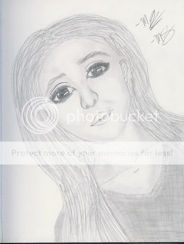 i think i'mma re-draw it with eyes like this: 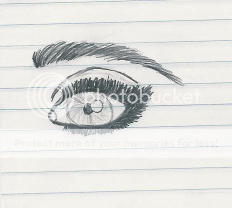 SORRY IT'S SO BIG!
|
|
|
|
|
|
|
|
|
|
|
|
|
|
|
|
|
|
Posted: Tue Oct 09, 2007 9:20 am
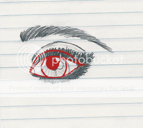 here is another paint over, hope it helps wink edit: p.s. when you draw eyelashes, less is more most of the times.
|
|
|
|
|
|
|
|
|
|
|
|
|
|
|
Posted: Tue Oct 09, 2007 2:17 pm
loontje here is another paint over, hope it helps wink edit: p.s. when you draw eyelashes, less is more most of the times. thanks. i wasn't going for totally realistic. i just wanted to try something different. creat my own way of doing it even if it's a bit over the top. ya know what i mean?
|
|
|
|
|
|
|
|
|
|
|
|
|
|
|
|
|
|
Posted: Tue Oct 09, 2007 8:36 pm
Here's a drawing of Hikaru from Magic Knights Rayearth. I know the eyes are a little off from eachother but i tried my best. comments? 
|
|
|
|
|
|
|
|
|
|
|
|
|
|
|
Posted: Sat Oct 20, 2007 9:20 pm
|
|
|
|
|
|
|
|
|
|
|
|
|
Posted: Sun Oct 21, 2007 8:18 pm
That last one is really well drawn!
The ears are uneven, and the left one should be more in line with the right one, as a general rule, the top of the ear lines up with the bottom/middle of the eyes.
Another thing that I noticed was the shaddow that the chin makes on the neck. It's a bit too exagerated in that the point of the shaddow from the chin is a bit too far to the right of the picture.
Good job with the fabric from the shirt!
Great job! I see improvemnt. :3
W/ the realistic solo eye. I agree with what loontje said, and also the angle of the lashes. They look unnatural, the way that they jut up so drastically on the corners, it should be a more gradual slope.
Good job on the eye brows!
W/ the realistic face.
Excelent job on the eyebrows. They look so real! However, with the nostrils on thenose, The upper part of the drawn line should be defined more w/shading, and not a definate line.
And that collar bone is just gorgeous!
Great job!!
I would do a draw over for you, but I dont have a tablet yet... T-T So sorry. I hope my descriptions are descriptive enough for you!
|
|
|
|
|
|
|
|
|
|
|
|
|
|
|
Posted: Mon Oct 22, 2007 6:28 am
Yuri Mono That last one is really well drawn! The ears are uneven, and the left one should be more in line with the right one, as a general rule, the top of the ear lines up with the bottom/middle of the eyes. Another thing that I noticed was the shaddow that the chin makes on the neck. It's a bit too exagerated in that the point of the shaddow from the chin is a bit too far to the right of the picture. Good job with the fabric from the shirt! Great job! I see improvemnt. :3 W/ the realistic solo eye. I agree with what loontje said, and also the angle of the lashes. They look unnatural, the way that they jut up so drastically on the corners, it should be a more gradual slope. Good job on the eye brows! W/ the realistic face. Excelent job on the eyebrows. They look so real! However, with the nostrils on thenose, The upper part of the drawn line should be defined more w/shading, and not a definate line. And that collar bone is just gorgeous! Great job!! I would do a draw over for you, but I dont have a tablet yet... T-T So sorry. I hope my descriptions are descriptive enough for you! Thank you! heh that helps a lot. LAtely i haven't had too much time to draw but when i do i'm trying to take in everything all of you say. Yeah i have A LOT of work to do before drawing actuall good realistis people. I just gave it a try cuz i was bored and such. Try new things right? I have a lot of trouble with the shading though. Thanks for all the advice though n_n. And your descriptions were just fine.
|
|
|
|
|
|
|
|
|
|
|
|
|
|
|
|
|
|
Posted: Mon Oct 22, 2007 6:29 am
By the way. the purple hairs account "shyneko" is mine too sorry for the confussion. i think i checked the guild on that account and forgot i wasn't on this one. lol
|
|
|
|
|
|
|
|
|
|
|
|
|
|
|
Posted: Mon Oct 22, 2007 8:59 am
|
|
|
|
|
|
|
|
|
|
|
|
|
Posted: Mon Oct 22, 2007 6:53 pm
My second attempt at a hand. Note, i had to keep moving my hand and trying to get it in the same position again cuz i was in spanish class whee . And yeah i know plenty of flaws. But at list it's harder than the last one i did right? 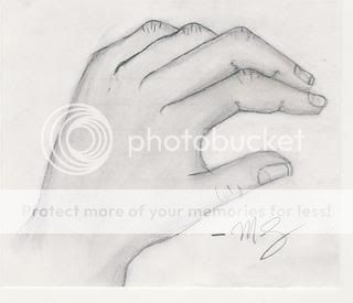
|
|
|
|
|
|
|
|
|
|
|
|
|
|
|
|
|
|