| Are You a Flamer? |
| Yes |
|
7% |
[ 12 ] |
| No |
|
18% |
[ 28 ] |
| Pff, I'm just a lonely poll whore. |
|
29% |
[ 45 ] |
| THIS. IS. SPARTA! |
|
45% |
[ 70 ] |
|
| Total Votes : 155 |
|
|
|
|
|
|
|
|
 Posted: Tue Nov 09, 2010 7:38 pm Posted: Tue Nov 09, 2010 7:38 pm
I really like it, Lemmy seems out of place, but you use it in all of your redesigns
|
 |
|
|
|
|
|
|
|
|
|
|
|
|
|
Posted: Sat Nov 13, 2010 7:34 pm
The blue part of the sword stands out soo much but I don't know what you could balance it with. Other than that great job with some hard to use items.
|
|
|
|
|
|
|
|
|
|
|
|
|
|
|
|
|
|
Posted: Sun Nov 14, 2010 7:53 am
I feel pretty, oh so pretty...
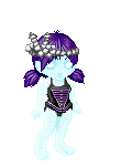
I like it, if a bit too much/too little yellow, but it's good. 3nodding
...Special Agent Emmmahy is on the case! ninja
|
|
|
|
|
|
|
|
|
|
|
|
|
|
|
Posted: Wed Nov 17, 2010 8:30 am
well there is a lot going on there
maybe clean up the background a bit and trim off some of the unnecessary stuff?
it just distracts
|
|
|
|
|
|
|
|
|
|
|
|
|
|
|
|
|
|
Posted: Wed Nov 17, 2010 8:59 am
Very simple. Assassain meets resident evil-ish. I like it.
|
|
|
|
|
|
|
|
|
|
|
|
|
|
|
Posted: Wed Nov 17, 2010 9:01 am
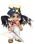
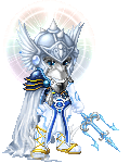
Very not-simple. xd
I don't like the hair or the wings (this shade of 'em anyway), it clashes too much with the shading of...everything else. xD
I'd say remove the wings and change hair. js.
|
|
|
|
|
|
|
|
|
|
|
|
|
|
|
|
|
|
Posted: Wed Nov 17, 2010 12:22 pm
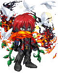
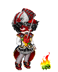
There's too much to make the costume work. Is it a pirate?
|
|
|
|
|
|
|
|
|
|
|
|
|
|
|
Posted: Wed Nov 17, 2010 1:34 pm
I have no idea. xd
Try adding a lil bit of green/blue on yer head.
|
|
|
|
|
|
|
|
|
|
|
|
|
|
|
|
|
|
Posted: Wed Nov 17, 2010 2:52 pm
Take out the water, screens, and Fausto's bottle and you'll be good. As it stands, they just clutter the background and add nothing to the outfit.
|
|
|
|
|
|
|
|
|
|
|
|
|
|
|
Posted: Wed Nov 17, 2010 3:43 pm
It's simple, quaint, stylish. It works. A real person might be wearing that somewhere in europe.
|
|
|
|
|
|
|
|
|
|
|
|
|
|
|
|
|
|
Posted: Wed Nov 17, 2010 9:11 pm
good theme, well put together, good color theme
the red of the Sake Hyotan Tokkuri kinda bugs me but it's a minor concern
|
|
|
|
|
|
|
|
|
|
|
|
|
|
|
Posted: Thu Nov 18, 2010 8:24 am
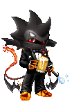
As much as I hate to say it since I don't want to buy anything from you, but I do like your avatar, it's simple, it's I'm going to ruin your day ninja swat like.
|
|
|
|
|
|
|
|
|
|
|
|
|
|
|
|
|
|
Posted: Thu Nov 18, 2010 11:54 am
Needs more blue/cyan to match the pages of the book.
|
|
|
|
|
|
|
|
|
|
|
|
|
|
|
Posted: Thu Nov 18, 2010 10:44 pm
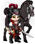
Interesting Pirate theme you have going there. I think that the various colors work well with your theme but it seems a little cluttered near your head.
|
|
|
|
|
|
|
|
|
|
|
|
|
|
|
|
|
|
Posted: Fri Nov 19, 2010 11:02 pm
Ooh, simple and evil. Nice and flowy - I like it.
|
|
|
|
|
|
|
|
|
|
|
|
|
|