|
|
|
|
|
|
|
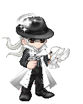
 Posted: Sun Jan 10, 2010 9:29 am Posted: Sun Jan 10, 2010 9:29 am
9/10
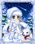
its hard to make a character in white isnt it? Even though you have a few differrent shades it was pulled off nicely.
|
 |
|
|
|
|
|
|
|
|
|
|
|
|
|
Posted: Sat Jan 23, 2010 8:23 pm
9/10
Kind of hillarious. Also kind of small - I wish there was something more going on (probably a background or something).
|
|
|
|
|
|
|
|
|
|
|
|
|
|
|
|
|
|
Posted: Thu Jan 28, 2010 3:25 pm
9 outa 10 I say.
Very similar to something you'd see outa Wonderland, like a vamped up Queen of Hearts of something. There's a lot goin' on there, but...somethin' 'bout it caused my to put it just shy of a 10...can't put my finger on it though......
|
|
|
|
|
|
|
|
|
|
|
|
|
|
|
Posted: Thu Jan 28, 2010 4:44 pm
8.978456481/10
Too simplistic for my tastes, but the colors compliment each other very well. i'd've given a 9 or higher if it didn't appear so blank to me.
|
|
|
|
|
|
|
|
|
|
|
|
|
|
|
|
|
|
Posted: Thu Jan 28, 2010 11:28 pm
8/10 It looks nice and very pretty, but it's a bit too clustered for my tastes.
|
|
|
|
|
|
|
|
|
|
|
|
|
|
|
Posted: Fri Feb 19, 2010 4:27 pm
6/10...not enough items to be considered a 7 but not too bad either
|
|
|
|
|
|
|
|
|
|
|
|
|
|
|
|
|
|
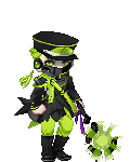
Posted: Fri Feb 19, 2010 7:02 pm
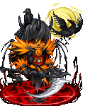
You have a color scheme, but the colors clash pretty badly. I do love the horns and Sentinel's Gift together, and I like your main body, but I think all the extras detract from it. The biggest problems, I think, are the Shadow Spirit and Pyre and the portal (all the purple, really), but I don't think the Flame Sword ties in well enough either without more balance to it. The yellow thing from the horns matches the Sword in color, but it doesn't seem to tie in thematically at all, so it doesn't help. It looks like you have two avatars together, the red one and the purple one.
I don't necessarily think that more items = better avatar. confused
5.3/10
|
|
|
|
|
|
|
|
|
|
|
|
|
|
|
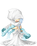
Posted: Sat Feb 20, 2010 9:50 am
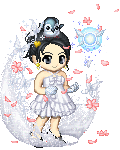
Wow 3nodding Your avatar is really pretty. I really like it! I like the way the colours kinda fade with the white. Puts me in mind of a rainbow. 9/10
|
|
|
|
|
|
|
|
|
|
|
|
|
|
|
|
|
|
Posted: Sat Feb 20, 2010 5:32 pm
6/10 I like the mix of the wings and the dragon on your head, but I think the pants and shoes clash. :/
|
|
|
|
|
|
|
|
|
|
|
|
|
|
|
Posted: Sun Feb 21, 2010 7:28 am
5/10 not to be mean but you look like a creepy marrionette doll
|
|
|
|
|
|
|
|
|
|
|
|
|
|
|
|
|
|
Posted: Sun Feb 21, 2010 11:45 am
4/10. you look all over the place... cant decide what kind of look you were going for
|
|
|
|
|
|
|
|
|
|
|
|
|
|
|
Posted: Sun Feb 21, 2010 3:17 pm
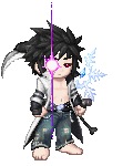
7/10
your look is kinda boring, it doesn't really tell a story. I can tell you put some thought into it.
And I'm supposed to be Nero from DMC4
|
|
|
|
|
|
|
|
|
|
|
|
|
|
|
|
|
|
Posted: Sun Feb 21, 2010 4:53 pm
I have to say that's really close to Nero but you have the color scheme backwards Red jacket Black Shirt And you could add a Aura or Get that fallen star guy as a background aura sooooo... 8/10
|
|
|
|
|
|
|
|
|
|
|
|
|
|
|
Posted: Mon Feb 22, 2010 8:37 am
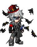
6/10 - I've seen better dark looking/demon looking avatars.
|
|
|
|
|
|
|
|
|
|
|
|
|
|
|
|
|
|
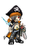
Posted: Tue Feb 23, 2010 2:06 am
8/10 I like yours, but I don't like the patch, it looks out of place.
|
|
|
|
|
|
|
|
|
|
|
|
|
|