|
|
|
|
|
|
|
|
|
 Posted: Sat Apr 12, 2008 8:31 am Posted: Sat Apr 12, 2008 8:31 am
|
|
|
|
|
|
|
|
|
|
Posted: Sat Apr 12, 2008 10:54 am
There may be many worlds,
But they all share the same sky!
I'm back for another beating, please
One sky...
One destiny...
|
 |
|
|
|
|
|
|
|
|
|
|
|
|
|
|
|
|
Posted: Sat Apr 12, 2008 11:17 am
|
|
|
|
|
|
|
|
|
|
Posted: Sat Apr 12, 2008 4:00 pm
@ Magadei
Well, I see you stuck to two colors. It’s not all that bad, but there are a few things I will pick out for you.
First of all, the ninja star in the back isn’t all “black”. It’s brown in some ways, but that’s not to say it ruins the avatar. It’s alright, even though I wouldn’t use it.
Secondly, there are about four or five different shades of black…not really something I want to see. The shoes match the pants, the gloves match the top, and the hat…doesn’t really match in color with the others. They are all kind of paired up on the avatar. Try and make them blend a little better.
Lastly, being a compliment, you spread the white areas out pretty nicely. There is some everywhere, so it works.
=]
Overall, 5.7/10
& that's all there is to it!      
|
|
|
|
|
|
|
|
|
|
|
|
|
|
|
|
|
|
Posted: Sat Apr 12, 2008 4:31 pm
|
|
|
|
|
|
|
|
|
|
Posted: Sat Apr 12, 2008 4:48 pm
|
|
|
|
|
|
|
|
|
|
|
|
|
Posted: Sat Apr 12, 2008 4:57 pm
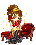
@ KRONiiCALLY KRiiSTEN
Let me begin with the worst parts, and make my way up. To start, why did you do that to her skin? It doesn’t match anything else on the avatar. If you wanted it to stick out, you did a great job. But unfortunately, it doesn’t do anything for her. I suggest you change it.
Next, her hair. There is only one other item on her that is brown: that being her top. This being said, it still doesn’t go. They are different hues of brown, and only match if there is MORE brown on the avatar itself.
The gold on the hat doesn’t match the sparse gold around the waist. I would suggest gold anklets and perhaps some gold on the arms. This way, the gold evens out over the whole avatar, not just the head!
As for the red, I’m not quite sure. It looks ok…but then again, off~ I don’t think it would hurt to leave it the way it is…but I’m sure there is a way to make it look a little better. I just can’t seem to think of how!
xD
The black, I would have to say, it pretty well spread out. Maybe a black skirt instead? The underwear isn’t that same shade as everything else…doesn’t look right to me~
Lastly, I think you need to add more to her. Maybe some kind of item on her back, a held-item, or some kind of tail? She just seems a little bare on the bottom.
Overall, 2/10
& that's all there is to it!
|
|
|
|
|
|
|
|
|
|
|
|
|
|
|
Posted: Sun Apr 13, 2008 8:49 am
|
|
|
|
|
|
|
|
|
|
|
|
|
Posted: Sun Apr 13, 2008 9:02 am
There may be many worlds,
But they all share the same sky!
What about this one?
One sky...
One destiny...
|
|
|
|
|
|
|
|
|
|
|
|
|
|
|
Posted: Sun Apr 13, 2008 9:28 am
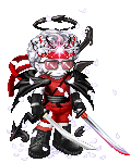
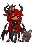
@ Magadei
Ok, first things first. I don’t really find the avatar as a whole, very appealing. I’m sorry, it’s just not.
That having been said, I’ll focus on a few key points, if you want to make it a little more even.
I see that you have added gold. Well, I think maybe you should add some to the head too. I don’t know how well that layering works, but some kind of head item that is gold.[Crown perhaps?]
Secondly, I don’t like the Demonbow – Demonic Anklet combo. The two, both being wing-like items, shouldn’t be used like that together. I would suggest either holding the Demonbow or changing the way the anklets are.
Your theme…I’m not really sure about. I don’t know what it’s supposed to be, so… I can’t really say much else.
Overall, 2.4/10
& that's all there is to it!
|
|
|
|
|
|
|
|
|
|
|
|
|
|
|
|
|
|
Posted: Mon Apr 14, 2008 3:06 pm
|
|
|
|
|
|
|
|
|
|
Posted: Tue Apr 15, 2008 2:58 pm
|
|
|
|
|
|
|
|
|
|
|
|
|
Posted: Wed Apr 16, 2008 12:02 am
Degrade- I mean, Rate me.
xd 3nodding
|
|
|
|
|
|
|
|
|
|
|
|
|
|
|
Posted: Wed Apr 16, 2008 8:53 am
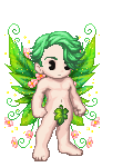
Please would you rate my avatar?
My rate to you...
I like it very much, I just think the Pixi wings and boots are a bit out of place. It might look better with a Nitemare bow instead of the wings, and defiantly go for red boots, just not that shade.
|
|
|
|
|
|
|
|
|
|
|
|
|
|
|
|
|
|
Posted: Wed Apr 16, 2008 2:20 pm
I improved it like you said. Any better?
|
|
|
|
|
|
|
|
|
|
|
|
|
|
|
|
|
|


 Vampy says: