|
|
|
|
|
|
|
|
|
 Posted: Mon Jul 09, 2007 8:22 pm Posted: Mon Jul 09, 2007 8:22 pm
ALL FINISHED!
THANK YOU GUYS SO MUCH. :3
(yes I suck at scythes. X3)

|
 |
|
|
|
|
|
|
|
|
|
|
|
|
|
Posted: Mon Jul 09, 2007 9:32 pm

Okay, I tried working on the current one... and I just couldn't get it right.

So I tried the one you 'failed'. I like this one better anyways.
Your main problem is, it seems like you're trying to get the figure at a side view, but you still want them front on. If you change the angle of the face/neck, this should make the problem less obvious.
The shoulders you do also are too pointy/too far out, so I made the transition smooother~ There's still some quarks with the red lines I've done (specifically with the arm on the left), but to fix it.. is to redo it all pretty much.
(I resized the second one, because it was easier to red line. As you linework + colour it, leave it full size. Once you're done, shrink it down and it'll be beautiful.)
|
|
|
|
|
|
|
|
|
|
|
|
|
|
|
|
|
|
Posted: Mon Jul 09, 2007 10:00 pm
Thank yooou! I was about to give up completely. (I'm hypercritical of my work)
I liked the seconed one too, better... the sketch was..well... a sketch.
So many red lines! D: *memories of TEH RED PEN* But now I know where to go... it was easy to see it was wrong, just not how to fix it. :b
Thanks so much, I shall improve this thing right away. ^o^
|
|
|
|
|
|
|
|
|
|
|
|
|
|
|
Posted: Mon Jul 09, 2007 10:13 pm
You're welcome 3nodding
It's good to notice the flaws in your own work, because then you can improve them... but it's not good to give up x__x!
|
|
|
|
|
|
|
|
|
|
|
|
|
|
|
|
|
|
Posted: Mon Jul 09, 2007 10:36 pm
Yeah, giving up is not good. My self-confidence is so low, though, that if something isn't looking good or showing promise right away, I get all discouraged. It's a curse, but I'm working to break it.
Thanks very much. ^^
Oh... and about the shoulders... I was going for that pointy/stiff look that coats/cloaks get. :b Didn't turn out so well.
|
|
|
|
|
|
|
|
|
|
|
|
|
|
|
Posted: Mon Jul 09, 2007 11:17 pm
Oh, well if it's the shoulder-pad thing.. then go for it, what really threw me off was just how the arms connected to the body smile
|
|
|
|
|
|
|
|
|
|
|
|
|
|
|
|
|
|
Posted: Tue Jul 10, 2007 12:27 am
Yeah... the connection... that was totally retarded... I should've made a skeletal line thingie over it just to see where I went wrong... didn't think of it until now, and I didn't want to redo the arm just yet.
It's looking better now. ^^;
|
|
|
|
|
|
|
|
|
|
|
|
|
|
|
Posted: Wed Jul 11, 2007 12:27 am
|
|
|
|
|
|
|
|
|
|
|
|
|
Posted: Wed Jul 11, 2007 1:43 am

I vote you make the blade of the scythe bigger, badder, and scarier. Even bigger than my weirdo monster one. I had to make the canvas bigger to do it properly, though. I cropped off the bottom of the arm, because it just looks better like this to me. I also extended the shading under his chin. Tracing is one of the biggest mistakes in cellshading.
http://www.mangarevolution.com/tutorial_display.php?tutorial_id=31 ; look at the difference between step #9 and step #10.
I totally did think of Alucard when I saw this, because of the broad shoulders, long hair, and crazy eyes XD. Nothing ya can do about that, it's a signature look~ Alucard is so going to be a clothing line. rofl.
|
|
|
|
|
|
|
|
|
|
|
|
|
|
|
Posted: Wed Jul 11, 2007 7:22 am
I thought he was based off of The Impaler, right? So to get away from Alucard, The Impaler is drawn with more like bulgey under-eyelids and a hooked nose, partially because that was how the artist did things, but that's how good old vlad was drawn and how you recognize him. You don't have to make the guy hideous or anything, but try incorporating some of the old painting into his face. 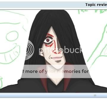 Use green in your shading.
|
|
|
|
|
|
|
|
|
|
|
|
|
|
|
|
|
|
Posted: Wed Jul 11, 2007 12:29 pm
Ah, thank you both so much!
I wasn't serious on the size of that scythe. ^^; Just doodling it in.
the turoial helped, but ostly the website it's hosted on. There's really great stuff! o___o
I completely redid the coloring on his outfit... got help from my mum (she watercolors veggies. <3)
I also put up a picture of good 'ol Vlad to reference to, and I think it helped.
Thanks for all the critique, I know I couldn't have gotten this far if you guys didn't help out. thanks so much. whee
|
|
|
|
|
|
|
|
|
|
|
|
|
|
|
Posted: Thu Jul 12, 2007 6:06 pm
XD kinda reminds me of Alucard from hellsing. But it look really good.
|
|
|
|
|
|
|
|
|
|
|
|
|
|
|
|
|
|
Posted: Thu Jul 12, 2007 6:13 pm
Ohhh, the colouring turned out really nicely biggrin !
|
|
|
|
|
|
|
|
|
|
|
|
|
|
|
Posted: Sat Sep 19, 2009 1:35 pm
|
|
|
|
|
|
|
|
|
|
|
|
|
Posted: Sat Sep 19, 2009 1:37 pm
 this is the first drawn pisture, its the butterfly from the corpse bride
|
|
|
|
|
|
|
|
|
|
|
|
|
|
|
|
|
|