|
|
|
|
|
|
|
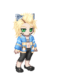
 Posted: Thu Jul 05, 2007 7:45 am Posted: Thu Jul 05, 2007 7:45 am
tell me anything i need to improve on. harsh critiquez r totally welcome.
im here to improve 3nodding
http://i45.photobucket.com/albums/f76/ohimsoawesomelvr/kittypencil1-2.jpg
sorry that u have to link it sad
|
 |
|
|
|
|
|
|
|
|
|
|
|
|
|
Posted: Thu Jul 05, 2007 9:04 am
umm 8-9 its good ^-^ can u do me one? xD wait let me pm u xD
|
|
|
|
|
|
|
|
|
|
|
|
|
|
|
|
Shameless Conversationalist
|
Posted: Mon Jul 09, 2007 10:46 am
err,...I like it?
Maybe you should try to draw cleaner lines. But I'm not very objective. I love those sketchy lines. sweatdrop The colouring is okay, but a little monotone, because of the gradients. Some shading would be nice.
Oh, and that net-shirt (idk how to call it) is two-dimensional, which is odd.....because the girl is 3d...I suppose? ^^
|
|
|
|
|
|
|
|
|
|
|
|
|
|
|
Posted: Sun Jul 15, 2007 4:41 pm
i like it a lot but some of the hair lines are coming out of the picture. Maybe you should use some thicker and full lines not like sorta kinda scratchy kind of lines
- but other than that, its awsome!-
|
|
|
|
|
|
|
|
|
|
|
|
|
|
|
|
|
|
Posted: Wed Jul 18, 2007 1:35 pm
i think its cute..
probably work on drawing cleaner and practice proportion..but thats about all
all in in..id give it a 7
|
|
|
|
|
|
|
|
|
|
|
|
|
|
|
Posted: Sat Jul 21, 2007 2:13 pm
I like it. It's really cute.
|
|
|
|
|
|
|
|
|
|
|
|
|
|
|
|
|
|
Posted: Mon Jul 23, 2007 3:23 pm
i actually like the skecthy lines. i thinkits a really cute pic ^^
|
|
|
|
|
|
|
|
|
|
|
|
|
|
|
Posted: Mon Jul 30, 2007 7:57 pm
It's very adorable! I think the sketchy lines make it unique and cute! Good work!
|
|
|
|
|
|
|
|
|
|
|
|
|
|
|
|
|
|
Posted: Tue Jul 31, 2007 12:37 pm
Porportionaly (not quite sure how to spell that sweatdrop ) I think that brining her hair line down would help and I agree that you should expirement with highlighting and shading
|
|
|
|
|
|
|
|
|
|
|
|
|
|
|
Posted: Fri Aug 03, 2007 10:40 pm
way better than anything i can do sweatdrop
|
|
|
|
|
|
|
|
|
|
|
|
|
|
|
|
|
|
Posted: Fri Aug 10, 2007 5:07 pm
Don't take this the wrong way if you've been drawing for many years, but it seems a little like a beginning artwork. (if it is, great, if not, then practice more) It may just be style, but I'm not too fond of the huge head/eye thing. But, overall, it is, as above stated, really cute. I'd say 5/10
|
|
|
|
|
|
|
|
|
|
|
|
|
|
|
Posted: Thu Aug 16, 2007 8:41 pm
Chujitsu-na-Rei i think its cute.. probably work on drawing cleaner and practice proportion..but thats about all all in in..id give it a 7 what she said. I like the face, it's cute.
|
|
|
|
|
|
|
|
|
|
|
|
|
|
|
|
|
|
Posted: Mon Oct 15, 2007 3:32 pm
try to work on shadows and light, more complex cloths and hair. Keep in ming hair is made of many little different colored lines
|
|
|
|
|
|
|
|
|
|
|
|
|
|
|
Posted: Fri Jan 11, 2008 12:26 pm
The overall image is good, and I agree with the sketchy lines. Just be careful not to make too many of them, for then it just looks like a scribble.
A straight-on drawing is a wonderful way to begin, but try to angle the face and body when you do more.
The face is awesome. I'm not a huge fan of the style of the eyes, but it fits your drawing nicely.
The shoulders seem a bit small and drawn in. Unless, of course, you were going for the enlarged-head type of look.
|
|
|
|
|
|
|
|
|
|
|
|
|
|
|
|
|
|
Posted: Sun Jan 13, 2008 12:10 pm
Good! but instead of movin the hairline down i think u should move the eyes nose and mouth up i mean that would be kinda a big head stare
|
|
|
|
|
|
|
|
|
|
|
|
|
|