|
|
|
|
|
|
|
|
|
 Posted: Fri Oct 20, 2006 8:41 am Posted: Fri Oct 20, 2006 8:41 am
Here Are Two Of My Latest Signatures, Tell Me What You Think... 1. 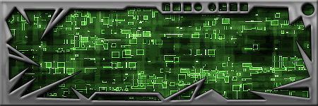 2. 
|
 |
|
|
|
|
|
|
|
|
|
|
|
|
|
Posted: Fri Oct 20, 2006 3:04 pm
Text could use mroe work on the animated one.
|
|
|
|
|
|
|
|
|
|
|
|
|
|
|
|
|
|
Posted: Fri Oct 20, 2006 10:58 pm
what do you mean could use more work? this is actually my first good-looking animated signature...
|
|
|
|
|
|
|
|
|
|
|
|
|
|
|
Posted: Sat Oct 21, 2006 8:39 am
I like the color choice, and the simplicity of the images, but there are some things I do not like about them. For one, the jagged, sharp borders you use around them. IMO they don't really help the image. In fact, they actually lessen the quality. You would really be better off with a 2px line border, rather than the beveled edges and choppy blocks. You could also make the animation of the text a little more definitive, it goes a little too quickly to run smoothly.
other than that, if its your first go at it, you are heading in a good direction =)
|
|
|
|
|
|
|
|
|
|
|
|
|
|
|
|
|
|
Posted: Sat Oct 21, 2006 9:58 am
AluRMeiN what do you mean could use more work? this is actually my first good-looking animated signature... But the text is too simple.
|
|
|
|
|
|
|
|
|
|
|
|
|
|
|
Posted: Fri Oct 27, 2006 5:09 am
You could turn the second one into a shoutbox. wink
|
|
|
|
|
|
|
|
|
|
|
|
|
|
|
|
|
|
|