|
|
|
|
|
|
|
|
|
 Posted: Sun Jun 18, 2006 3:17 pm Posted: Sun Jun 18, 2006 3:17 pm
There are a few iffy things, but overall I'm pleased with it.
What do youuu think?

|
 |
|
|
|
|
|
|
|
|
|
|
|
|
|
Posted: Sun Jun 18, 2006 4:39 pm
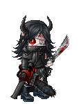
I like the main image, but I personally don't like the text or the circle shape of the background. The circle looks rushed, I think if you cleaned it up a bit it would improve the quality of the picture.
i love love how you did the girls hand. It's so graceful.
|
|
|
|
|
|
|
|
|
|
|
|
|
|
|
|
|
|
Posted: Sun Jun 18, 2006 5:03 pm
Yeah, that text is pretty bad.
Either use a ruler to draw in lines so you can write straight and have all your letters the same tallness (lack of a better word), or use stencils or something. D:
The image itself is really cool though. Except the girl's nose looks somewhat like a clown nose. ninja
|
|
|
|
|
|
|
|
|
|
|
|
|
|
|
Posted: Sun Jun 18, 2006 5:23 pm
yeah, i think this could do without the text
that way people can interpret it the way they see fit.
either that or you could just make that the name of the final piece.
i really like the monster-creature thing, especially his face.
maybe where you have all the filling in the bkg you could do silouhettes of a cave-like enviroment, i dont know. it seems like it's missing something in the bkg.
it took me a couple of mins to figure out the thing coverring the girl's eyes was a hand. maybe it's because the spacing between what would be the elbow and the hand is too short.
over-all, the shading seems to be much too gray. you should define the brightest and darkest parts of the figures and up the contrast a little.
|
|
|
|
|
|
|
|
|
|
|
|
|
|
|
|
|
|
Posted: Mon Jun 19, 2006 4:10 am
i think if you want to include text in any final piece of work, you need to make sure that the text is treated like part of the piece, and that an equal amount of effort goes into the appearance/quality of the text.
|
|
|
|
|
|
|
|
|
|
|
|
|
|
|
Posted: Mon Jun 19, 2006 5:25 am
I think your should make the black circle into a kind of set stone. Create a bit of a border.
The placing of the text is right, I mean, the way you have split it up is fine. The wording. I can't say I know much about text in pictures, other than that it looks very sketchy. You seem to have already recieved advise on that front though.
If you are worried about messing up what you already have you could always try printing off a few copies and seeing what you can do with the text and the background.
mrgreen
|
|
|
|
|
|
|
|
|
|
|
|
|
|
|
|
|
|
|