|
|
|
|
|
|
|
|
|
 Posted: Thu Aug 30, 2012 3:16 pm Posted: Thu Aug 30, 2012 3:16 pm
 Here's just a drawing I did in a realistic style this is a self-portrait by the way, my hair is different now 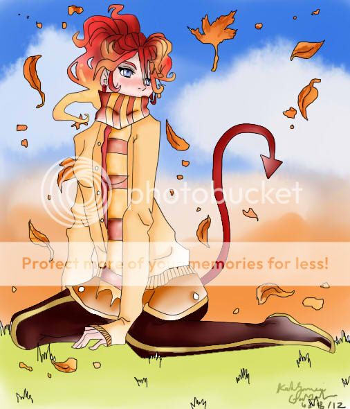 Also here's something I did digitally What do think?
|
 |
|
|
|
|
|
|
|
|
|
|
|
|
|
Posted: Thu Aug 30, 2012 9:58 pm
dang that's some nice art biggrin I think the self portrait would look better if the black was more solid if it didn't come in and out colorwise (if that makes sense :<) It also looks like you are trying to do rembrandt shadowing on the picture, which would be better achieved if you did not provide the little pice of light where the eyebrow is (it sort of throws me off)
|
|
|
|
|
|
|
|
|
|
|
|
|
|
|
|
|
|
Posted: Thu Aug 30, 2012 10:01 pm
I like your digital art the coloring is beautiful, i like how in the sky you took to opposite colors and used them together.
|
|
|
|
|
|
|
|
|
|
|
|
|
|
|
Posted: Thu Aug 30, 2012 10:02 pm
1eyeliner1 dang that's some nice art biggrin I think the self portrait would look better if the black was more solid if it didn't come in and out colorwise (if that makes sense :<) It also looks like you are trying to do rembrandt shadowing on the picture, which would be better achieved if you did not provide the little pice of light where the eyebrow is (it sort of throws me off) Thank You :3 it was my first time doing a self portrait like that, it was actually kind of a side project to a project i had already done in class, stupid teacher made me "fix" some things which i think made it look worse
|
|
|
|
|
|
|
|
|
|
|
|
|
|
|
|
|
|
Posted: Thu Aug 30, 2012 10:03 pm
D-ment Psyche I like your digital art the coloring is beautiful, i like how in the sky you took to opposite colors and used them together. Thank you :3 took me forever to do the sky, re-did it like 10 times
|
|
|
|
|
|
|
|
|
|
|
|
|
|
|
Posted: Thu Aug 30, 2012 10:04 pm
xXx_Zombeh Bunneh_xXx D-ment Psyche I like your digital art the coloring is beautiful, i like how in the sky you took to opposite colors and used them together. Thank you :3 took me forever to do the sky, re-did it like 10 times It payed off blue and orange are hard to put together without them clashing good job!
|
|
|
|
|
|
|
|
|
|
|
|
|
|
|
|
|
|
Posted: Thu Aug 30, 2012 10:08 pm
xXx_Zombeh Bunneh_xXx 1eyeliner1 dang that's some nice art biggrin I think the self portrait would look better if the black was more solid if it didn't come in and out colorwise (if that makes sense :<) It also looks like you are trying to do rembrandt shadowing on the picture, which would be better achieved if you did not provide the little pice of light where the eyebrow is (it sort of throws me off) Thank You :3 it was my first time doing a self portrait like that, it was actually kind of a side project to a project i had already done in class, stupid teacher made me "fix" some things which i think made it look worse No problem biggrin that's what this guild is for and if i didn't participate in helping out what would be the point :3 It's very impressive for a first time deal biggrin What did he make you do to fix it? Mean ol teachers never understanding the creative soul
|
|
|
|
|
|
|
|
|
|
|
|
|
|
|
Posted: Thu Aug 30, 2012 10:13 pm
1eyeliner1 xXx_Zombeh Bunneh_xXx 1eyeliner1 dang that's some nice art biggrin I think the self portrait would look better if the black was more solid if it didn't come in and out colorwise (if that makes sense :<) It also looks like you are trying to do rembrandt shadowing on the picture, which would be better achieved if you did not provide the little pice of light where the eyebrow is (it sort of throws me off) Thank You :3 it was my first time doing a self portrait like that, it was actually kind of a side project to a project i had already done in class, stupid teacher made me "fix" some things which i think made it look worse No problem biggrin that's what this guild is for and if i didn't participate in helping out what would be the point :3 It's very impressive for a first time deal biggrin What did he make you do to fix it? Mean ol teachers never understanding the creative soul she kept telling me to go over it, she said my black was too light which i didn't understand because it was a freaking black marker,how can it be light? it looks different in the scan than it does in rl.
|
|
|
|
|
|
|
|
|
|
|
|
|
|
|
|
|
|
Posted: Thu Aug 30, 2012 10:16 pm
xXx_Zombeh Bunneh_xXx 1eyeliner1 xXx_Zombeh Bunneh_xXx 1eyeliner1 dang that's some nice art biggrin I think the self portrait would look better if the black was more solid if it didn't come in and out colorwise (if that makes sense :<) It also looks like you are trying to do rembrandt shadowing on the picture, which would be better achieved if you did not provide the little pice of light where the eyebrow is (it sort of throws me off) Thank You :3 it was my first time doing a self portrait like that, it was actually kind of a side project to a project i had already done in class, stupid teacher made me "fix" some things which i think made it look worse No problem biggrin that's what this guild is for and if i didn't participate in helping out what would be the point :3 It's very impressive for a first time deal biggrin What did he make you do to fix it? Mean ol teachers never understanding the creative soul she kept telling me to go over it, she said my black was too light which i didn't understand because it was a freaking black marker,how can it be light? it looks different in the scan than it does in rl. ah that sounds really obnoxious. I don't see how black could be too light, maybe she just was a jerk who never got to use black markers in art class. Well keep up the good work, you are a talented person :3
|
|
|
|
|
|
|
|
|
|
|
|
|
|
|
Posted: Thu Aug 30, 2012 10:19 pm
1eyeliner1 xXx_Zombeh Bunneh_xXx 1eyeliner1 xXx_Zombeh Bunneh_xXx 1eyeliner1 dang that's some nice art biggrin I think the self portrait would look better if the black was more solid if it didn't come in and out colorwise (if that makes sense :<) It also looks like you are trying to do rembrandt shadowing on the picture, which would be better achieved if you did not provide the little pice of light where the eyebrow is (it sort of throws me off) Thank You :3 it was my first time doing a self portrait like that, it was actually kind of a side project to a project i had already done in class, stupid teacher made me "fix" some things which i think made it look worse No problem biggrin that's what this guild is for and if i didn't participate in helping out what would be the point :3 It's very impressive for a first time deal biggrin What did he make you do to fix it? Mean ol teachers never understanding the creative soul she kept telling me to go over it, she said my black was too light which i didn't understand because it was a freaking black marker,how can it be light? it looks different in the scan than it does in rl. ah that sounds really obnoxious. I don't see how black could be too light, maybe she just was a jerk who never got to use black markers in art class. Well keep up the good work, you are a talented person :3 thank you :3
|
|
|
|
|
|
|
|
|
|
|
|
|
|
|
|
|
|
Posted: Mon Sep 10, 2012 1:09 pm
I like your digital piece, although I think that if you are using lines that thin, maybe you'll want to colour them a little - dark enough to see them, but light enough so that they match the picture a little better (e.g use darker browns for the lines around bits of skin, darker version of the hair colour around that etc) or maybe use a thicker brush if you want to keep the lines black, to make them really stand out.
|
|
|
|
|
|
|
|
|
|
|
|
|
|
|
Posted: Thu Sep 20, 2012 8:36 am
The self portrait is a neat idea but its hard to tell whats what because the shadows all blend together and the marker was thick so detail looked like ti was harder to do. It might help to just use a thinner marker, or figure out a way to make definition in the shadow itself, like using a gradient.
as for the digital drawing, just take some practice on the human body to make proportions better. as for the coloring, it looks really good. the blending is really well done, but i think again the shadows should blend a little more
|
|
|
|
|
|
|
|
|
|
|
|
|
|
|
|
|
|
|