|
|
|
|
|
|
|
|
|
 Posted: Sat Mar 03, 2012 10:55 pm Posted: Sat Mar 03, 2012 10:55 pm
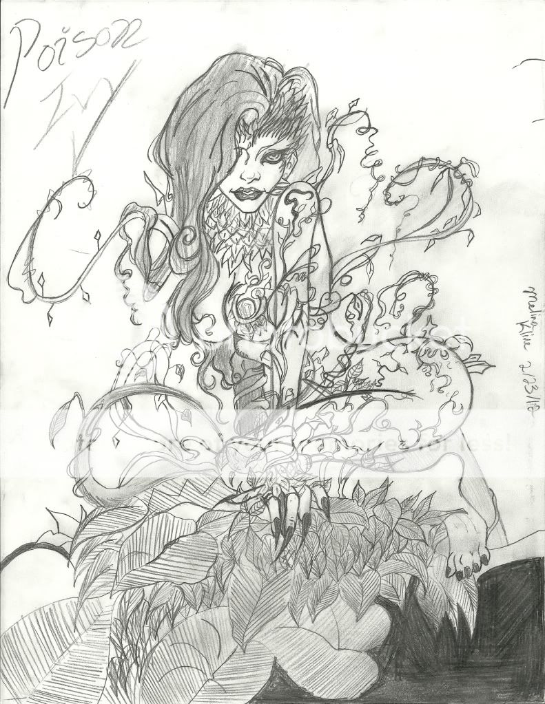
Hello. I've been an anime artist for 6 years, and have tried to move on to comic book art. This is one of my recent arts, could I get so criticism on it? Please don't be brutal >< It's Poison Ivy from Batman. 
|
 |
 |
|
|
|
|
|
|
|
|
|
|
|
|
 Posted: Sun Mar 04, 2012 2:25 pm Posted: Sun Mar 04, 2012 2:25 pm
it looks really good. i think you're getting the comic book art down really well.
i love the curve of her butt. XP
|
 |
 |
|
|
|
|
|
|
|
|
|
|
|
|
|
|
|
 Posted: Sun Mar 04, 2012 2:28 pm Posted: Sun Mar 04, 2012 2:28 pm
xxXSleepy_NinjaXxx it looks really good. i think you're getting the comic book art down really well.
i love the curve of her butt. XP lol thank you, it took 5 tries to get it perfect
|
 |
 |
|
|
|
|
|
|
|
|
|
|
|
|
 Posted: Wed Jun 20, 2012 4:52 pm Posted: Wed Jun 20, 2012 4:52 pm
Well, since you did say brutal...I will be as nit-picky as possible >: D
The black area to the bottom right. It seems you got a bit lazy on it since it's easier than shading the actual character but I would say to try and make it smoother and even. I can see different directions in your strokes and because not all of them are even, some rows are darker than others and there are small white spots you missed while shading. Also, some of the black leaked into the bottom leaf's outline. Other areas include her hair and bottom leaves.
I guess the only area where I see could use improvement is shading.
Nice job on her hands. I like how the wrinkles on her middle finger make it look like she's got a grip on that bush/leaves. Nice job on face and body. 3nodding
|
 |
 |
|
|
|
|
|
|
|
|
|
|
|
|
|
|
|
 Posted: Sun Jul 08, 2012 1:22 pm Posted: Sun Jul 08, 2012 1:22 pm
I can't criticize it.. it is too amazing 4laugh the only thing I can possibly think of to make it better is to color it..
|
 |
 |
|
|
|
|
|
|
|
|
|
|
|
|
 Posted: Mon Oct 22, 2012 1:47 pm Posted: Mon Oct 22, 2012 1:47 pm
I agree with PiratePockyPoo the only thing I can see fault with it is the lower right corner. Unless you did it on purpose it'd be better if it was all in one direction.. maybe you could try adding some shadding into the hair instead of all the same. I dunno how it looked in the manga but the heel of her foot looks like its protruding too much not sure.. = Well those are my thoughts. Its an awesome peice of work
|
 |
 |
|
|
|
|
|
|
|
|
|
|
|
|
|
|
|
 Posted: Tue Mar 05, 2013 6:56 pm Posted: Tue Mar 05, 2013 6:56 pm
I can be pretty mean when criticizing (if i feel like it)
but I'll try to be nice this time ^_^
The foot looks a bit odd. When you like colored and shaded, it seemed a bit lazy. The same with the lines on the leaves, but who can blame ya? Drawing the lines can be annoying -__- Unless you meant to shade, I son't think you had to draw that much lines for the leaves.
Other than those, It looks great ^_^
|
 |
 |
|
|
|
|
|
|
|
|
|
|
|
|
 Posted: Sat Mar 09, 2013 5:38 am Posted: Sat Mar 09, 2013 5:38 am
|
|
|
|
|
|
|
 |
|
|
|
|
|
|


