|
|
|
|
|
|
|
|
|
 Posted: Sun Feb 07, 2010 4:46 pm Posted: Sun Feb 07, 2010 4:46 pm
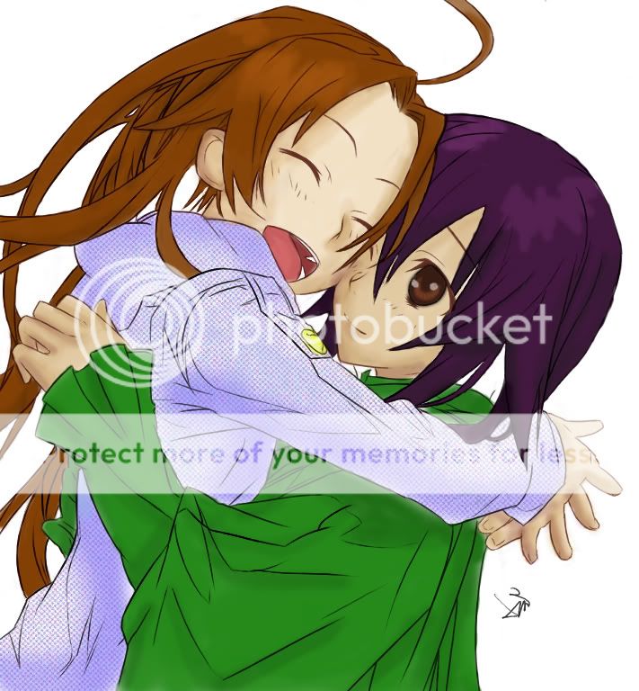 I did this for my friend Shido (Sydney) and am wondering how I did...? PS: Once again, I didn't do the lineart, so coloring critique please =3
|
 |
|
|
|
|
|
|
|
|
|
|
|
|
|
Posted: Sun Feb 07, 2010 5:17 pm
Very cute.
What is that big green thing the girl on the right is wearing?
|
|
|
|
|
|
|
|
|
|
|
|
|
|
|
|
|
|
Posted: Sun Feb 07, 2010 5:30 pm
My guess is a very loose top.
Anyway, my biggest first impression is that you need a lot more contrast in your shade choices. As it stands, I can barely see a difference between the base color and the shade choice. You don't necessarily have to go for a darker shade, but perhaps a slightly different color in a somewhat darker color (example: cool colors, an off-red shade, etc.). The skin shade works better than the hair shade, but you definitely need more contrast all around.
Be careful with hair highlights. Try not to have the lighting overlap over the lineart, or at least have the highlights follow with the lineart and not just arbitrarily cross over.
You forgot to color the purple-haired girl's neck, by the way (beneath the hair).
|
|
|
|
|
|
|
|
|
|
|
|
|
|
|
Posted: Sun Feb 07, 2010 5:39 pm
very nice use of colors. the way that you handled this piece shows that you have a good concept of what you're doing.
the lineart is astounding. the girl in the white's hands however are out of proportioned and oddly place. if you ever need help with hand angles just use your own.
I like how you used brown as your base lineart color. you're hair needs improvement but that takes time. very good over all.
|
|
|
|
|
|
|
|
|
|
|
|
|
|
|
|
|
|
Posted: Sun Feb 07, 2010 6:46 pm
Kupocake My guess is a very loose top. Anyway, my biggest first impression is that you need a lot more contrast in your shade choices. As it stands, I can barely see a difference between the base color and the shade choice. You don't necessarily have to go for a darker shade, but perhaps a slightly different color in a somewhat darker color (example: cool colors, an off-red shade, etc.). The skin shade works better than the hair shade, but you definitely need more contrast all around. Be careful with hair highlights. Try not to have the lighting overlap over the lineart, or at least have the highlights follow with the lineart and not just arbitrarily cross over. You forgot to color the purple-haired girl's neck, by the way (beneath the hair). O_O I didn't notice the neck part *smacks forehead* thanks for the critique =3
|
|
|
|
|
|
|
|
|
|
|
|
|
|
|
|
|
|