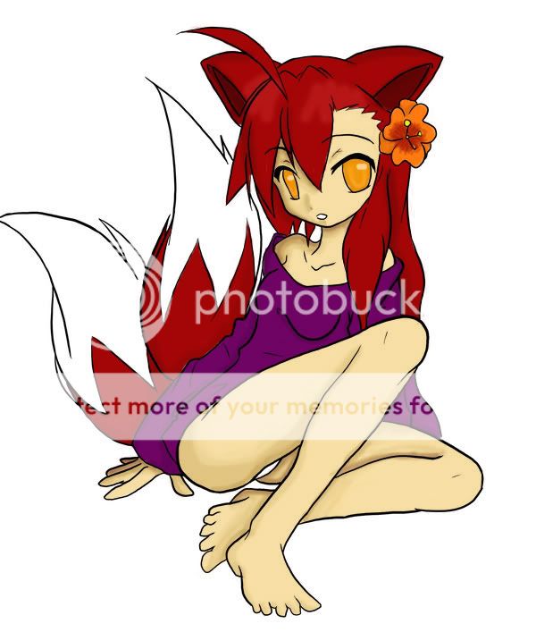
On the right (our left) side of her face, the shading is well-done. There is a good amount of depth.
However, I do agree with the others. Use a lot more contrast in your shading. Don't be afraid to experiment on that color wheel. Here, I'll offer you a tip on shading.


The diagram above was taken from my Photoshop CS2.
See how the arrows point to what would be better for light and dark? It's always best to pick colors yourself (dodge and burn don't work in most cases, dodge is turning a color white and burn is turning a color black). You can even transition to a dark purple in case you want to make some deep shadows. The same goes for a brighter blue to make highlights (if you were shading the color blue).
I hope that helped.
Experiment as much as you can with those colors. I see tons of potential!