|
|
|
|
|
|
|
|
|
 Posted: Sun May 31, 2009 9:19 pm Posted: Sun May 31, 2009 9:19 pm
tell me is it a good background or what do i have to improve?? ((feel free to critique the avis too ^^)) 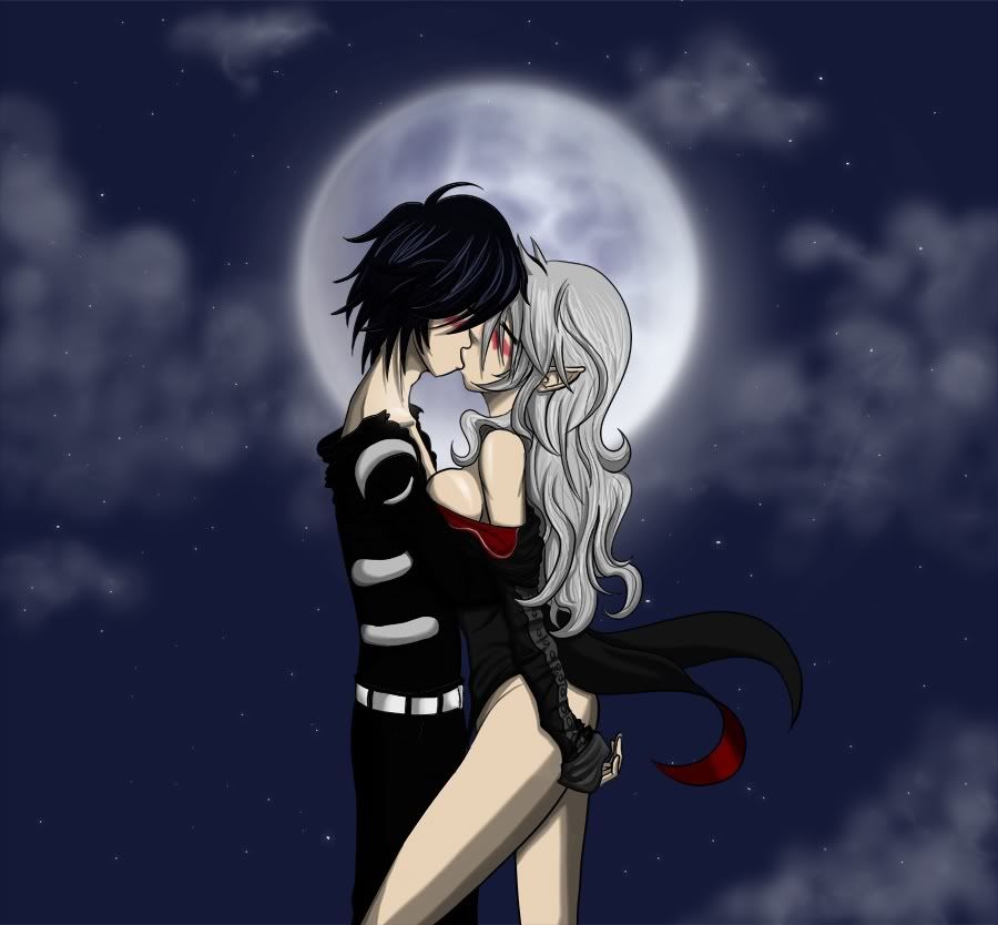
|
 |
|
|
|
|
|
|
|
|
|
|
|
|
|
Posted: Sun May 31, 2009 9:45 pm
Really nice but personally I'd try working on the sky itself. It needs black holes like the real sky has, and sometimes lighter spots. But overall you did real good!
|
|
|
|
|
|
|
|
|
|
|
|
|
|
|
|
|
|
Posted: Sun May 31, 2009 9:45 pm
that's not bad biggrin
but the faces on the avi's kinda bug me...
however.... do you do avi art?
|
|
|
|
|
|
|
|
|
|
|
|
|
|
|
Posted: Mon Jun 01, 2009 9:30 pm
Gengi Camichi that's not bad biggrin but the faces on the avi's kinda bug me... however.... do you do avi art? nope sorry bug you? why?
|
|
|
|
|
|
|
|
|
|
|
|
|
|
|
|
|
|
Posted: Fri Jun 05, 2009 8:02 pm
Try adding a cliff or moutains. It might make a better backgroung. wink
|
|
|
|
|
|
|
|
|
|
|
|
|
|
|
Posted: Sat Jun 06, 2009 1:27 am
i looks great
just on the bottom corner change the cloud to someting else maybe?
idk maybe im wrong sweatdrop
|
|
|
|
|
|
|
|
|
|
|
|
|
|
|
|
|
|
Posted: Sat Jun 06, 2009 12:34 pm
eduardk250 Schlechter Gengi Camichi that's not bad biggrin but the faces on the avi's kinda bug me... however.... do you do avi art? nope sorry bug you? why? errrr... the lips seem off.
|
|
|
|
|
|
|
|
|
|
|
|
|
|
|
Posted: Tue Jun 09, 2009 1:20 pm
I do like the background, hun.
The air-brushed quality of it makes the crispness of the couple stand out, almost like the focus on a camera, which definitely adds interest.
However, because the moon is behind the two, it changes the original light source you used when coloring the characters, as well as the fact that they are now in a night scene would change the previous colors because of the lack of light. For example, their faces and bodies would be more in shadow because of the back lighting, and the entire color scheme would most likely have an indigo cast.
On the other hand, you could simply add a suggestion of another light source that would over power the moon. For example, you could add a balcony railing to suggest that they are close to a lit window.
But when considering a background, think of where the light is coming from because it is always key to the coherency of the piece.
Also, the moon is lovely, hun, but at the same time a bit cliche. I suggest moving it somewhere other than the center. Because you want to keep their kiss the focal point of the piece, and the only way to do that is to keep the lightest lights and darkest darks in that area (at the moment that contrast is predominantly centered around her left leg), which is another good reason to move the moon away from their faces because of the light source you have now.
I do highly suggest putting in a ground line to add emphasis to the impact of the scene, because without feet or any type of ground, they're just floating in space, which stagnates the effect.
Fortunately, these things are all easy to fix with more additive layers on photoshop.
Fore an example of my meaning of light sources, check out this piece Good vs. Evil by janaschi.
If you have any questions, or didn't understand something, feel free to PM me. I can always do red-lines and other such example-edits. I hope this has been helpful to you in some way.
|
|
|
|
|
|
|
|
|
|
|
|
|
|
|
|
|
|
Posted: Tue Jun 09, 2009 3:22 pm
Queen.Trickster I do like the background, hun.
The air-brushed quality of it makes the crispness of the couple stand out, almost like the focus on a camera, which definitely adds interest.
However, because the moon is behind the two, it changes the original light source you used when coloring the characters, as well as the fact that they are now in a night scene would change the previous colors because of the lack of light. For example, their faces and bodies would be more in shadow because of the back lighting, and the entire color scheme would most likely have an indigo cast.
On the other hand, you could simply add a suggestion of another light source that would over power the moon. For example, you could add a balcony railing to suggest that they are close to a lit window.
But when considering a background, think of where the light is coming from because it is always key to the coherency of the piece.
Also, the moon is lovely, hun, but at the same time a bit cliche. I suggest moving it somewhere other than the center. Because you want to keep their kiss the focal point of the piece, and the only way to do that is to keep the lightest lights and darkest darks in that area (at the moment that contrast is predominantly centered around her left leg), which is another good reason to move the moon away from their faces because of the light source you have now.
I do highly suggest putting in a ground line to add emphasis to the impact of the scene, because without feet or any type of ground, they're just floating in space, which stagnates the effect.
Fortunately, these things are all easy to fix with more additive layers on photoshop.
Fore an example of my meaning of light sources, check out this piece Good vs. Evil by janaschi.
If you have any questions, or didn't understand something, feel free to PM me. I can always do red-lines and other such example-edits. I hope this has been helpful to you in some way. no no everything its clear i can see your points and thanks for the critique ^^ its been very helpfull
|
|
|
|
|
|
|
|
|
|
|
|
|
|
|
Posted: Tue Jun 09, 2009 4:52 pm
eduardk250 Schlechter Queen.Trickster I do like the background, hun.
The air-brushed quality of it makes the crispness of the couple stand out, almost like the focus on a camera, which definitely adds interest.
However, because the moon is behind the two, it changes the original light source you used when coloring the characters, as well as the fact that they are now in a night scene would change the previous colors because of the lack of light. For example, their faces and bodies would be more in shadow because of the back lighting, and the entire color scheme would most likely have an indigo cast.
On the other hand, you could simply add a suggestion of another light source that would over power the moon. For example, you could add a balcony railing to suggest that they are close to a lit window.
But when considering a background, think of where the light is coming from because it is always key to the coherency of the piece.
Also, the moon is lovely, hun, but at the same time a bit cliche. I suggest moving it somewhere other than the center. Because you want to keep their kiss the focal point of the piece, and the only way to do that is to keep the lightest lights and darkest darks in that area (at the moment that contrast is predominantly centered around her left leg), which is another good reason to move the moon away from their faces because of the light source you have now.
I do highly suggest putting in a ground line to add emphasis to the impact of the scene, because without feet or any type of ground, they're just floating in space, which stagnates the effect.
Fortunately, these things are all easy to fix with more additive layers on photoshop.
Fore an example of my meaning of light sources, check out this piece Good vs. Evil by janaschi.
If you have any questions, or didn't understand something, feel free to PM me. I can always do red-lines and other such example-edits. I hope this has been helpful to you in some way. no no everything its clear i can see your points and thanks for the critique ^^ its been very helpfull No problem! I'm just glad to have helped you instead of confusing you (which is kind of what I do to myself every time I reread what I wrote).
xd
|
|
|
|
|
|
|
|
|
|
|
|
|
|
|
|
|
|
|