Welcome to Gaia! ::

Arts of the Midnight

Back to Guilds

Where time is not a boundary for dreams. 

Tags: arts, painting, music, movies, randomness 

Reply Creative Criticism
For a beginner...criticism wanted please Goto Page: 1 2 [>] [»|]

Quick Reply

Enter both words below, separated by a space:

Can't read the text? Click here

Submit

DestineyzChild

PostPosted: Fri May 22, 2009 9:35 am


I just started a few days ago...I know I am no where near being mediocre but here is what I have User Image

What can I do to make my pictures betetr?
PostPosted: Fri May 22, 2009 9:38 am


sweatdrop

DestineyzChild


velvetveela

PostPosted: Fri May 22, 2009 10:01 am


Well I can't really say anything cause you used a computer program sweatdrop but the art looks good ^_^
PostPosted: Fri May 22, 2009 10:16 am


It looks like what it is, so, its decent, O.o Can't really say much b'cause I'm no critique but its something.

Red Frogers

Witty Prophet

11,575 Points
  • Friendly 100
  • Noob wrangler 100
  • Mark Twain 100

Oblivious Neko

PostPosted: Fri May 22, 2009 10:18 am


I like it, but there is something about the head that bothers me... I mean, it's good! But...I don't know...
I think the mouth needs to be a bit bigger... but I don't know...!
Ack! I hate giving critisism! And I hate that I can't spell!
PostPosted: Fri May 22, 2009 10:47 am


velvetveela
Well I can't really say anything cause you used a computer program sweatdrop but the art looks good ^_^
It was a sketch first and then I just went over it.

Jac- Yea I know there is something wrong with the head but I just couldn't fix it the way I wanted sweatdrop

DestineyzChild


Mister Yah

PostPosted: Fri May 22, 2009 10:56 am


It's good! However, the jaw is a bit to wide. All her facial features seem to have been slid a bit to the left. And her hairline is a bit high...

Just work on placement-- maybe study skulls!
PostPosted: Fri May 22, 2009 3:07 pm


Quite good especially if you started not too long ago whee
I would suggest using head proportions even with stylized pictures.
I can't be bothered to write it out so here's a link http://drawinglab.evansville.edu/face.html

Duong Chan


jdub8823

PostPosted: Fri May 22, 2009 7:52 pm


i think its a good start. maybe work on face shape a lil, the hair looks great, and i would suggest maybe a different program or different colors, they seem to pop in an odd way
PostPosted: Sat May 23, 2009 3:35 am


bwahaha!
no worries! ill help u out!
first off, i can say u have loads of potential, unfortunatly its sorta like what u get when a light hits a prism XD
try some basic art technics to get urself off the ground, like drawing a skeleton first, then using it to guild your drawing. eyeballing (looking at a finished work and copying it) can really help bring out your style, seriously, u do a few, u will reconise constants and things u should be doing, an notice ways they fix things u always do wrong ect ect.
also!
PRACTICE PRACTICE PRACTICE!!1 scream
youll be drawing better then me in notime!
bwahaha!!1

Leafblight


kinky-case

PostPosted: Sun May 24, 2009 8:19 pm


the shadows are a little funky in my opinion look too lined up, too exact, too straight edged...try to make it a little more natural
PostPosted: Mon May 25, 2009 12:39 am


I think the stuff that people have said previously is what I would say, so yeah.
Also, methinks you did this in photoshop? If so, I wouldn't mind lending you a hand at very basic methods of drawing and colouring in photoshop. 3nodding

NikiPaprika

2,650 Points
  • Gaian 50
  • Member 100
  • Dressed Up 200

tinyfreya

PostPosted: Mon May 25, 2009 5:56 pm


ε з

User Image
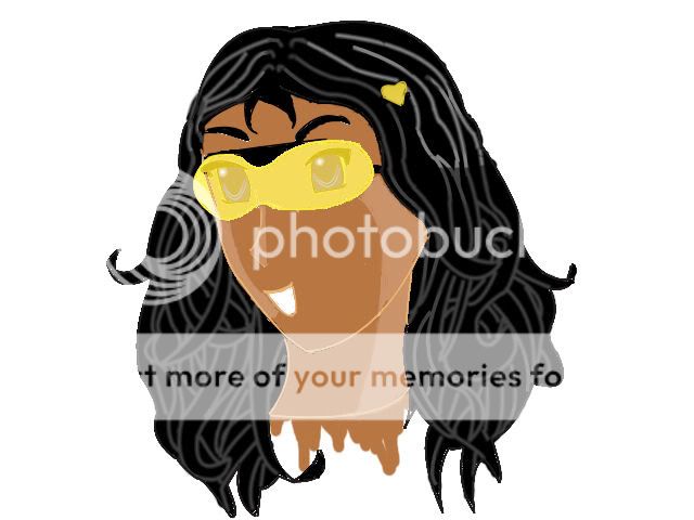
Obviously you've read a few manga/anime style tutorials, and that's given you a nice solid base to work from. Stylistically, (is that a word?) it's really nice.
Technically, however, it's not that great.
First things first. Tools. What tools did you use? At a glance, I'd say bucket fill tool (which is the devil), and possibly dodge and burn (also pretty devilish), and the brush (or whatever Photoshop calls an anti-aliased blob) tool. Right so far? Well, in short, don't. The brush is fine, but you should use it more often. You see all those little greyish blobs surrounding the lines? That is the product of bucket fill. Now, I'm going to contradict myself here and say that I use the bucket tool occasionally to fill massive areas. However, if you or I or anyone else does so, we MUST brush around the edge in the same colour to get rid of those pixels. It seriously ruins the look of the whole piece if they're there. Secondly: Dodge and burn. I'm not sur eif you have used these, but if you have, don't. They make a piece look washed-out and bland; use the brush tool in a lighter/darker colour or shading.
Also, I'm assuming you're going for the cell-shaded look? I'd advise against that too. Although it can look cool, you need bucketloads of experience and practise. Start off with a basic, soft-shaded apprach, and then try cell-shading when you have a better grip on anatomy and light and shade.
You really need to work on your face anatomy - that is, bone structure. What you've done makes the face seem like a ball with a piece of paper stuck on for a nose... Which isn't what you want, really. Take a look at this diagram to see more-or-less where each part of the face faces.
User Image
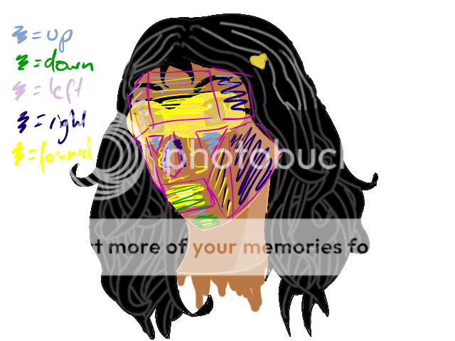
Probably fiind a better one than that, because I'm not the greatest redliner/anatomy encyclopaedia in the universe, but you get the general idea.
Oh, lightsource. You seem to have light coming from about six dirctions at the moment. One is a better way to start! Check this diagram:
User Image
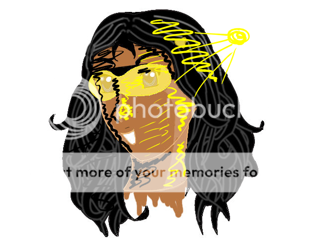
Using this method of actually drawing a sun and basic shading (on a separate layer) can really help - often when you're trying to get everything else right at the same time shading can be compromised. Just remember, if it faces towards the light, it's lighter, if it faces away, it's darker. A little yellow blob in the corner can really help remind you where the light is coming from.
Finally, layers! Remember that lots of layers is good. Skin layer, hair layer, eyes layer, clothes layer, etc, etc. It helps prevent little anti-aliasing blobs from appearing, and makes mistakes much easier to fix!
But don't be disheartened! As you said, you're just a beginner. These things will get easier in time, so just practise, practise, practise! You've made a great start!
(Oh, by the way, if it's any consolation, this was my very first avatar art. You're doing better than I was! ^^)

ε з
PostPosted: Thu May 28, 2009 1:57 pm


the eyes are too high up, and the nose is a little too long, the mouth is too smal too. It's a decent work, but more knowledge of the human face is needed to improve.
EDIT: I just noticed that an arm of the sunglasses are missing
On anither note, the eyes are very nice for anime.

cristeal


Terix_FM

2,850 Points
  • Conversationalist 100
  • Forum Sophomore 300
PostPosted: Thu May 28, 2009 3:43 pm


tinyfreya basically PWNed everything i could possibly say sweatdrop
Reply
Creative Criticism

Goto Page: 1 2 [>] [»|]
 
Manage Your Items
Other Stuff
Get GCash
Offers
Get Items
More Items
Where Everyone Hangs Out
Other Community Areas
Virtual Spaces
Fun Stuff
Gaia's Games
Mini-Games
Play with GCash
Play with Platinum