|
|
|
|
|
|
|
 Posted: Thu May 07, 2009 2:57 pm Posted: Thu May 07, 2009 2:57 pm

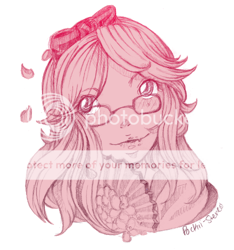
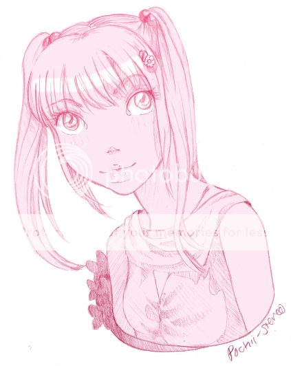
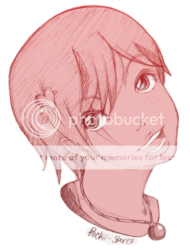
Um yeah, critique please, These are just sketches, i dont have many pictures of my recent drawing. Besides these below @@ I think i need help with facial structures


|
 |
 |
|
|
|
|
|
|
|
|
|
|
|
|
 Posted: Thu May 07, 2009 3:07 pm Posted: Thu May 07, 2009 3:07 pm
I personally think your faces are awesome--the individual components are really amazing. It's just the placement of said features when on an angle? For example, your noses are in the centre of the drawn area of the face when that centre line has in face shifted when in different angles. biggrin

So I guess (after trying to find words for it) it may look off because you're drawing the facial features at one angle and the actual face-head on another angle. biggrin
|
 |
 |
|
|
|
|
|
|
|
|
|
|
|
|
|
|
|
 Posted: Thu May 07, 2009 3:21 pm Posted: Thu May 07, 2009 3:21 pm
hello biggrin !
nice stuff you have here :3~ your penciling skills are great and your characters are very appealing to look at biggrin
One thing that jumps out at me is that your eyes are a bit too far apart - that can be made into its own style but it's especially noticeable on the middle picture because her eyes are unfocused...
(usual rule for 'real' faces is that the face is one eye width between the eyes and the same amount 'outside' the eyes - so 5 eye widths apart... you can see a picture if you scroll down the page here: http://conceptart.org/forums/showthread.php?t=84105 ) <-- also has lots of other goodies on heads...
Again on the middle picture: I think she could use more "back of head"... if that makes any sense... as in her skull is a bit too small in the back for her face.
Last picture: what you've done here is put a frontal face on a head that's not fully frontal which is why it looks kinda awkward :3~~ You could move the nose and mouth more to the top/right...
The neck is at a painful angle as well - remember that necks bend and are not just a tube... try looking in the mirror whenever you're unsure of something... if it hurts when you do it, it's probably not a good idea to draw someone in that position either XD...
picture <--- explains what I'm trying to say...
Maybe try drawing guidelines for the facial components before filling them in next time? :3 I think that would quickly fix the small problems you have right now.
p.s. morrosseth already got to some of what I'm saying XD....
|
 |
 |
|
|
|
|
|
|
|
|
|
|
|
|
 Posted: Thu May 07, 2009 3:32 pm Posted: Thu May 07, 2009 3:32 pm

Thank you for the suggestions.
I Know I need to draw eyes closer (a friend told me), but it just looks sooo weird, and when I do draw them closer, for some reason when i draw in the nose and mouth they still look so far apart. Any suggestions on that?
I also so get what your saying about the position of the face features to the actual face shape. I use to use guide lines before, i dunno why i stop using them @@.
|
 |
 |
|
|
|
|
|
|
|
|
|
|
|
|
|
|
|
 Posted: Thu May 07, 2009 4:30 pm Posted: Thu May 07, 2009 4:30 pm
Oh, Gurl... you've always had a good style.
But the thing that always seemed a bit off to me was the proportion of like, body parts. I think you have facial features down packed. (You're eyes are spread apart a little too much but I just connect that to your style, so I don't see anything wrong with that fact. I think it's charming) But, like in the second one, the shoulders are much too small for her head. Things like that.
I dunno. I'm a proportion nazi xDDD
But, other than that... I always liked how you did faces. It's all "YOU".
|
 |
 |
|
|
|
|
|
|
|
|
|
|
|
|
 Posted: Fri May 08, 2009 9:56 am Posted: Fri May 08, 2009 9:56 am
05/08/2009

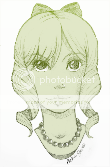
Okay I took you guys suggestions is this better? I must say u like it, I drew frontal face features on a frontal face shape, also made the eyes closer. The next one I am going to do a face at a slight angle. Please critique!
|
 |
 |
|
|
|
|
|
|
|
|
|
|
|
|
|
|
|
 Posted: Fri May 08, 2009 3:37 pm Posted: Fri May 08, 2009 3:37 pm
It could be an optical illusion, but her face seems really long. I think the eyes are too far up. It's either they really are too far up for the hair is making it seem like they are because it's so short.
I dunno. /tilts head
|
 |
 |
|
|
|
|
|
|
|
|
|
|
|
|
 Posted: Fri May 08, 2009 4:06 pm Posted: Fri May 08, 2009 4:06 pm

its because of the hair, i get what ur saying. the lips may be a bit too far down, but that's it.
|
 |
 |
|
|
|
|
|
|
|
|
|
|
|
|
|
|
|
 Posted: Fri May 08, 2009 4:53 pm Posted: Fri May 08, 2009 4:53 pm
|
|
|
|
|
|
|
|
|
|
 Posted: Fri May 08, 2009 8:05 pm Posted: Fri May 08, 2009 8:05 pm
Yeah, it's that the lips and nose are too far down because you did not leave room for the chin. Look at your own chin and just keep in mind that you need to leave a circle of a similar amount of space on the faces that you draw. The way it is now her features are a little horse-like.  Your original is to the left, and my edited version (nose & lips shifted up and no other edits) is to the right. The face to the right looks much more natural and confident, doesn't it? It seems like you make this error on all of your faces, so just make sure that you leave a space for the chin in faces that you draw from now on. I usually draw a circle where the chin should be so I do not make the mistake of drawing the lips too low. The hair and eyes are very well rendered, and anatomical errors aside, you draw with an admirable amount of confidence.
|
 |
 |
|
|
|
|
|
|
|
|
|
|
|
|
|

Errol McGillivray Captain
|
 Posted: Sat May 09, 2009 8:06 am Posted: Sat May 09, 2009 8:06 am
Personally, I think the eyes could have been moved down a bit, rather than moving the rest of the face up to meet it. That change makes a drastic difference in the look and feel of the girl. I found the longness of the face to the nose charming. Rather, try moving the mouth up a hair and the eyes down a bit, leaving the nose where it is. (Just a bit though.)
|
 |
 |
|
|
|
|
|
|
|
|
|
|
|
|
 Posted: Sat May 09, 2009 2:04 pm Posted: Sat May 09, 2009 2:04 pm
I agree with Error. :3
But I still think it's an optical illusion because of the hair being so short and thin. xD
I dunno... Treniece, you should try just drawing a face. No hair... Just the face. We might be able to see the little flaws (if there are any)
|
 |
 |
|
|
|
|
|
|
|
|
|
|
|
|
|
|
|
 Posted: Mon May 11, 2009 7:17 pm Posted: Mon May 11, 2009 7:17 pm

The only thing is that the mouth is too low, i always draw faces without the hair, including the bald hair. Its the mouth, i actually think the mouth is low, i like the position, of the nose and the eyes, the hair may make the face look longer.
|
 |
 |
|
|
|
|
|
|
|
|
|
|
|
|
 Posted: Mon May 18, 2009 10:16 am Posted: Mon May 18, 2009 10:16 am

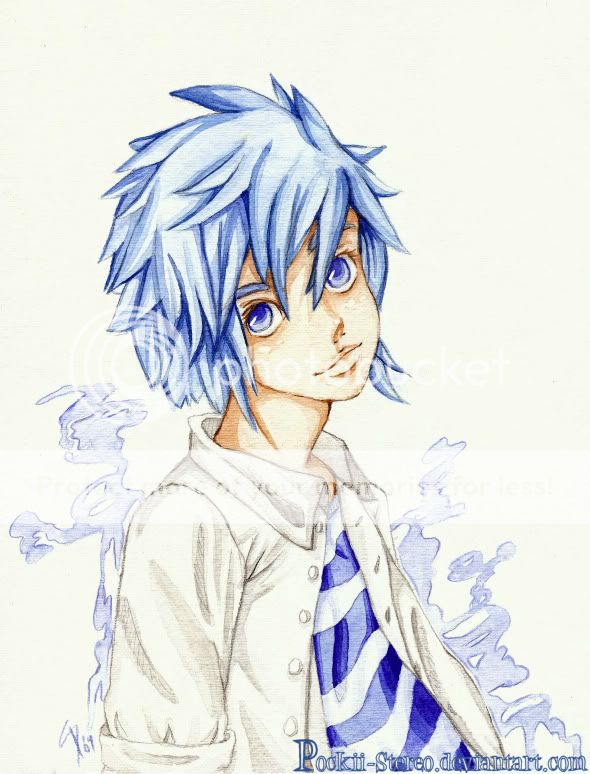
I come to you with a colored piece XD. Critiques?
|
 |
 |
|
|
|
|
|
|
|
|
|
|
|
|
|
|
|
 Posted: Thu Jun 11, 2009 11:29 pm Posted: Thu Jun 11, 2009 11:29 pm
|
|
|
|
|
|
 |
|
|

