Welcome to Gaia! ::

Captain's Guild 2.0

Back to Guilds

Accepting Guild and Clan captains and crew alike! 

Tags: captain's, guild, network, clans, developers 

Reply GGN Support
New idea for Moderator Panel redesign

Quick Reply

Enter both words below, separated by a space:

Can't read the text? Click here

Submit

WindowOpener
Captain

PostPosted: Tue Nov 04, 2008 1:54 am


This belongs in the GGN Suggestions sticky, but it's quite image-intensive so I posted it on its own. ^^

Today I had a new idea for how the Moderator Panel could be redesigned. Previously I suggested just bringing all the options together onto one page, to save clicking and hitting "Back" so much when you want to check join requests, edit subforums, etc. This idea would save even more clicking by bringing the Moderator Panel right on to the forum page.

The panel could be displayed above subforums, in the style of the Forum Pulse feature in the main forums. In this mockup I was able to keep vertical height to 225px, which is over 100px shorter than Pulse.

User Image

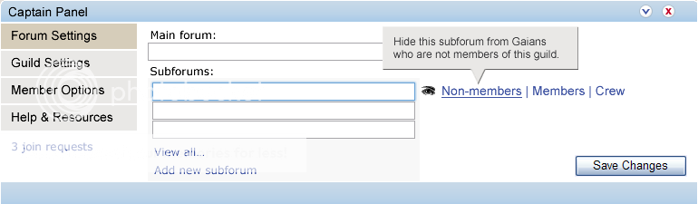
To save space, tools are grouped together under clickable headings (on the left) again, except this time page refreshes aren't necessary to move between them.

A subforum is highlighted (in blue) when it is selected, and options appear to the right. (Yes, I stole the eye from Fireworks).

Of course, subforums can be rearranged by drag and drop. smile

"Tool tips" are a minor idea - I put an option for disabling them under "Help & Resources" (below).

User Image

As with Forum Pulse, the window can be minimised or closed with the buttons in the top-right corner - which is more convenient than storing the panel on a separate page.

User Image

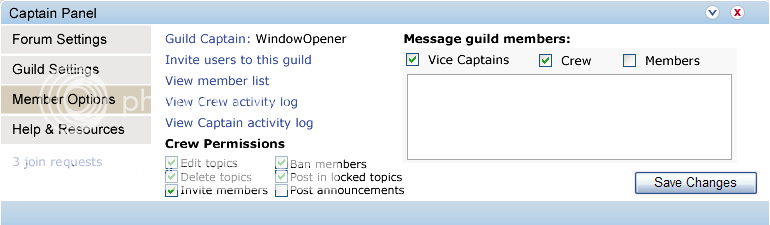
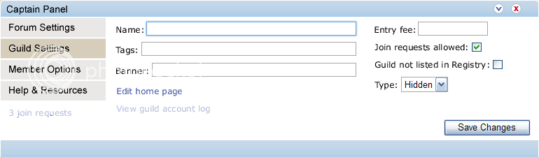
I took some liberties with the options that might be available. whee

User Image

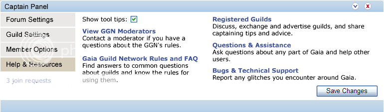
The links do not navigate to a different page - instead, windows 'pop up.' (Except the bold links to other forums in the "Help & Resources" tab.)

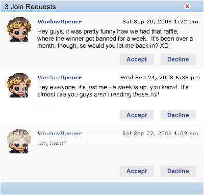
For example, Join Requests might look like this:

User Image

...And if the panel looks like this on the page...


...then Join Requests would look like this:


The panel looks a bit out of place in the mockup because it mixes the old-style forums with the new style, but that's the idea in a large nutshell. smile

In this way it would be possible to perform nearly all admin/mod tasks without refreshing the page!

It would require some clever AJAX coding, though, and consideration would need to be given to the effect on page loading times. However, I would imagine the burden - for most features, anyway - would be less than Forum Pulse.
PostPosted: Tue Nov 04, 2008 2:47 am


I like the integration, but I, and I believe many other captains don't use the moderation panel beyond the join requests and invitations all that often. I suggest you design a mini version with just the common tasks, then have an option for which is used by default in Help and Resources, plus a quick switch up at the minimize and close buttons, I'd do it as a +/- button

lily564a
Crew


JVCA

PostPosted: Tue Nov 04, 2008 2:58 am


Personally I prefer having the Moderator Panel on a seperate page (Forum pulse gets in the way and annoys me (probably doesn't help that I didn't realise that you can minimise it till now LOL >.< )), but otherwise I much prefer your suggestion for layout - even if on a different page, I hate having to go to the mod panel page and *then* to the page I want - so what you've got there but on the mod panel page would work wonders. heart

I especially like the tool tips function. I hate having to try figure out what things do by going to an FAQ and spending fifteen minutes trying to find it, and then it's not even there. >.>
PostPosted: Tue Nov 04, 2008 3:45 am


JVCA
Personally I prefer having the Moderator Panel on a seperate page (Forum pulse gets in the way and annoys me (probably doesn't help that I didn't realise that you can minimise it till now LOL >.< )), but otherwise I much prefer your suggestion for layout - even if on a different page, I hate having to go to the mod panel page and *then* to the page I want - so what you've got there but on the mod panel page would work wonders. heart

I especially like the tool tips function. I hate having to try figure out what things do by going to an FAQ and spending fifteen minutes trying to find it, and then it's not even there. >.>

Agreed - if this existed, I'd expect to have it minimised most of the time myself. ^^

Tool tips would be one way to make some functionality more transparent - the number of very basic question threads in the CG showed how un-intuitive some of the tools currently are. sweatdrop More information in general needs to be integrated into the panel (although preferably with the option to toggle most of it off so it doesn't annoy veterans, but certainly on by default). Two obvious examples of the need for more info are the fact the subforum purchasing process doesn't tell you the cost until the final confirmation page, and the way it is so damn easy to promote people to Vice Captain without knowing what Vice Captains can do.

lily564a
I like the integration, but I, and I believe many other captains don't use the moderation panel beyond the join requests and invitations all that often. I suggest you design a mini version with just the common tasks, then have an option for which is used by default in Help and Resources, plus a quick switch up at the minimize and close buttons, I'd do it as a +/- button

Yes, I don't use many tools in the Mod Panel often, either - probably the most common reason I visit it is to check join requests (which is why I put the Join Request link on all pages). The purpose of the close button of course is to stop it getting in the way of captains who don't use it all the time - but I really like the idea of a 'shortcuts' kind of panel (and having it customisable would be doubly awesome). eek

User Image

Would something like that, if it was customisable (or not) be more or less useful than having the whole thing on a separate page? Personally I like it. whee

The X and arrow icons just come from Forum Pulse - personally I prefer them over +/- but it would be up to the UI designers. They might choose to depart from the theme in the main forums and give guilds a slightly distinctive graphical identity, and I'd welcome that, too.

Another thing you could do is make each of those menu options ("Forum Settings", "Guild Settings", etc.) into tabs along the top, which would mean, for example, if the panel was closed, getting to "Member Options" would be one click away instead of two. (Yes, I obsess over click counts...)

Also, I just realised that tucking "View member list" inside the Mod Panel is kind of redundant. xP

WindowOpener
Captain


lily564a
Crew

PostPosted: Tue Nov 04, 2008 3:26 pm


the icons are fine, I just suggested +/- so we could keep the arrow as the basic expand button, then have the +/- to switch between the mini and the full versions, alternatives might be some sort of double arrow or a red one instead of a blue one

I really like the quickbar idea but for send invite and message I'd use an icon instead of text
PostPosted: Tue Nov 04, 2008 7:08 pm


Oh, yes - I'd also ideally put icons beside most links in the pictures at the top, too. It's just that I suck at pixel graphics. ^^

WindowOpener
Captain


Slytherin Lord

Desirable Guildsman

14,825 Points
  • Partygoer 500
  • Invisibility 100
  • Signature Look 250
PostPosted: Fri Dec 05, 2008 9:23 pm


Get it to be implemented imediatly it will make less trouble for all guild captains.
PostPosted: Fri Jan 02, 2009 10:57 am


You should consider putting this in the thread that Grace made for suggestions.

I quite like the idea my self.

The Lovely 86

Beloved Mage

7,800 Points
  • Battle: Mage 100
  • Object of Affection 150
  • Dressed Up 200

MrsMica

PostPosted: Tue Jan 06, 2009 10:28 am


I don't like the popup for join requests. I don't like popups in general. I'd rather have it navigate to a separate page.

I think the overall design would be more useful for crew members if they could rename and change around the forums themselves, which I think they should be able to do (so, another check box for crew permissions). I like how it looks, but member options should be the default (top) option that opens up. I love the help & resources. Even though I don't need that stuff often, when I do need it, it's such a pain to hunt down.
PostPosted: Thu Jan 08, 2009 12:46 pm


I very much dislike having the first option be like changing the guild settings/forums. I don't do it very often, and would hate to mistype or something. I'd like to have that on a separate captains only type page and not integrated with the rest. I would prefer it that you click "moderator panel" and it comes up with every crew option (except maybe banning/promoting, as that should be memberlist-style) so uh..viewing the crew log and accepting join requests (and whatever else?) and a separate link at the bottom for captains to a page with all of the captain's options.

OneOfLittleHarmony

Assimilated Millionaire

12,275 Points
  • Invisibility 100
  • Megathread 100
  • Millionaire 200

goodshot911SNK

PostPosted: Mon Apr 13, 2009 5:53 pm


i like it vary much but thay should make you able to disalow crew and/or vice caps.it looks easy enough but unlike some other caps i do use the activeity loggs oftin i like how you incorprated them in with basics
PostPosted: Mon Apr 13, 2009 6:18 pm


hi, its me again.

Thanks for taking the time to put this together, WindowOpener. We are working on the moderator panel as part of the circuit app re-design. We're not doing anything drastic yet, so this is good timing. We are updating the look/feel and menu items, however, along with some other bonuses. But I hope to get additional updates into future releases. I really like the explicit permissions section wink These are great ideas that get us thinking!

wesden

6,050 Points
  • Beta Citizen 0
  • Forum Sophomore 300
  • Friendly 100

goodshot911SNK

PostPosted: Mon Apr 13, 2009 11:10 pm


please
Reply
GGN Support

 
Manage Your Items
Other Stuff
Get GCash
Offers
Get Items
More Items
Where Everyone Hangs Out
Other Community Areas
Virtual Spaces
Fun Stuff
Gaia's Games
Mini-Games
Play with GCash
Play with Platinum