|
|
|
|
|
|
|

Dr. Valentine Vice Captain
|
 Posted: Sat Apr 05, 2008 11:56 pm Posted: Sat Apr 05, 2008 11:56 pm
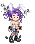
 Okay the deal is that I am making a short series of images of fairies because well I have this old Bondage Fairies shirt that is getting kind of worn out so I've decided to make my own replacement. This is a WiP. I am hopefully going to be wearing this when it is done so I really want input on how to make it the best it can be. (i am also going to do a coffee fairy) I would particularly appreciate tips on how to draw bigger boobs nicely because she is supposed to be a sexy type fairy and I have a real hard time making large breasts look right.
|
|
|
|
|
|
|
|
|
|
|
|
|
|
|
Posted: Sun Apr 06, 2008 6:41 am
-There is no reason the 'stretch' folds on a shirt would go past the n****e.
-Needs a facial expression.
-Clean up the hair lineart. It's chunky.
-The ribcage totally doesn't make sense. It looks like you cut out her bottom three ribs on the back or something.
-Study a pleasing female shape. Study it again. Repeat.
-The shoes are great. Nice, brave perspective on a shoe that can be hard as hell to draw.
|
|
|
|
|
|
|
|
|
|
|
|
|
|
|
|
Dr. Valentine Vice Captain
|
Posted: Sun Apr 06, 2008 8:59 am
Lineart will definitely be cleaned up
I think i will redraw the face and chest
Can you scribble a picture of what you mean about the ribs?
I'm glad the shoes are working. Any feelings about the rest of the outfit? How's the color?
|
|
|
|
|
|
|
|
|
|
|
|
|
|
|
Posted: Sun Apr 06, 2008 5:42 pm
MF gave a lot of good feedback.
The one thing that really stands out to me is how the cigarette disappears behind her leg. It doesn't look like it would end there.
|
|
|
|
|
|
|
|
|
|
|
|
|
|
|
|
|
|
Posted: Sun Apr 06, 2008 7:06 pm
i'd structure the face more. she has no jaw, really, and the ear is real funny and high. also it looks like shes 3/4 but her face is liked of more front view
id try to wrap it the face better its kind of floating there.
|
|
|
|
|
|
|
|
|
|
|
|
|
|
|
Posted: Sun Apr 06, 2008 9:27 pm
If you can nail the under-drawing, you've got it. Your finishing techniques are working well, but you might want to spend more time on structure, namely using blocks to orient your anatomy before adding details. Having an art anatomy book on hand is an excellent reference for whenever you get stuck or aren't certain of where precisely something should be. I know I don't consult mine have as much as I should. rolleyes
I'm going to endorse George B. Bridgman here, his books are typically pretty good references.
I'm wondering if METAPHOR FISTS is getting at the two little nubs on her abdomen that are typically used for identifying the front of the rib cage. If you're familiar with constructive anatomy, you might begin by sketching the proportions out as blocks, which will help with both anatomy and perspective and make proportion easier to troubleshoot.
As far as her upper torso anatomy goes, you might actually need to move her breasts higher up on the rib cage...maybe. Again the anatomy book will help, so you can see how the muscles underneath will overlap and connect to the shoulder. As soon as that gets ironed out you can start working on how large they should be, whether they're real or artificial, what kind of support she has affecting them (bra, no bra, bustier, full corset, electrical tape, etc.). I recommend researching the muscles before researching her breasts. It'll get you better results than taking photos of yourself with a couple grapefruit duct-taped to your chest and which may endanger any potential political career you may have...
I am gonna challenge you on the shoes, the hands, and the hips.
Right now, her legs are facing away from the viewer, we're clearly seeing her great calves. But her hips are pointed towards us more or less on end, with her abdomen apparently starting to face towards us. It's not to say it can't occur, just that you would have to adjust the left thigh to be moving away from the viewer whereas right now it's looks like it's running parallel to the picture plane.
Spending some time blocking in/over your layout before adding anatomy could help. I sketched up a couple quick examples to lessen ambiguity:
http://i7.photobucket.com/albums/y263/mistersmite/more random stuff/example-1.jpg
Please bear with my dodgy anatomy and proportioning,
The feet look great, the heels not so good. Consider that they're going to essentially lie along the same plane that the toes do, so you should be able to extend lines from the bottom of the shoe to locate where the heel will intersect. Does that make any sense?
Um, and consider getting her right thumb around the cigarette, might make it look more stable. And what Hansma said about overlapping the cigarette and her thigh, it'd help the composition and it looks like you have enough length on the filter to do it, too. And don't shortchange the fingers on her left hand.
This was supposed to be a quick comment sweatdrop
You may now TLDR to your heart's content.
|
|
|
|
|
|
|
|
|
|
|
|
|
|
|
|
Dr. Valentine Vice Captain
|
Posted: Sun Apr 06, 2008 9:30 pm
Redrew face, chest and hair. Adjusted ribs? I hope this is what MF meant. Tweaked shading. Adjusted color temperature, I think I liked it better before.
|
|
|
|
|
|
|
|
|
|
|
|
|
|
|
Posted: Mon Apr 07, 2008 4:59 am
things im noticing:
stubby sausage pinky fingers
thickness of arms fluctuating weirdly
ribs are weird still, i would say either remove those lines to make it less obvious or redo it all together???
how is the cigarette burning but not smoking...i dunno if this is a big deal 2 u or not haha artistic license i guess
andddd....she is supposed 2 be sexy...but her face just isnt sexy -_____- it looks off from the rest of the drawing to me, to much cartoon not enough sexxxxx
|
|
|
|
|
|
|
|
|
|
|
|
|
|
|
|
|
|
Posted: Mon Apr 07, 2008 6:39 am
Yes yes yes. Just adding that little corner to the cigarette peaking out behind her leg makes the world of difference.
|
|
|
|
|
|
|
|
|
|
|
|
|
|
|
Posted: Mon Apr 07, 2008 9:25 am
I plan on worrying about the smoke later.
I agree that the smoke looks better now, I can't believe I missed that.
I guess I will redraw the hands next. I guess that using my own sausagey fingers as reference is not the best idea in this case.
I think the face is improved, but yes I agree that it is less than sexy... I am not sure what I can adjust?
I suppose I should redo the mouth with a better smile and lipsier lips.
Do you think that the / should be dropped entirely? That might reduce the ribs problem...
Yeah I see what you mean about the arms, snakes. Her right forearm is longer and more muscular than her left. I guess I shall redraw her left forearm and hand to match.
mr_smite: I must have pressed reply while you were still working on that post because I didn't see it before. I see what you mean about the heels, they are a touch long aren't they?
I think that I might take a version of your advice; instead of adjusting her legs I might redraw her hips more from profile so that there is a more natural twist to her.
What do you guys think of the new haircut though? I think it's a good bit better.
|
|
|
|
|
|
Dr. Valentine Vice Captain
|
|
|
|
|
|
|
|
|
|
|
|
Posted: Mon Apr 07, 2008 11:33 am
fix the eyes, make them talk also if you want sexy it would probably be wise to actually give her lips also the arms are different thicknesses the outfit where it goes down to her crotch, if the black part is like a frill that borders the lines of the suit it wouldn't be the way it is on her right side without extreme body torsion I would also recommend having her holding the cigarette at a different angle and making it larger so it goes completely across her, which will make the image look more balanced, although what I drew looks a little weird carrying it, maybe have it under her arm anyways sorry if I repeated what someone else said and here's a doodle over to help explain 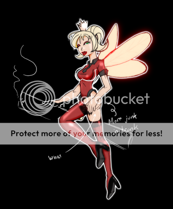
|
|
|
|
|
|
|
|
|
|
|
|
|
|
|
Posted: Mon Apr 07, 2008 11:59 am
The boobs don't need to be bigger, the right boob is fine. The left one just needs to be more connected to the under arm. Like the line needs to be more to the right on the picture. Like here > http://www.acupunctureproducts.com/meridians/GBO.JPG < And I agree with you, I liked the reds before you made them lighter. Here's an idea of what I'm talking about that would look real cool. Kinda like how comic books do it.
|
|
|
|
|
|
|
|
|
|
|
|
|
|
|
|
Dr. Valentine Vice Captain
|
Posted: Mon Apr 07, 2008 12:23 pm
Tomato: I am not going to re-scale the cigarette, it's that size for a reason.
That hand is getting a redraw anyhow, what I was going for didn't work.
I will consider the junk suggestion.
Siin: Yeah I like the blue tint for sure, and I see what you mean about that boobline. I had actually drawn that (i usually do) but I removed it thinking it didn't look right with clothes?
I think you are right though.
|
|
|
|
|
|
|
|
|
|
|
|
|
|
|
Posted: Mon Apr 07, 2008 2:58 pm
ps - and her left calf is huge compared 2 her hip and her right calf
|
|
|
|
|
|
|
|
|
|
|
|
|
|
|
|
Dr. Valentine Vice Captain
|
Posted: Mon Apr 07, 2008 3:04 pm
mountain pony ps - and her left calf is huge compared 2 her hip and her right calf can i claim artistic license on that one
|
|
|
|
|
|
|
|
|
|
|
|
|
|
|
|
|
|