|
|
|
|
|
|
|
|
|
 Posted: Wed Oct 17, 2007 12:53 am Posted: Wed Oct 17, 2007 12:53 am
UPDATE wowww Hi, I'm Vena, I live in Vancouver, BC (though maybe not for very long anymore). I just graduated with a BFA from Emily Carr University of Art + Design, with a major in Animation. (I guess the description below is still effective, yet pink). Hi, I'm Vena. I live in Vancouver, BC, and I am a 3rd year animation student at Emily Carr University of Art and Design. I am currently trying to re-passionize myself with my artwork and find ways to communicate what I really want to express... I do enjoy my own work though reflecting on it I often find it kitschy and not effectively conveying what I want. I love any feedback on work, technical or subjective, give it a go.
I love animating and I just finished my technical year, so I hope this year I can try out some more experimentation in the medium. Links TumblrDeviantArtVimeo
|
 |
|
|
|
|
|
|
|
|
|
|
|
|
|
Posted: Wed Oct 17, 2007 2:32 pm
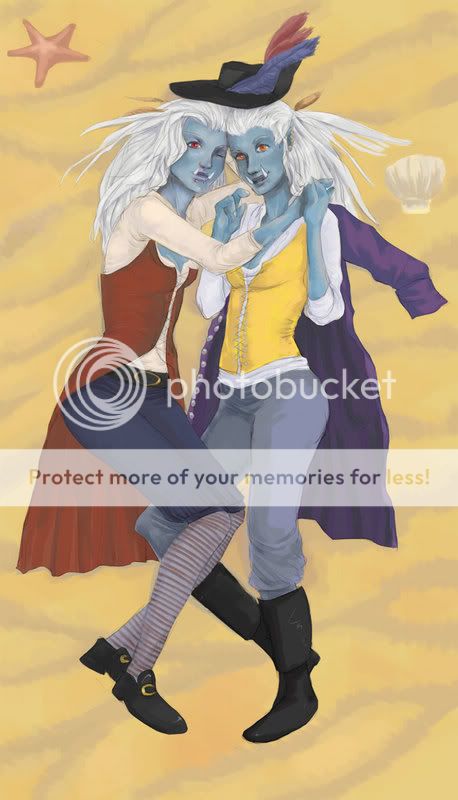
Druids I started this a billion years ago and never finished, maybe this summer :V 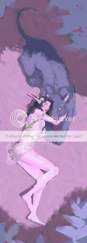 here is a closeup of the faces 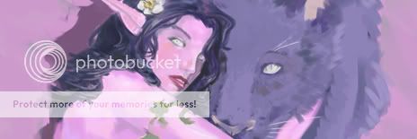 An update on my trolls commission: 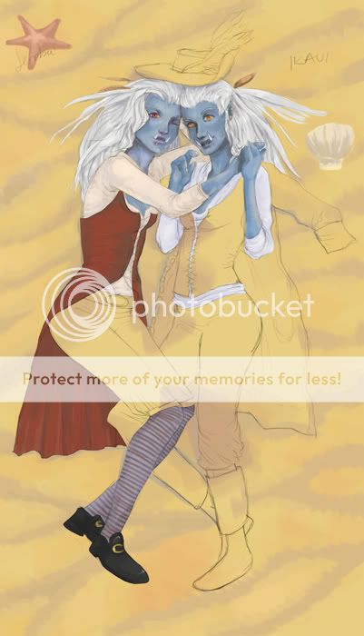
|
|
|
|
|
|
|
|
|
|
|
|
|
|
|
|
|
|
Posted: Wed Oct 17, 2007 3:01 pm
 Your work is amazing... and very WoW oriented... but it's still awesome. haha Your work is amazing... and very WoW oriented... but it's still awesome. haha
|
|
|
|
|
|
|
|
|
|
|
|
|
|
|
Posted: Thu Oct 18, 2007 1:50 pm
I'm impressed with your painting skills. @ 3@ -grabbyhands-
|
|
|
|
|
|
|
|
|
|
|
|
|
|
|
|
|
|
Posted: Fri Oct 19, 2007 1:26 am
|
|
|
|
|
|
|
|
|
|
Posted: Fri Oct 19, 2007 3:16 am
|
|
|
|
|
|
|
|
|
|
|
|
|
Posted: Sun Oct 21, 2007 8:37 pm
Your art is pretty much amazing.
The only input I have is to refine your lines a bit?
To me, esp on the last one, it makes the appendages look a bit lumpy.
And the hand on the last one, I'm sure you prolly heard this a lot, but They look kinda short and smallish for the rest of the body. The only way that I can say to fix this (as I dont have a tablet/mouse drawing sux/i cant draw hands anyways) Is too look at pictures/take pictures of your own hands, and draw from those pictures. Or steal your friends and use them. shrug.
Hope this helps... >__>
|
|
|
|
|
|
|
|
|
|
|
|
|
|
|
Posted: Sat Oct 27, 2007 7:55 pm
 the reason why it looks like she doesnt have arms... is cause she doesnt XD commission work =)
|
|
|
|
|
|
|
|
|
|
|
|
|
|
|
|
|
|
Posted: Wed Oct 31, 2007 4:22 pm
|
|
|
|
|
|
|
|
|
|
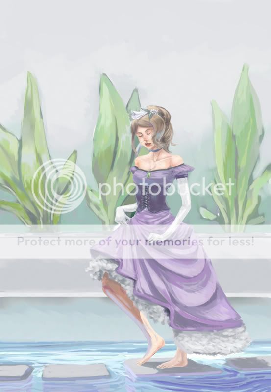
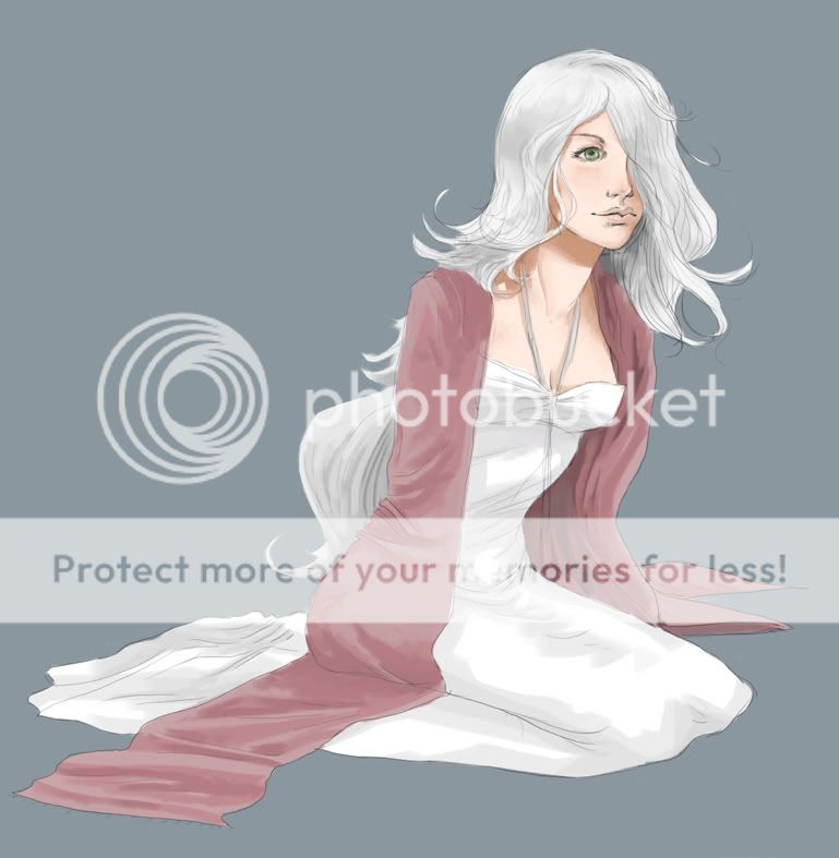
Posted: Sat Nov 03, 2007 8:09 am
Wow... that's so pretty, Vena. (Seriously, someone has to help me learn to paint.)
In any case, I love this last one. My only suggestions would be about your background and the gesture of her legs.
Both are very linear and restricted looking. Her torso turns 3/4, but her legs are full profile. It looks a bit strange and stiff. Try turning her feet and knees so they match the overall orientation of the body.
For the background, try breaking up that uniformity of the horizontal lines the shapes and color make with some other shapes that are more random in direction and position.
The area of water and rocks are a great example. The rocks are on a slight diagonal. The water has the ripples. The plants are really great for that too. They're vertical, but varied in the leaves and color distribution. I would add wear to the wall. Wild plants will grow along the base and creep up the wall. Weeds can be very pretty. Look at dandelions. Some flying insects can break up that block of color and bring life to it. Something recognizable that likes water, like a dragonfly.
Then there's that empty space at the top. I'm not sure if you'd want to crop it out, but there could be something to help frame the image. Maybe the top of the wall and the countryside beyond? A mansion beyond? Something that tells the story of where this richly dressed girl is. Maybe it's frowned upon for her to be out like that. Maybe the some figure is looking for her. There's a lot of background information that can be told with effective use of the background. That helps take a picture of a girl and make it a narrative about a adjective girl what is [insert premise]. Narrative is what illustration is all about.
If you don't mind, I'd like to save a couple of your paintings to my harddrive in my inspiration folder, and I'd also like to request a small painting tutorial if you have time.
|
|
|
|
|
|
Errol McGillivray Captain
|
|
|
|
|
|
|
|
|
|
|
|
Posted: Tue Nov 06, 2007 12:25 pm
Errol McGillivray Wow... that's so pretty, Vena. (Seriously, someone has to help me learn to paint.) In any case, I love this last one. My only suggestions would be about your background and the gesture of her legs. Both are very linear and restricted looking. Her torso turns 3/4, but her legs are full profile. It looks a bit strange and stiff. Try turning her feet and knees so they match the overall orientation of the body. For the background, try breaking up that uniformity of the horizontal lines the shapes and color make with some other shapes that are more random in direction and position. The area of water and rocks are a great example. The rocks are on a slight diagonal. The water has the ripples. The plants are really great for that too. They're vertical, but varied in the leaves and color distribution. I would add wear to the wall. Wild plants will grow along the base and creep up the wall. Weeds can be very pretty. Look at dandelions. Some flying insects can break up that block of color and bring life to it. Something recognizable that likes water, like a dragonfly. Then there's that empty space at the top. I'm not sure if you'd want to crop it out, but there could be something to help frame the image. Maybe the top of the wall and the countryside beyond? A mansion beyond? Something that tells the story of where this richly dressed girl is. Maybe it's frowned upon for her to be out like that. Maybe the some figure is looking for her. There's a lot of background information that can be told with effective use of the background. That helps take a picture of a girl and make it a narrative about a adjective girl what is [insert premise]. Narrative is what illustration is all about. If you don't mind, I'd like to save a couple of your paintings to my harddrive in my inspiration folder, and I'd also like to request a small painting tutorial if you have time. thanks for the comments! I noticed some pretty glaring anatomical flaws after I finished... thats what I get for not working my sketch out properly : x I've never done a lot of backgrounds but I am trying to improve them now, I think your suggestions will really help me out in the future. Its really the little stuff that makes it nicer >< oh, and I don't mind you saving my pictures at all =) I'm not sure about making a tutorial... I have never made one before but also my drawing/painting process is a bit disorganized. I think I will try it the next painting I do but I will see how my process turns out first XD
|
|
|
|
|
|
|
|
|
|
|
|
|
|
|
Posted: Mon Feb 04, 2008 6:39 pm
|
|
|
|
|
|
|
|
|
|
|
|
|
Posted: Fri Feb 08, 2008 3:06 pm
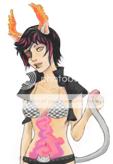
I think this came out really well. For Stickykitteh. 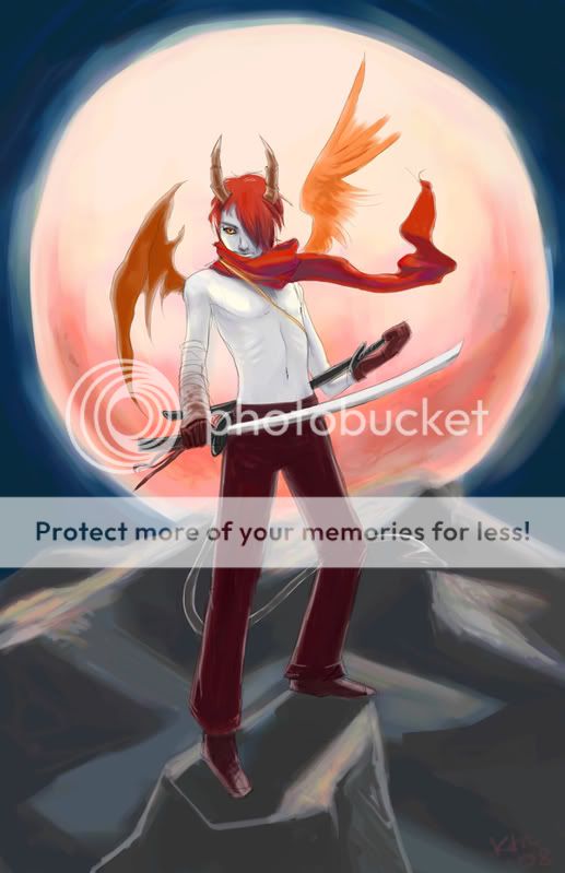
|
|
|
|
|
|
|
|
|
|
|
|
|
|
|
Posted: Sat Feb 09, 2008 9:57 am
I enjoy the colour scheme a lot in your newest picture, but I think the tail gets lost in the background because it's almost the same colour.
|
|
|
|
|
|
|
|
|
|
|
|
|
|
|
|
|
|
Posted: Sat Feb 09, 2008 10:38 am
yeah it was a bit of an afterthought.. aka I almost forgot it =P
|
|
|
|
|
|
|
|
|
|
|
|
|
|
|
|
|
|